Stax Theme Blocks
Table of contents
Overview
Since the introduction of WordPress 5.0, WordPress has a new editor in place known as Gutenberg. This is now the default editor that WordPress uses.
Below is a sample preview of a new page while using the default editor:
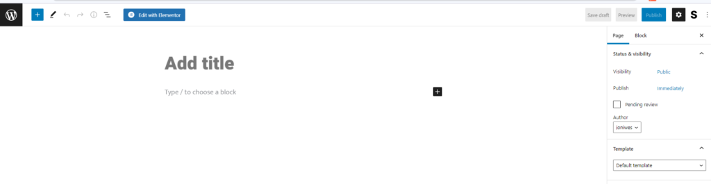
This editor contains a collection of blocks and patterns to assist in editing your pages.
Using Blocks Within Posts and Pages
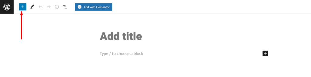
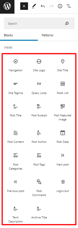
Blocks and patterns can be found by clicking on the block inserter icon within a page or post as can be seen below:
Once you identify a block / pattern that you would wish to add, clicking on it will display it within the page / post.
Below are some screencasts illustrating how you can can add blocks and patterns to your page / post:
How to add Blocks
How to add Patterns
Theme Blocks
Stax theme is designed to fully support the Gutenberg Editor. You can hence opt to use Gutenberg to design your posts and pages. The theme adds a collection of blocks to the editor, to add on what WordPress already provides.
These blocks include:
-
Navigation
-
Site Logo
-
Site Title
-
Site Tagline
-
Query Loop
-
Posts List
-
Post Title
-
Post Excerpt
-
Post Featured Image
-
Post Content
-
Post Author
-
Post Date
-
Post Categories
-
Post Tags
-
Next Post
-
Previous Post
-
Post Comments
-
Login / Out
-
Term Description
-
Archive Title
Within this doc segment, we will look into each of these blocks and how to use them within the editor.
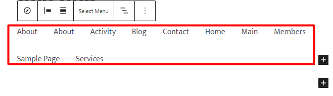
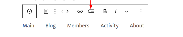
Navigation
When added to a page, the display is as illustrated below:

Within the block, this enables you to carry out a number of actions:
1. Select menu
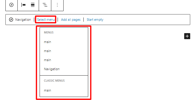
Enables you to select a menu from the already created menus within your website.
2. Add all Pages
When clicked on, it adds a page list block or else all pages within your site to the navigation.
3. Start Empty
Once selected, it renders a navigation with no menu items and provides options to add custom links to the navigation.
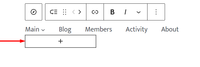
Adding a Sub-Menu to a Menu Navigation item
In order to add submenus to a navigation menu item, you will need to carry out the following:
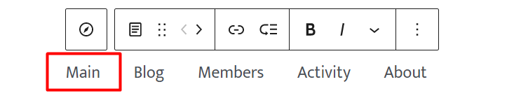
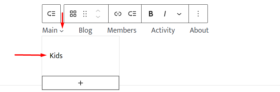
1. Select a menu item where you would wish to add the sub-menu. In our case here, we will click on “main”.
2. Click on the “add submenu” module within the navigation
3. Once this is done, you will be provided with a sub-menu dropdown box
4. Click on the “plus” icon within the box and you will be presented with a popup
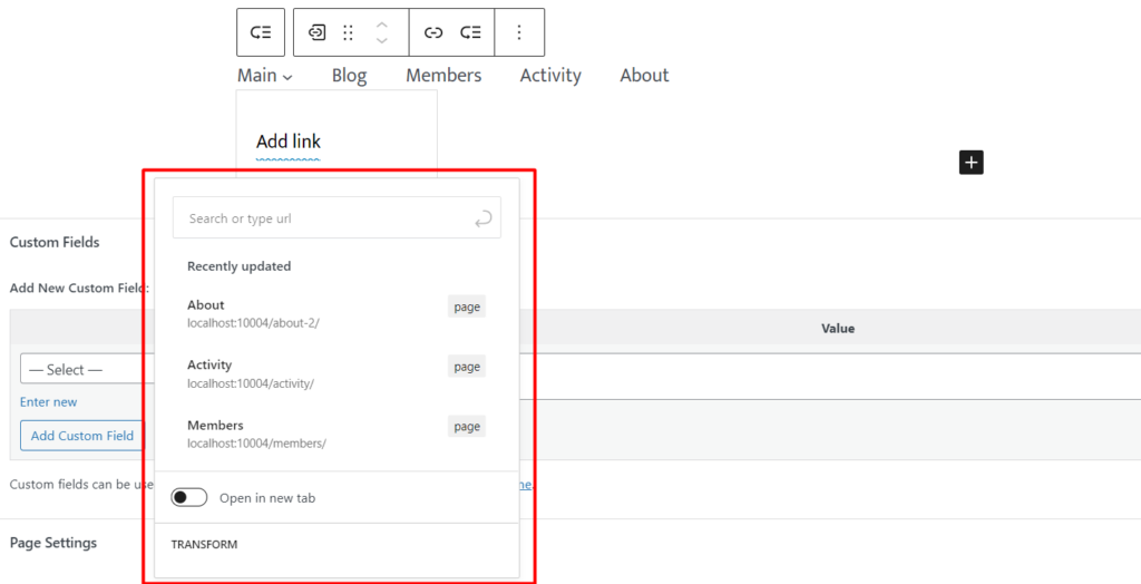
Here you can search for a post type, category, tag or any other supported menu items and add it as your submenu. You can also set a custom link here or create a draft page.
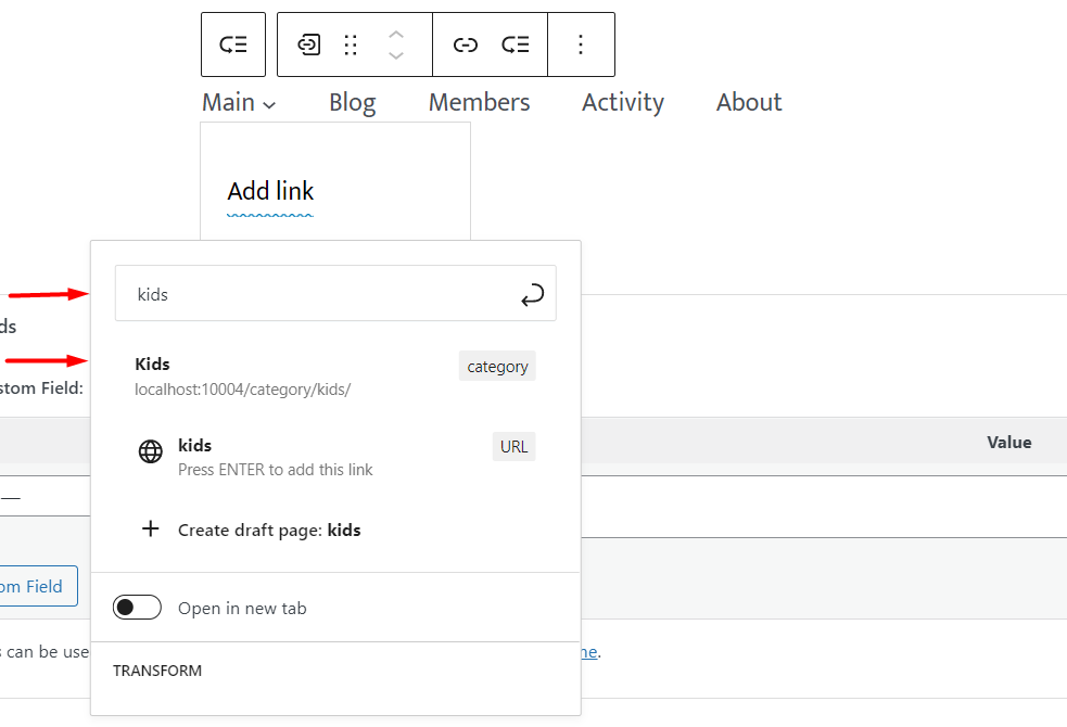
Within this illustration, we will search for “kids” which is a post category and add it:
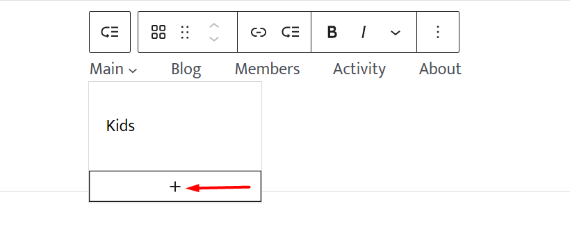
5. Once done, you will now have a view of the sub-menu display and a dropdown menu icon close to the menu item as illustrated below:
You can add many more sub-menu items by clicking on the “plus” icon within the dropdown.
Site Logo
The Site Logo block enables you add a logo image that represents your website.
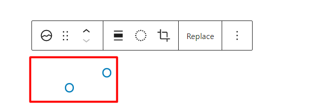
When the block is added to a page, there are a number of block settings in place, one of them being the option to replace or reset the default site logo within the block.
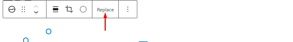
This option helps in the addition of the logo to the block.
The block also contains additional styles and settings as outlined below.
Styles
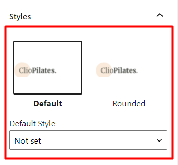
Default: Renders the logo as originally uploaded
Rounded: Adds rounded borders to the logo, hence resulting to the display of a circular logo
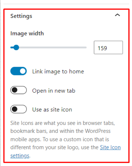
Settings
Image Width: Helps you adjust the size of the logo, in terms of width
Link Image to Home: When enabled, the logo is linked to the home page
Open in new tab: This setting is available when “Link image to home” setting is enabled. Once the “Open in new tab” option is also in turn enabled, clicking on the site logo will open the home page in a new tab.
Use as site icon: This setting renders the logo as a site icon within the site.
It is also important to note that the site logo added and settings applied to it will be observed within the whole site.
Site Title
The Site Title render the Title you have added to the Appearance > Customize > Header > Change Logo > Site Title.
The block also enables you to specify a site title of your preference. Doing so, will also affect your whole site.
The block does provide a number of settings that can be applied on it. These include:
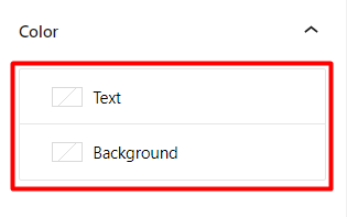
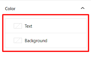
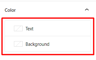
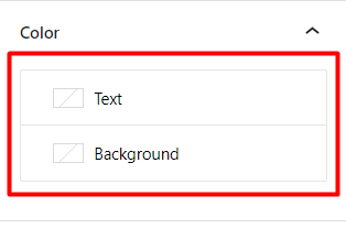
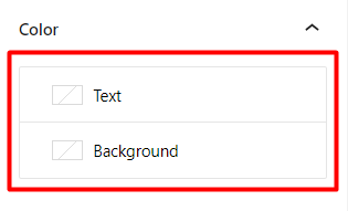
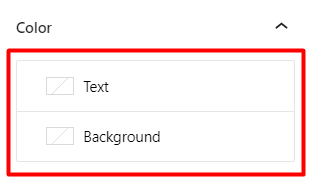
Color
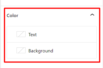
Text: Enables you to set the color of the Site title text
Background: Enables you to set the background color of the site title
Link Settings
Make title link to home: Once this option is enabled, the site title will redirect to the home page when clicked upon.
Open in new tab: This option is only displayed if the “Make title link to home” option is enabled. This option will help in ensuring that the home page opens in a new tab once the site title is clicked upon.
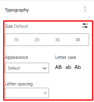
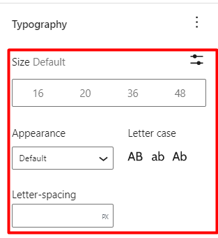
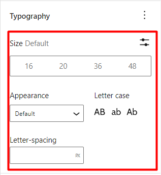
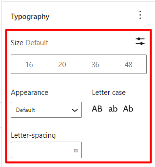
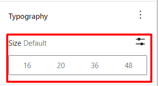
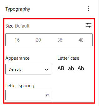
Typography
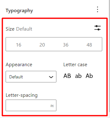
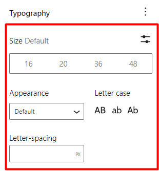
Size Default: Helps in adjusting and setting the Site Title font size
Appearance: Enables you to set a font style to the Site Title
Letter-Spacing: Here you can set a value that helps in increasing or decreasing the spacing between characters on the Site Title
Letter Case: Helps in determining the capitalization of the Site Title
Site Tagline
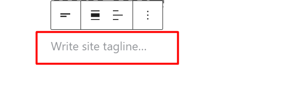
The Site Tagline block displays the Tagline you have added to the Appearance > Customize > Header > Change Logo > Tagline section.
This block does also enable you to set a site tagline or else a site description of your preference. Doing so, will also affect your whole site.
The block does also provide a number of settings that can be applied on it. These include:
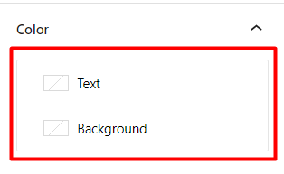
Color
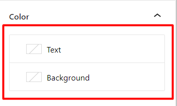
Text: Enables you to set a color to the site Tagline / description
Background: Helps in setting a background color to the site Tagline/description
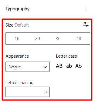
Typography
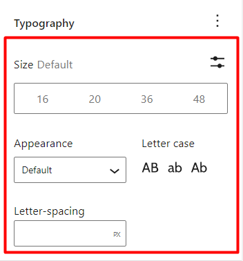
The Typography settings contain a number of options, among them being:
Size: Helps in setting the text size of the Tagline
Appearance: Determines the font style of the Tagline
Letter-Spacing: Enables you to add some spacing between the Tagline characters
Letter Case: Helps in setting the capitalization to the site Tagline
Query Loop
The Query loop block helps in displaying posts from a particular post type based on the set query.
When added to a page, the block enables you to select a post type to start new query setup, or select your query loop settings to populate your query as shown below:
Start Blank
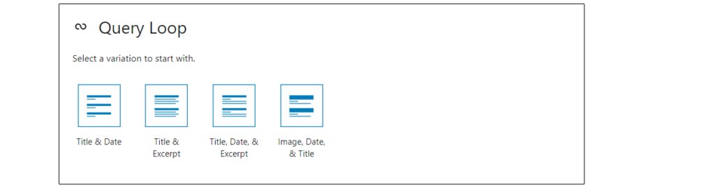
Once the “Start blank” option is selected, a number of layout display variations are provided for the post results. These are:
Title & Date: When selected, the posts rendered only display the post title and date
Title & Excerpt: Upon selection, posts will only contain a title and excerpt to the post(s)
Title, Date & Excerpt: The display within posts will comprise of the title, date and excerpt
Image, Date & Title: Upon selection, the posts will contain the featured image, date and post title
Once either of the above variations are selected, you will be presented with a panel of options to customize your query as seen below:
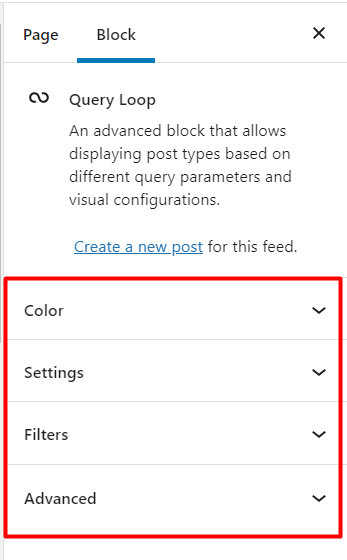
Color
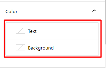
Text:-Enables you to set the color to the date and excerpt to the posts within the query
Background: – Here you can set the background color to the query loop
Settings
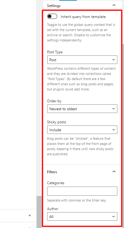
Inherit Query from Template: When enabled, the query is set to run the global query of the current template.
Post Type: Enables you select the target post type, from the available post types within your website.
Order by: Help sin specifying the particular arrangement used to display posts within the Query loop.
Sticky Posts: Stax theme provides an option to set sticky blog posts, referenced as “Stick to the top of the blog”. The Sticky Posts option within the Query loop helps in determining whether these posts are included within its query results or not. This option can also help in having only the sticky blog posts rendered within the query results.
Filters
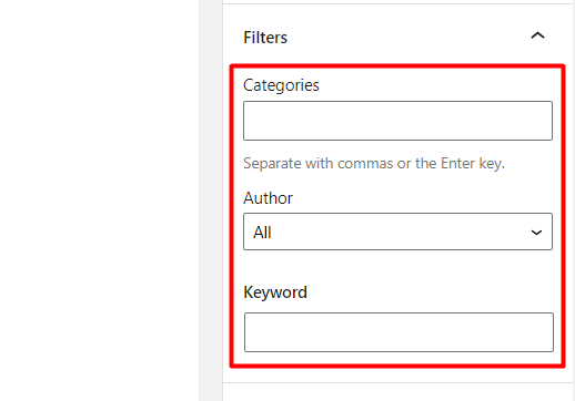
Categories: Helps in limiting posts rendered within the query loop, based on the specified categories.
Author: Limits the posts returned within the query loop based on the selected author.
Keyword: Sets the query within the Query Loop to be determined by a keyword filter.
Advanced
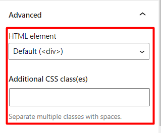
HTML Element: Enables you to specify a wrapper to the posts returned within the query loop.
Additional CSS class(es): This section can be used to add classes that can be used to target the query loop block.
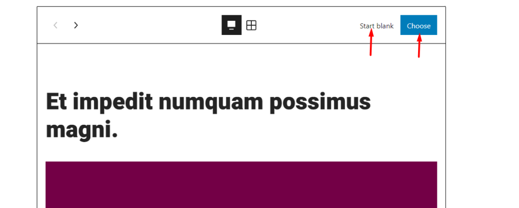
Choose
With the option “Choose” selected, the default query results based on post are rendered within the Query block.
Similar to the “Start Blank” option, a panel with a number of settings are rendered to the left, to allow you customize the query to your preference.
Within the Query loop, are also a number of options as illustrated below:
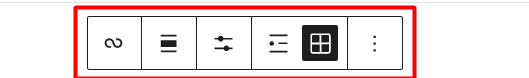
These options will help in adjusting:
- The alignment of the query loop block results within a page
- The display of posts within the Query Loop block results
- How posts are rendered(Either as a List or Grid)
It is also worth noting that you can also customize the inner blocks within the Query Loop block. Such blocks include: Post Excerpt, Post Featured Image and Post Date.
Posts List
This is a block similar to the “Query Loop” block, but is used to render the most recent posts, with exclusion of the sticky posts.
Post Title
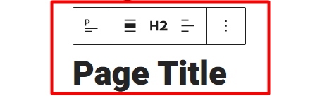
The “Post Title” block renders the title to a post or page where the block is added.
It contains a couple of settings which include:
Color
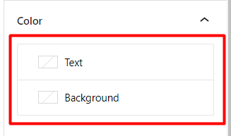
Text: Enables you to set a color to the post/page title
Background: Helps in setting a background color to the post/page title
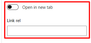
Link Settings
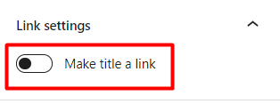
When the option “Make title a link” is selected, it allows you to a link resource to the post/page title.
Within the Link settings, you can also specify the linked resource to the post/page title, as well as whether to open the post/page title link in a new tab or not.
Typography

This segment, contains a number of Typography options that you can utilize which are:
Size: Defines the font size of the post/page title
Appearance: Specifies the font style to the post/page title
Letter Case: Defines the capitalization of the post/page title
Letter-Spacing: Enables you to set some spacing between the Post Title characters
Post Excerpt
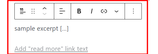
The Post Excerpt block helps in displaying excerpts to the post within which the block is added or as a component within other theme blocks such as the Query block.
When added to a post, the block displays a number of settings that can be used to adjust the excerpt styling. These include:
Color
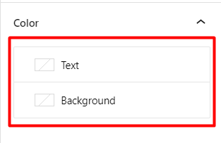
Text: Enables you to specify the text color to the post excerpt
Background: Allows you to specify a background color or gradient to the post excerpt
Post Excerpt Settings
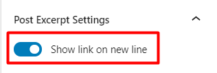
When the “Show link on new line” option is enabled, the “read more” link is rendered on a new link. On the other hand if this option is not enabled, the link is displayed inline to the post excerpt.
Typography
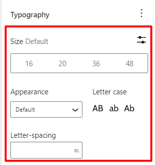
This setting determines the styling of the excerpts. A number of options are available here which include:
Size Default: Helps in setting the font size to the excerpt
Appearance: Determines the font style of the excerpt
Letter Case: Defines the capitalization used on the excerpt
Letter-spacing: Enables you to set some spacing between the post excerpt characters
Post Featured Image
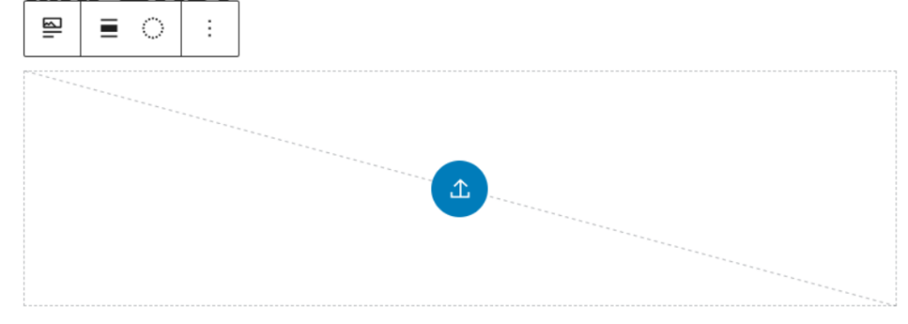
The “Post Featured Image” block when added to a post/page helps in rendering the featured image to the post/page.
The block is also a component of other theme blocks such as Query loop and is also editable within the block.
A few settings are also available within this block. These include:
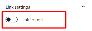
Link Settings
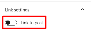
When the “Link to post” setting is enabled, clicking on the featured image will redirect to the post/page URL which that contains the featured image.
Dimensions
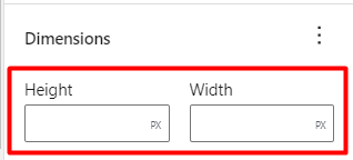
This setting enables you specify the width and height values of the featured image.
Upon specifying the values, the block offers some extra options on how you can scale the featured image. These include:
- Cover: The image will be clipped to fill the entire container (space defined by the set height and width values), without any distortion to the image.
- Fill: The image here will be resized and stretched to fill the entire container. There will be noticeable distortion on the image in this case.
- Contain: The image here will be resized to fit the aspect ratio of its container, without any clipping or distortion to the image.
Post Content
This is the default editor block within your pages/posts, and is responsible for displaying the contents to the post / page.
You don’t necessarily need to use it within your posts/pages as it’s present by default.
Post Author
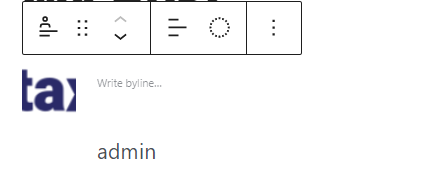
Th Post Author block renders the author to the post/page where the block is added as well as other author properties such as the avatar and byline.
When added to a post/page, the block presents a number of settings of which are:
Color
Text: Enables you to set the color of the author name and byline.
Background: Helps in defining the background color/gradient to the post author block.
Author Settings
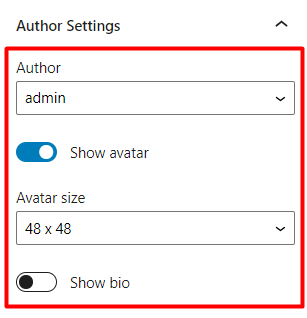
Author: Displays the author name to the post/page where the block is added
Show Avatar: When enabled, the author avatar is displayed within the block
Avatar Size: Helps in defining the size of the author avatar based on the predefined sizes in the dropdown, If avatar display is enabled
Show bio: Displays the authors’ bio information if a user has a set bio
Typography
Size: Defines a uniform font size to the author name, byline and bio information.
Appearance: Enables you to adjust the font style to the author name, bio and byline information.
Letter Case: Determines the capitalization of the author name, bio and byline information.
Letter-Spacing: Helps you define the spacing between characters in the author name, bio and byline information.
Post Date
The Post Date block helps in the display of the date/time that the post/page where the block is added, was published.
Post Date block also serves as a component of other blocks such as the Query Loop block.
A number of settings are available within the Post Date block. These include:
Color
Text: Helps in setting the color to the publish date
Background: Helps in setting the background color/gradient to the post date block
Format Settings
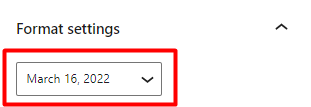
The “Format Settings” helps in defining the format of the date rendered.
Within it, you can have the block set to render either the time a post was published, date, or date and time.
Link Settings
When the “Link to post” option is enabled, clicking on the date will redirect to the post/page where the Post Date block is added.
Typography
Size: Determines the font size of the date/time
Appearance: Helps in setting the font style of the date/time
Letter Case: Enables you set the desired capitalization of the date/time
Letter-Spacing: Helps in setting the character spacing of the date/time
Post Categories
The post categories block helps in rendering the category assigned to a post, within which the block is added.
A number of settings are present within this block. These include:
Color
Text: Enables you to specify the color to the post category
Background: Helps in setting the background color/gradient to the post category block
Typography
Size: Defines the font size to the categories returned within the Post Categories block
Appearance: Helps in determining the font style to the post categories
Letter-Spacing: Determines the space between category text characters
Letter Case: Helps in setting the desired capitalization of the post categories
Post Tags
The Post Tags block when added to a post displays the tags that are assigned to the particular post where the block is added.
The block contains a number of settings which include:
Color
Text: Enables you to specify the color of the tag(s) displayed
Background: Helps is setting a background color or gradient to the Post Tags block
Typography
Size: Helps in setting the font size of the post tag(s) displayed
Appearance: Helps in defining the font style of the post tag(s)
Letter Case: Determines the capitalization of the post tag(s)
Letter-Spacing: Helps in setting a spacing for the characters within the post tag(s)
Advanced
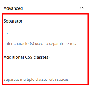
Separator: Provides a field to set the character or symbol to use as the separator for the tags
Additional CSS Class(es): This is an optional field where you can add custom CSS classes to be used to target the post tags block.
Next and Previous Blocks
The “Next” and “Previous” blocks are two different blocks that help with the navigation of posts.
Next: Helps in displaying the post that follows the current post.
Previous: Helps in displaying the post that precedes the current post.
These blocks contain similar settings which are:
Display the title as a link
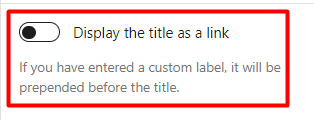
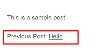
When enabled, the post title will be displayed as a link within the block. Below is a sample comparison when the option is not enabled, and when enabled:
Option Enabled
Option Disabled
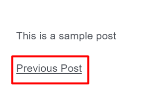
When the option “Display the title as a link”, it also provides an additional setting “Include the label as part of the link” as seen below:
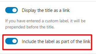
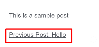
When the “Include the label as part of the link” is enabled, the label added to the blocks is also made a part of the post title link. Below is a sample illustration on this:
Typography
Size: Enables you to define the font size of the contents to the next and previous post navigation blocks
Appearance: Helps in setting the font style to the contents of the next and previous post navigation blocks
Letter Spacing: Enables you to set the spacing between characters on the next and previous navigation blocks
Letter Case: Helps in specifying the capitalization of the contents to the next and previous navigation blocks
Post Comments
Post comments block displays the comments within a post or page where the block is added.
The block contains a couple of settings. These include:
Color
Text: Enables you to specify the color of comments
Background: Helps in setting the background color or gradient to the post comments
Typography
Size: Enables you to specify the font size to the comments
Appearance: Used in specifying the font style to the comments
Letter-Spacing: Helps in adding some spacing to the comment characters
Letter Case: Used in defining the capitalization of comments
Login/Out
The login/out block renders a login link or form if a guest visits the page or section where the block is added. On the other hand, if a logged in user visits the page or section where the block is added, a log out link is rendered.
The block provides a number of settings. These include:
Login/out Settings
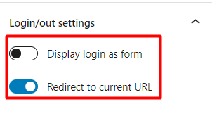
Display login as form: When enabled the login is displayed as form and when disabled, the login is displayed as a link
Redirect to current URL: When enabled, upon a successful login, the user is redirected to the current URL or else the URL where the login action was triggered from.
Term Description
The Term Description block displays the descriptions of archives such as categories, tags and custom taxonomies when viewing them.
This block can for example be added to a sidebar that you are using for your archives.
There are a couple of settings present within the block. These include:
Color
Text: Helps in setting the color of the description content
Background: Helps in setting the background color or gradient to the description content
Typography
Size: Enables you to set your desired font size for the description content
Archive Title
The Archive Title block is an inbuilt block that displays the title of a queried object.
There are a couple of settings available within the block. These include:
Color
Text: Enables you define the color of the archive Title
Background: Enables you set a background color or gradient to the Archive Title
Typography
Size: Helps is setting the font size to the Archive Title
Appearance: Helps in determining the font style to the Archive Title
Letter Spacing: Enables you to set some spacing to the characters in the Archive Title
Letter Case: Helps in defining the capitalization of the Archive Title
Conclusion
Stax theme contains over 20 integrated theme blocks. This extends to the number of default blocks that WordPress provides by default. It is important to learn how to utilize Gutenberg blocks within your website since this is the default WordPress editor in place and official support of the classic editor may not be there for long.