Footer Overview
Footers form the very bottom content of a website. The provide more engagement with your website users by rendering content such as navigation links, contact information and social network representation.
The Stax theme provides three different footer sections that you can use within your website. These include:
- Footer Top
- Footer Main
- Footer Bottom
Below is a sample screenshot illustration of the footers, with the different background colors depicting them.

These footers are easily customizable, allowing you to add different content based on your preference.
Footer Top
Footer top as the name suggests refers to the top most footer. Within our original screenshot, this footer is represented as seen below:

Footer Main
The footer main is the central footer of the three footer sections. Within the original screenshot we have it represented as:

Footer Bottom
Footer Bottom is the base footer section. Within our screenshot it is depicted as:

Styling and Customizing Footer Sections
The three footer sections can be customized from the Appearance > Customize > Footers section after selecting the footer section that you would wish to have customized.
Settings within the three footer sections are all similar. Notably, there are two customization segments:
- Layout
- Style
Within this segment, we will see how each of them is utilized.
Layout
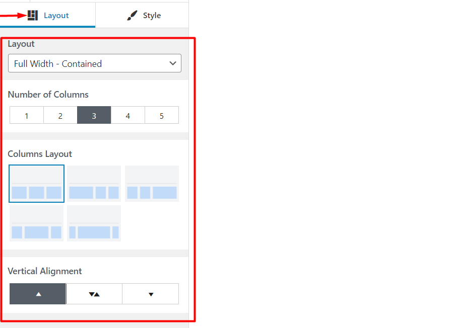
Within this section, you can specify the layout, number of columns within the footer row, the desired column layout and the vertical alignment you would wish to have in place, for the column(s).
Layout Selection
There are 3 layout selections available for use, by default. These include:
- Full Width
- Full Width Contained
- Contained
Full Width
Within this layout the footer row occupies the full width of the browser. Contents within it occupy the full container width. Below is a sample illustration of this:

Having a closer look on the above layout, you will notice some minor spacing on the right and left of the footer items. This is a result of the padding added to the container class, of which is alterable via CSS.
Full Width Contained

In the full width contained layout, the footer row occupies the full browser width, but the content is constrained to the set container width set across different device screens by default, hence not occupying a full width as seen above.
Contained

In this layout both the footer row and content occupy the set container width. As can be seen in the above screenshot, there are some white spacing, indicating that the footer does not occupy the full width of the browser.
Number Of Columns

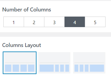
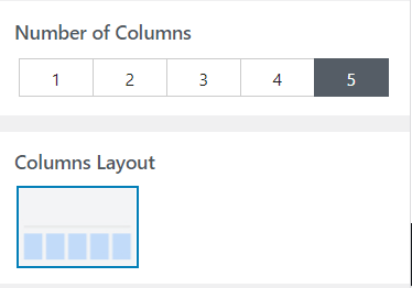
This setting is used in setting a specific number of columns that are to be rendered within a particular footer. The setting provides a range of columns that you can use, from 1 to 5.
Columns Layout
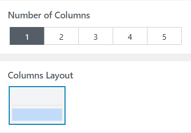
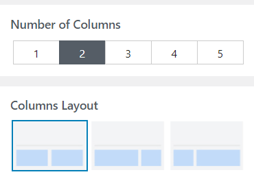
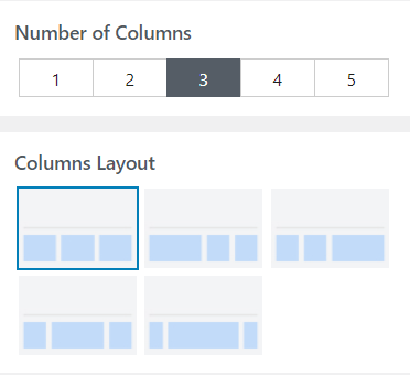
The Columns Layout setting helps in defining the layout of columns based on the set number of columns to be rendered.
Each set number of columns has different layout options as illustrated below:
Vertical Alignment

The Vertical alignment setting helps in defining the vertical positioning of the footer contents within a specific footer.
Content can either be vertically positioned at the top, bottom or centrally aligned just as highlighted by the arrows.
Style
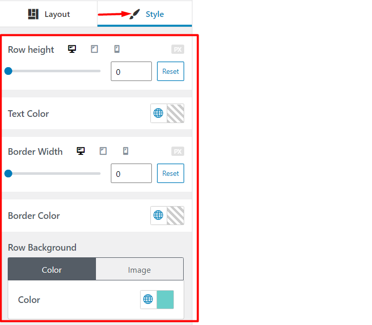
The Style segment enables you to set a desired look for your footer, with the help of the integrated styling aspects/properties. These include:
- Row Height
- Text Color
- Border Width
- Border Color
- Row Background
Row Height
Row height enables you to specify the vertical height of your footer in pixels.

The Row height settings can also be utilized to set the footer row heights in mobile and tablet devices.
Text Color

Enables you to specify the color of text content within your site.
Border Width
The border width property enables you to specify a top border to your footer. Below is a sample illustration, where the black region represents the top border and the red icons represent the border width.

Border Color
The Border color setting is used in specifying the color to the top border of your footer.

Please do note that for this property to work, you need to first set the border width to the footer.
Row Background
This setting enables you to specify a background to your footer row. Within it, there are two main segments, namely the color and image settings.
The color segment enables you to set a background color to the footer row as seen below:

From the color selector, you can use the Global Palette colors or your own desired color selection.
The image segment on the other hand enables you to set a background image to your footer row.
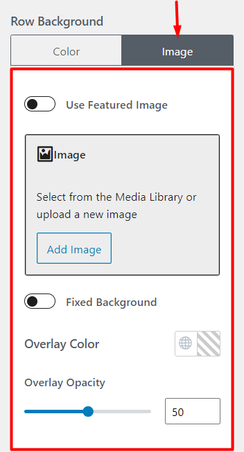
There are various settings that you can apply within this segment. These include:
- Use featured Image: Once enabled, this setting will enable the display of a featured image to your current page/post, in your footer row background.
This brings in quite some flexibility since you can have different images rendered as background images to your footer, within different posts/pages in your site.
- Image/Fallback Image: The image section enables you to directly upload an image to serve as your footer background. It is only available if the option “use featured image” is not enabled. The Fallback image section on the other hand is available if the option “use featured image” is enabled. The section allows you to set a fallback image to be used by posts / pages that do not have set featured images.
- Fixed Background: Once this setting is enabled your footer background image will be rendered in a fixed position in the footer row, hence creating a Parallax-like effect.
- Overlay Color: An overlay color is the color covering your footer background image, thereby creating a blending effect.
Below is a sample comparison on a footer with an overlay and one with none:
Footer With No Overlay

Footer With Overlay

- Overlay Opacity: This setting specifies how light or dark the overlay will be. You can set a value ranging from 0 to 100. The value 100 is the full opacity and if set, you will only be in a position to have a view of the overlay color.
Footer Builder
Overview
Stax theme comes with an integrated footer builder to enable you create a custom footer for your website. This builder is accessible from the Appearance > Customize > Footer section.

The builder provides a drag and drop interface to help you design you footer. You can easily drag the components on the left panel to the builder on the right, within your desired footer sections. The top most row within the builder represents the Footer Top, the middle row represents Footer Main and the bottom row represents Footer Bottom.
Footer Builder Components
Footer builder components are the elements provided within the left pane of the builder.

Namely these include:
- Footer One: Renders widget block content added to the Footer Column 1, found within the Appearance > Customize > Widgets section
- Footer Two: Displays content from widget blocks added to the Footer Column 2
- Footer Three: Displays widget block content added to the Footer Column 3
- Footer Menu: Displays the menu set as the “Footer Menu” to the site, within the Appearance > Menu section
- Footer Four: Renders widget block content added to the Footer Column 4
- Copyright: Displays a Copyright notice on your website footer section. The Copyright notice can be set from the Appearance > Customize > Footer > Change Copyright
Once any of these components is dragged to the builder, you can add content within them by clicking on the Item setting SVG icons within them as highlighted below:

The widget settings icon within the footer columns are used when you want to customize the Footer columns. Below is an illustration of the icon.

Each of the footer components are hence customizable. However, you can only use one component in a single footer section. As an example, you cannot have the “Footer One” component both in the “Footer Top” and “Footer Bottom” and neither can you have a duplicate of the component within the same Footer.


