Header Overview
The Stax theme header has up to three different header sections, namely:
- Header Top
- Header Main
- Header Bottom
Below is a sample screenshot on the headers, with the different colors depicting different headers.

You can use one or all these header sections within your Website.
Header Top
This is the top most header within a page in your website.
In our case here, this is the header represented as shown below:

You can think of this header as a top bar. While using the three headers in your site, you can use “Header Top” to add site content such as the location, email or a phone number, but not limited to these.
Header Main
Header main is the central header within the full header in your page.
In this case, it is represented in the original screenshot as shown below:

While using the three headers in your site, the “Header Main” would be most appropriate for content such as your site logo and in cases where you do not want to use Header bottom, you can use it for your menus.
Header Bottom
The header bottom is the header rendered underneath the rest of the headers.
In our case here, it is represented within the original screenshot as shown below:

While using the rest of the headers, this header would be more appropriate in rendering the menus, but not limited to this as well.
Styling and Customizing Header Sections
Each of these headers’ styling and layout can be customized to your preference. To do so, navigate to the Appearance > Customize > Headers section and select the Header you would wish to customize.
The customization settings to each of the headers are quite similar. Within this segment, we will cover these settings and see how these can be utilized.
Layout

Within the layout section, you can set one of three layout options provided within the theme. These include:
- Full Width
- Full Width – Contained
- Contained
Full Width
In this layout, the header row stretches and occupies the full width of the browser window. Contents within the header will occupy the full container width. Below is a sample illustration on this:

You will however notice that is a bit of spacing left out towards the right and left of the header contents. These are the left and right paddings set on the container class.
Full Width – Contained

Within this layout, the header row occupies the full width of the browser but the content is constrained to the defined container width set across different device screens, as seen above.
Contained

In this layout, both the header row and content are constrained to the container width. You will find some white spacing within the header as illustrated in the screenshot above.
Style
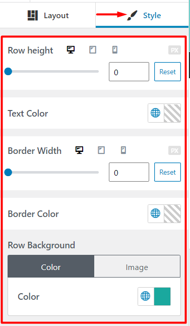
The style section provides options that you can set to add some styling to your headers. Some of the aspects taken into consideration here include:
- Row Height
- Text Color
- Border Width
- Border Color
- Row Background
Row Height
This section allows you to set a specific height to your header row across different screen devices.

You can use the range control slider provided to adjust the value and on the right pane where you have your header, you can have a view of the changes in real time.
Text Color
Enables you to specify a color of the text elements within your header, if none is specified within the individual elements.

Border Width
Enables you to set a bottom border within your header, across different device screens.
Below is a sample output:

Here we can see a gray-white color highlighted, which serves as the body background color in this instance, illustrating that there is a border spacing in place.
Border Color
Here you can set the color to the border within your Header, so that the default underlying background color is not rendered instead. Below is a sample screenshot on this:

The color selector provided provides you with an option to also utilize the global colors within your site, in just a few clicks.
Row Background
This section enables you to specify a background to your header. There are two segments here. The color and image segment.
The color segment enables you to specify the background color to the header. The color selector provided also allows you to easily assign the global colors, thereby helping in setting consistent color displays within the site.
As an example, we can see that the background color to the header in our screenshot below is black:

The image segment on the other hand enables you to specify a background image to your header.
There are a couple of settings available within this segment:
- Use Featured Image: This sets the header to use the featured image of a page. This brings in quite some flexibility since with this option enabled, you can have different images rendered as background images to your header, within different pages in your site.
If you do not desire to use the featured image as your header background image, then you can just upload your desired image to the image section below this setting.
- Fallback Image / Image: The Fallback Image option allows you to upload a fallback image, of which will be used as your header background image in case for example a post / page in your site does not have a set featured image in it . If on the other hand you have not enabled the option “Use Featured image”, then you can just upload your desired background image to the image section.
- Fixed Background: This option sets a fixed background image for your header, hence bringing in a Parallax-like effect to your header.
- Left & Top: These settings are used to specify the background position of the image. The values specified are in percentage form. You can adjust these values to a range of your preference.
- Overlay Color: A color overlay in basic terms here is a color covering the background image. The Overlay Color setting helps in adding a blending color overlay to the background image.
Below is a sample comparison on an image with no color overlay and one with a color overlay respectively:
No Overlay

With Overlay

- Overlay Opacity: This setting helps in determining how light or dark the overlay will be.
Header Presets
Header Presets are pre-designed layouts that you can use to apply instant header layouts.
Below is a sample illustration on this:
Header presets help in saving time while designing your site header. You can use these presets if you do not wish to build your header from scratch.
Mobile Sidebar
The mobile sidebar is a sidebar rendered once you click on the hamburger menu icon within mobile devices.
There are layout and styling customizations that can be made on this sidebar. Below is a breakdown on these:
Layout
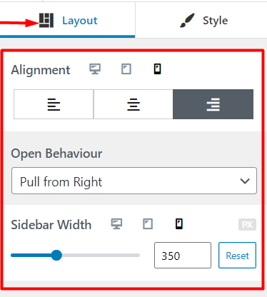
Alignment
This refers to the positioning of items within the mobile sidebar. You can set the display of items either on the left, right or in a central position as illustrated below:
Left Alignment
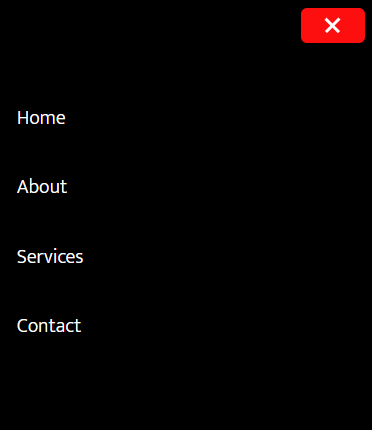
Right Alignment
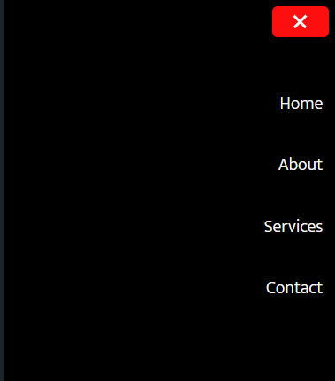
Central Alignment
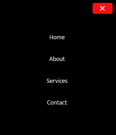
Open Behaviour
As the name suggests, this refers to the opening behaviour or rather the reaction of the hamburger menu icon once clicked on.
These behaviour include:
- Slide from Left
- Slide from Right
- Pull from Left
- Pull from Right
- Full Canvas
- Slide Down
Below is a quick demo on these behaviour:
Sidebar Width
This setting allows you to define the width of the mobile sidebar across different device screens. You can use the range slider to alter the width, save your changes and refresh the page to check on the applied width.
Style
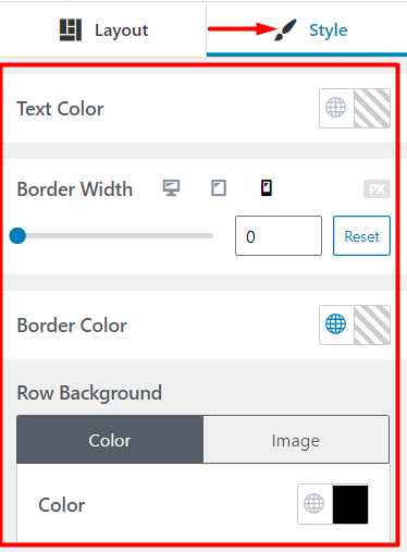
The style section enables you to add some styling to the mobile sidebar. The properties that can be applied within this segment include:
- Text Color
- Border Width
- Border Color
- Row Background
Text Color
Enables you to specify the color of texts within the mobile sidebar if any is present.
Text content can for example be added using the HTML element
Border Width
With this setting, you can specify the border width to the mobile sidebar.
Border Color
While using this setting, you can specify a color to the border set on the mobile sidebar.
Row Background
This section enables you to specify the background to the mobile sidebar. There are two segments to facilitate this which are the color and image segments.
The color segment allows you to set a background color to the mobile sidebar. The color selector also allows you to easily assign the global palette colors, thereby helping in setting consistent color displays within your site.
The image segment on the other hand enables you specify a background image to the mobile sidebar.
A number of settings are provided here which include:
- Use Featured Image: Within this setting, you can enable the use of the featured image set in your page to act as the background image to the mobile sidebar.
- Image / Fallback Image: If you do not desire to use the featured image as your mobile sidebar background image, then you can just upload your desired image to this section. Else, you can also specify the fallback image if you have enabled the option “Use Featured Image”. This image will be rendered if there is no featured image within a post or page.
- Fixed Background: This option sets a fixed background image for your mobile sidebar.
- Overlay Color: The Overlay Color setting helps in adding a blending color effect, in this case an overlay, to the background image on the mobile sidebar.
- Overlay Opacity: This setting helps in determining how light or dark the overlay will be. You can specify values from a range of 0 to 100.
Header Builder
Overview
The Stax theme comes with an integrated header builder to assist you in creating custom layouts to your header. You can have access to the builder from the Appearance > Customize > Header section within your administrator dashboard.

On desktop, the builder enables you to customize all the header sections within the theme, with the top section being the Header top, the middle being Header Main and the bottom section being Header Bottom.

On the other hand, the header builder also provides support for header customizations to be used within mobile displays. Similar to desktop, the builder allows you to customize the Header top, Header Main and Header Bottom sections. In addition, it does also provide a region where you can customize the mobile sidebar as seen in the screenshot below:

Header Builder Components
Stax theme provides a number of Header Components of which you can use to design your Header. For ease in customization, these Components are located within the left panel of the header builder.

These components include:
- Button: The button component can be used in rendering a button within the header if one is needed
- HTML: Used to add HTML content to the header
- Search Form: Displays a search form within the header
- Search Icon: Renders only a search icon within the header. Once there is a click action within it, then the search form is rendered in turn
- Logo and Site Identity: Renders the Site title and the set logo
- Menu Icon: Displays the hamburger menu icon within the header. This is mostly used in mobile
- Primary Menu: Renders the menu set as the primary menu within the Appearance > Menu section of the WordPress dashboard
- Secondary Menu: Renders the menu set as the secondary menu within the Appearance > Menu section of the WordPress dashboard
Each of the available Header components are easily customizable to match your site preferences. However, while creating your headers, you can only use one component at a single header occurrence. As an example, if you add “Button” to “Header Top”, you cannot add it to any other header section such as Header Top, Header Main, or even add it as a second to the same header where the first button is currently in place.


