Overview
The Single post section within the Stax theme is located within the Appearance > Customize > Single Post section. This section provides settings for the individual post pages. These settings mainly influence the display of elements within the single post pages.
In this guide, we will cover how you can utilize the settings provided to achieve various post displays within your website.
Settings within this section are subdivided into:
- General
- Navigation
- Related Posts
General
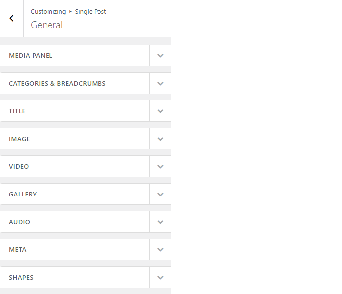
Within this section, the theme provides settings on how the post content such as media, categories & breadcrumbs, titles are rendered across single post pages.
Media Panel
The media panel determines how media content such as featured images and videos are displayed within your single post pages.
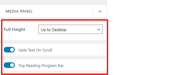
A number of settings are provided within this section of which include:
- Full Height
- Fade Text On Scroll
- Top Reading Progress Bar
Full Height
This setting determines within which devices do media items within the media panel, occupy a full height. A couple of options are available here.
Off: With this option enabled, media items do not occupy a full height in any device screen
Up to Mobile: In this option, media items will occupy a full height only in mobile devices
Up to Tablet: With this option enabled, media items will occupy a full height in both mobile and tablet devices
Up to Desktop: Once this is enabled, media items will occupy a full height in mobile, tablet and desktop screens
When either of the options off, up to mobile or up to tablet are selected, you are provided with an option to set the maximum height the media item can occupy.
Fade Text On Scroll
With this option enabled, there will be some noticeable fading on your post entry header items as the user scrolls the post.
Below is a sample illustration:
Top Reading Progress Bar
When enabled, a progress bar is rendered at the top of your posts as the user reads or scrolls through it.
Below is a sample screenshot on this:

Categories and Breadcrumbs
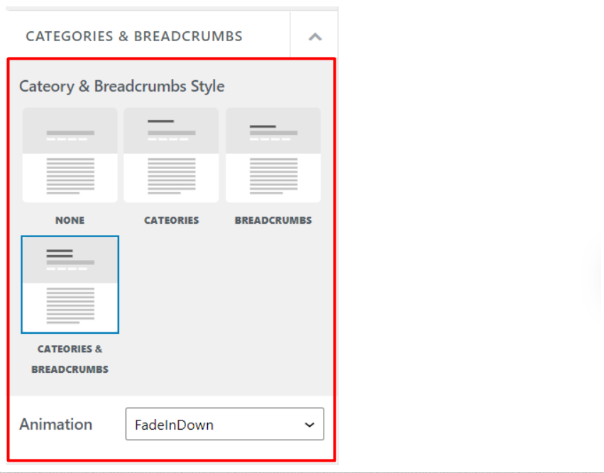
This setting determines how categories and breadcrumbs are rendered at the top of your posts. There are a number of options provided here. These Include:
None: With this option selected, no categories or breadcrumbs will be rendered within the post
Categories: Once selected, the post categories will be rendered within the posts.
Breadcrumbs: This option when enabled results to the rendering of breadcrumbs within the post
Categories & Breadcrumbs: Once enabled, it renders both the post categories and breadcrumbs within the posts.
Animation
The Stax theme provides the animation field, which provides an option for you to define the animation settings applied to the categories and breadcrumbs, on post load. If you do not wish to have animations within the category and breadcrumb sections, you can do so by selecting the option “none”. Else, you may select either of the other options FadeIn, FadeInDown, or FadeInUp based on the animation you would prefer.
Title
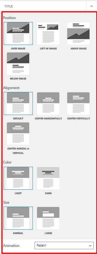
The title section mainly determines how and where the entry header items are rendered as well as the space they occupy within the posts.
There are a number of settings provided to facilitate this. These Include:
- Position
- Alignment
- Size
Position
This setting helps you manipulate the location of the post entry header items within single post pages.
This setting provides a number of options of which include:
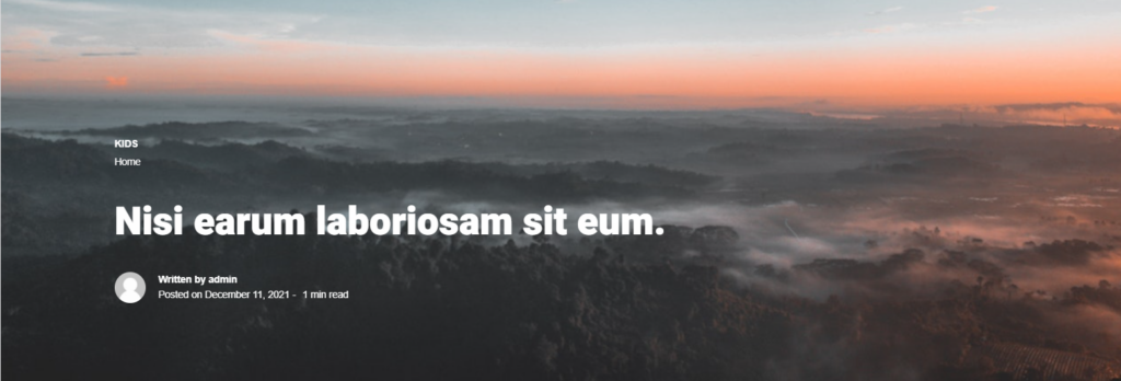
Over Image: In this option, the entry header items are displayed overlaying the featured image within the post. Below is a sample screeshot:

Left Of Image: When enabled, the entry header items on the post are rendered on the left of the featured image.

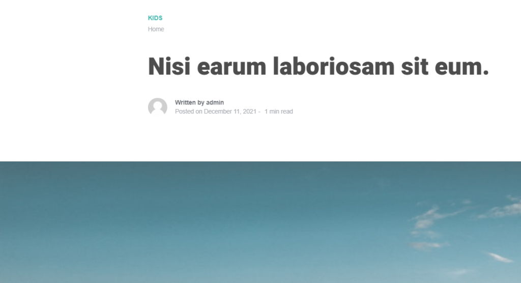
Above Image: Upon selection of this option, entry header items on the post are rendered above the featured image. Below is a sample screenshot.
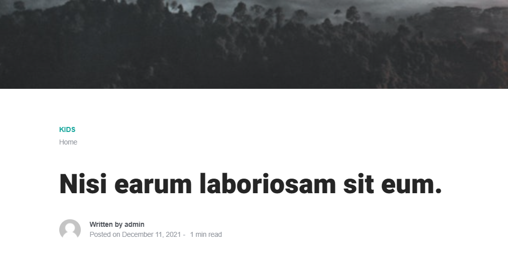
Below Image: Upon setting this option, the entry header items are rendered below the featured image.
Alignment
The alignment setting helps in setting the horizontal alignment of the header entry items within a post.
This setting provides a number of options for this. These include:
Default: In this option, the entry header items are aligned to the left bottom side of the entry header items section. This is the default setting used in case no other setting is set.
Below is a sample screenshot on this:
Center Horizontally: Once this option is set, the entry header items will be horizontally centered within the content section.
Below is a sample screenshot on this:

Center Vertically: With this option, the entry header items will be vertically centered within the media panel, but aligned to the left.
Below is a sample screenshot on this:
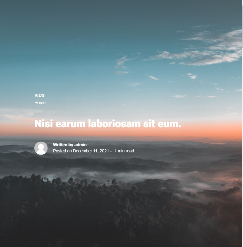
Something worth-while noting is that this option is not available for the positions “above image” and “below image”.
Center Horizontal & Vertical: Once this option is set, the entry header items are both vertically and horizontally aligned in a central position.
Below is a sample illustration on this:
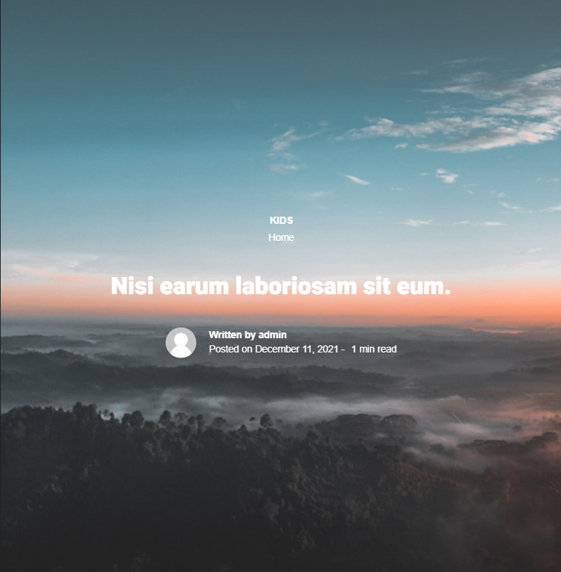
This option is also not available for the positions “above image” and “below image”.
Color
This section is only available for the positions “Over Image” and “Left Of Image”.
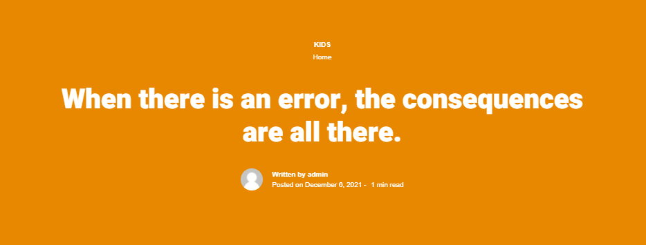
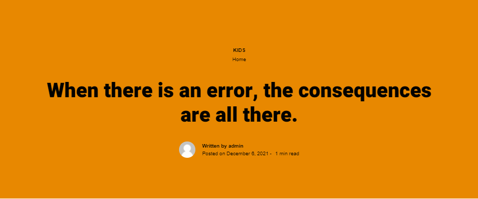
The color section provides options for you set either a light or dark color scheme for your entry header items.
Below is sample comparison:
Light
Dark
Size
The size setting helps in defining the font size and line height of the post title within the single post pages.
There are two options available for this. These are “Normal” and “Large”.
“Normal” displays the default font size and line height for the H1 tag on post titles within single post pages.
“Large” displays a hero font size and line height for post titles within the single post pages.
Below is a sample comparison:
Large

Normal

Animation
The animation section enables you to animate the entry header items by selecting either of the options FadeIn, FadeInUp or FadeInDown. If on the other hand you do not wish to have animations in place, you will need to select the option “None”.
Image
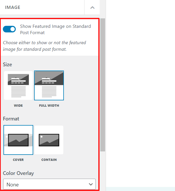
This section influences the display of the featured image within standard post formats and also image post formats.
There are a number of settings available to facilitate this. These include:
Show Featured Image on Standard Post Format
Determines whether to display a featured image within standard post formats or not. If not enabled, then all other settings within the “Image” section will not be applicable.
Size
Defines the width occupied by the image within “image” post formats and “standard post formats”
You can either have it as “wide” or “full width”. Below is a side by side comparison on these two.
Wide

Full Width

Format
Defines whether the featured image is to be rendered as a cover, whereby it’s resized to fit the specified size or resized to fit its content box.
For a clearer illustration below is a sample side by side comparison of a contained and cover format for a full width featured image.


Color Overlay
A color overlay lays a color on top of the featured image.
You can select from the dropdown provided the color that you would wish to use .
Upon the color selection, you will then be provided with settings on where you would like to have the overlay rendered. These include:
- Single Post: In this option, the color overlay is only applied to the featured image within the single post pages
- Listings: Once this option is selected, the color overlay is only applied to the featured images within the post listings such as on archive pages and only on posts using the “image” post format
- Single Post & Listings: If selected, the cover overlay will be rendered on featured images within single post pages and post listings using the “image” post format
Video
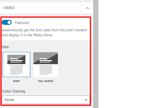
The Video section influences how the video within posts using the “video” format, is displayed.
There are a few settings provided within this segment which include:
Featured
This setting determines on whether to fetch the first video within the post content and have it rendered within the media panel.
If this setting is not enabled, then no video will be rendered within the media panel.
Size
The size setting enables you to define the width occupied by the video within the single post pages. This can either be wide or full width.
The “Wide” option when selected will result in having the video occupy the container width, whereas “full width” will cause the video occupy the full browser width.
Color Overlay
A color overlay lays a color on top of the featured video
From the dropdown within the setting, you can select a color of your preference to act as the overlaying color. Upon selection of the color, then you can specify where you would wish to have the overlay displayed. This can either be in:
- Single Posts: With this option selected, the color overlay is only rendered within the featured video on the single post pages
- Listings: Once this option is enabled, the color overlay will only be rendered on the featured videos within the post listings, such as on archive pages and only on posts using the “video” post format
- Single Post & Listings: When selected, the color overlay will be rendered on featured videos within single post pages and post listings using the “video” post format
Gallery
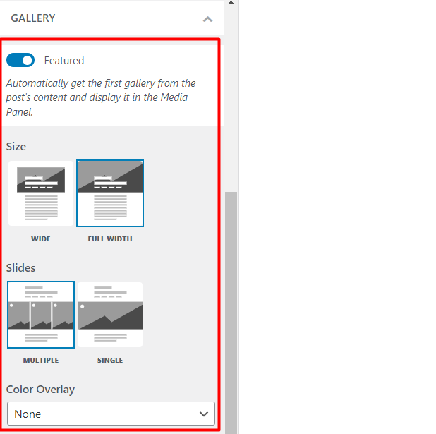
This segment influences how the image gallery in posts using the “Gallery” post format, is rendered.
There are a couple of settings provided to facilitate this. These include:
Featured
Enables the display of the gallery within the media panel. If this setting is not selected, then no gallery would be rendered as the featured Gallery within your posts. In addition, all other settings discussed within this section, would not be applicable.
Size
Defines the width occupied by the gallery within single post pages. There are two options here, which are “wide” and “full width”.
“Wide” option will result in having the gallery occupy the container width, whereas “full width” will cause the gallery occupy the full browser width.
Slides
The Slides setting determines how the image slides within the gallery are displayed. There are two options up for selection in this. These include:
Multiple: When selected, more than one image slide is rendered
Single: In this option, only a single slide is rendered
Color Overlay
The color overlay option adds a color over the gallery.
Within the “Color Overlay” dropdown, you can select a color of your preference to serve as the overlaying color. Upon selection of the color, then you can specify where you would wish to have the overlay displayed. There are three options to this:
- Single Posts: With this option selected, the color overlay is only rendered on the gallery within the media panel, on the single post pages
- Listings: Upon enabling this option , the color overlay will only be rendered on the gallery within the post listings, such as on archive pages and only on posts using the “gallery” post format
- Single Post & Listings: When selected, the color overlay will be rendered on the featured gallery within single post pages and post listings using the “gallery” post format
Audio
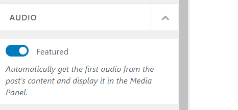
The Audio section determines how posts of the “audio” post format are rendered.
The section contains one setting:
Featured
Once enabled, the “Featured” setting enables the display of the first audio within a post to be rendered within the media panel.
Meta
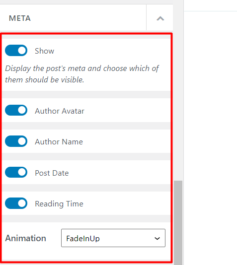
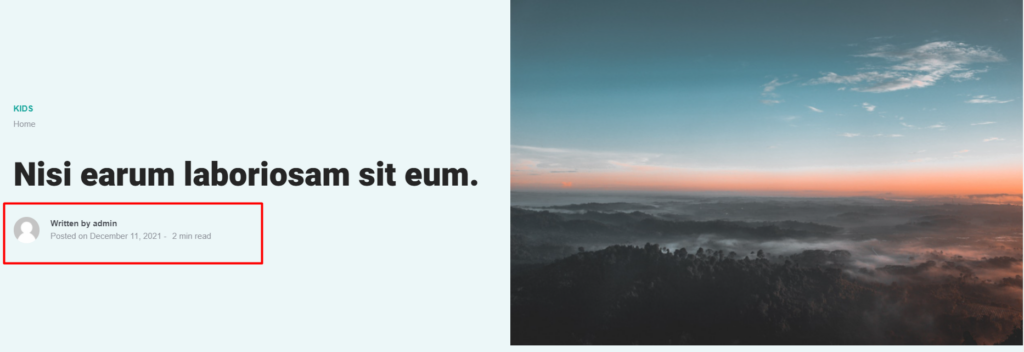
Meta represents information about your post. A post’s metadata in the Stax theme will include the: author avatar, author name, post date, and reading time.
The meta section here determines whether this information is rendered within the single post pages, or not. There are a couple of options available to facilitate this. These include:
Show
This is a first-level setting that determines whether to render the meta information or not. If disabled, then no meta is rendered within the post and all other settings beneath it will be disabled. On the other hand, if enabled, it provides options on which meta you would wish to render within your posts as outlined below:
- Author Avatar: Determines whether the avatar of the post author will be rendered within the meta. If a user does not have a set avatar, the default Gravatar will be used.
- Author Name: Helps in determining whether the name of the post author will be rendered within the single post pages.
- Post Date: If enabled, the publish date of the post will be rendered within the post.
- Reading time: This option enables you to specify whether you would wish to have the time taken to read a post rendered within the single post pages.
Below is a sample screenshot on the rendering of these metas within a post:
Animation
The animation setting within this section enables you to specify an animation style for the meta items within the single post pages. The setting provides a number of selections for this, which include: FadeIn, FadeInUp or FadeInDown. If on the other hand you do not wish to have animations within the post meta, you will need to select the option “None”.
Shapes
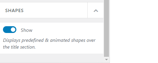
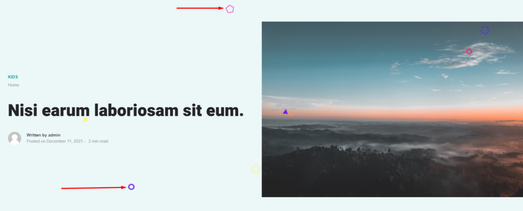
The shapes section settings help in rendering animated and predefined shapes over the post title within your single post pages. It does contain only one option to facilitate this:
Show
If enabled, the shapes will be rendered over the post titles on the single post pages and if not enabled, no shapes are displayed within the posts.
Below is a sample illustration once the “show” option is enabled:
Navigation
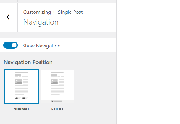
Within this section, the theme incorporates settings to determine whether to render the navigation (previous and next post) towards the bottom of your single post pages.
Show Navigation
This is the core setting within this section. If enabled, the navigation will be rendered within your single post pages and if not enabled neither the navigation nor its settings will be rendered.
Navigation Position
This setting determines the positioning of the navigation items within the single post pages. The setting provides a number of options which include:
- Normal: Once this option is selected, the navigation is rendered beneath the post content
- Sticky: If this option is selected, the navigation is displayed in a fixed position at the bottom of the post and is visible upon an upward scroll on the post.
Below are some illustrations on the two styles:
Normal
Sticky
Something to note as well is that in the “normal” style, both the “previous story” and “next story” navigation items are rendered, whereas in the “sticky” style, only the “next story “navigation item is rendered by default.
Related Posts
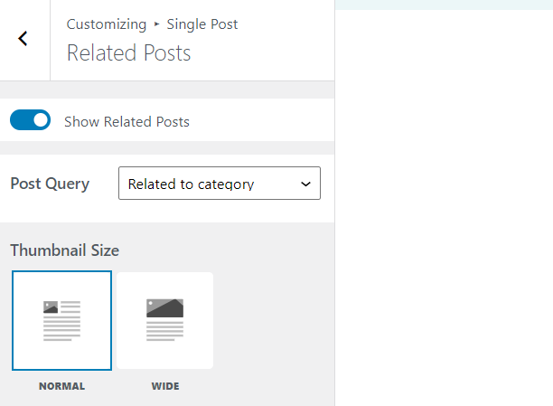
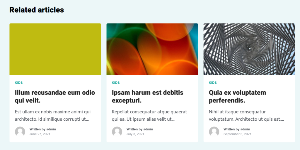
Related posts are the posts linked to the current post in view based on shared authors and categories. These posts are important as they help your site visitors find similar content to their current read.
The related posts section within the Stax theme provides settings to determine whether these posts will be displayed on the single post pages or not.
Show Related Posts
This is the core setting provided within this section. When enabled, a related posts section is rendered after your post content. If not enabled then the related post section will not be rendered within your post and also the rest of the settings beneath it will no longer be rendered.
A couple of settings are also present once you have the related posts option enabled. These include:
Post Query: Specifies the mechanism used in fetching the related posts. Within the Stax theme, Related posts are either based on the post categories or the author.
This means that if the current post in view is assigned to category “A”, then all posts assigned to category “A” will be considered as related posts.
The same case applies to related posts that are based on the author. If the current post in view is from Author “B”, then all posts from Author “B” will be considered as related posts.
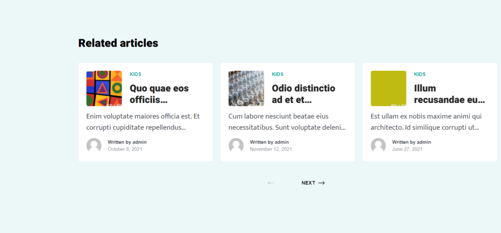
Thumbnail Size: This setting determines the size of the thumbnail images within the related posts. There are two options available for this. These are “Normal” and “Wide”.
In the “Normal” Style, the thumbnail appears to be rendered to the left of the post title and occupies a minimal width of a slide. On the other hand, when the “Wide” style is used, the thumbnail occupies the full slide width.
Below is a side by side comparison of the two styles:
Normal
Wide
