Stax – Colors
Overview
Section titled “Overview”The Appearance > Customize > Colors section here enables you set global colors for your website in just a few clicks. This is easily achievable with the help of the already integrated palettes. Stax theme avails three global palettes. These include:
- Light
- Dark
- purple Accent
Each palette contains a range of colors that can be customized to your preference. Once any of the palettes is selected, then its colors will be rendered across the various theme sections and content.
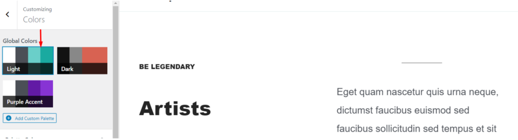
Light is the default palette used within the theme.
This palette maintains a high level of content readability and is highly suitable for forums, news and blog sites, but not limited to the above.
This palette applies the following color codes by default:
| Content / Section | Color Code |
|---|---|
| Body Background | #ffffff |
| Text Color | #4B4F56 |
| Heading Color | #242424 |
| Primary Color | #6ACFC9 |
| Light Color | #eef8f9 |
| Dark Color | #242424 |
| Link Color | #1aaaa0 |
| Border Color | #DDEBED |
| Meta Color | #90949C |
| Archive Title Background | #6ACFC9 |
| Related Section Background | #EEF8F9 |
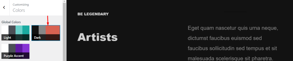
The dark palette generates a dark color scheme throughout the website.
Content within this palette is represented in fairly light colors, that easily blends with the dark mode thereby making the content easily readable with no visual strains.
This palette would come in highly recommended for music sites or websites with huge amounts of images and graphics, but not limited to the above.
Below is an outline of the default color codes applied to the sections and content within the site:
| Content / Section | Color Code |
|---|---|
| Body Background | #121212 |
| Text Color | #888888 |
| Heading Color | #d0d0d0 |
| Primary Color | #d86252 |
| Light Color | #1a1a1a |
| Dark Color | #e0e0e0 |
| Link Color | #d86252 |
| Border Color | #383838 |
| Meta Color | #888888 |
| Archive Title Background | #0c0b0b |
| Related Section Background | #0c0b0b |
Purple Accent
Section titled “Purple Accent”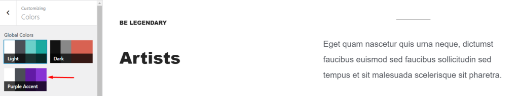
The Purple accent palette has an almost similar display to the “Light” palette. There are however differences in the primary color, light color, link color and border color.
Within this palette purple comes in as the primary color. This palette can be quite useful to brands that would like to convey their creative achievements. It is hence quite favorable for art websites and portfolios, but not limited to these.
Below are the color codes applied to the various sections and content within the site when the palette is selected:
| Content / Section | Color Code |
|---|---|
| Body Background | #ffffff |
| Text Color | #4b4f56 |
| Heading Color | #242424 |
| Primary Color | #621aa5 |
| Light Color | #fafafa |
| Dark Color | #242424 |
| Link Color | #8734d4 |
| Border Color | #e5e5e5 |
| Meta Color | #90949c |
| Archive Title Background | #6acfc9 |
| Related Section Background | #eef8f9 |
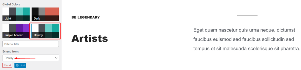
Creating Custom Palettes
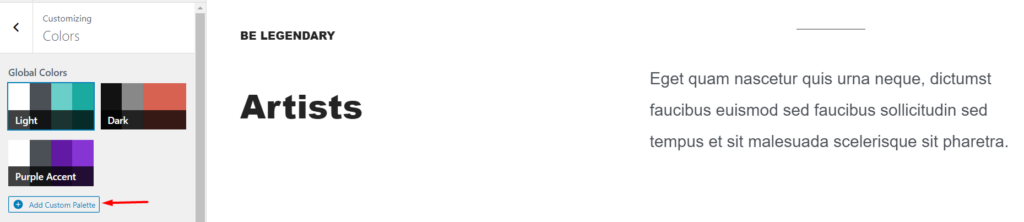
Section titled “Creating Custom Palettes”In a use case where you would like to setup your own palette, Stax provides some flexibility when it comes to this, by the provision of a section where this can be accomplished.
This is achievable within the Appearance > Customize > Colors section, by clicking on the “Add Custom Palette” button shown below:
Once this is done, you will be provided with a panel to add the palette details as illustrated below:
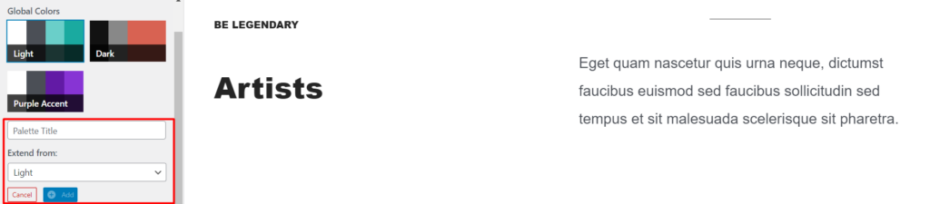
Here you will need to:
- Add your palette title
- From the pre-designed palettes, select a palette to derive your custom palette from
- Click the “Add” button once the above are carried out
Unlike the predesigned palettes, custom Palettes can be deleted by clicking on the “Delete” icon within the palette as illustrated below:
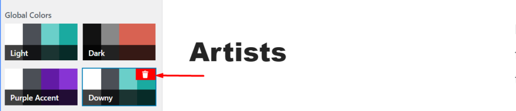
Custom palettes added can also be extended when creating a new palette. In our sample screenshot above, we have “Downy” as the custom palette. During the creation of another custom palette, Downy will also now be available for selection as seen below: