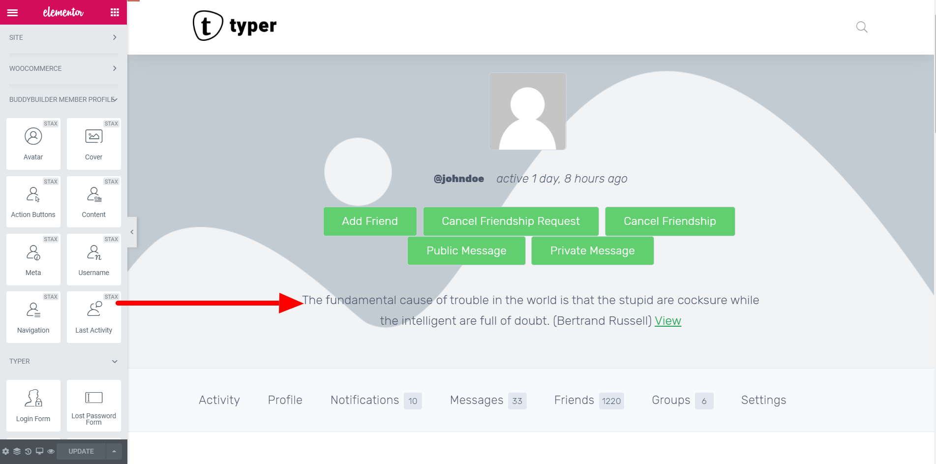
The last activity widget is used to display the members latest action that he or she did on the site. Users can use this widget to display member’s activity in an impressive way using multiple customization options and functionalities.
Note: This widget shows and can be added only on the Member Profile template.

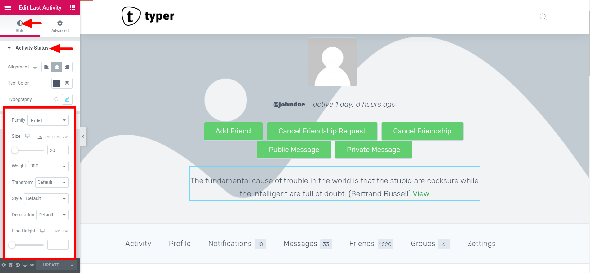
Users are able to make styling changes in the style tab. There are two sections which are the “ Activity Status” and the “Link”. Let’s look at each customization separately:
Activity Status:

In the activity status which displays members last activity on the site you can customize the following styles:
- Alignment
- Text Color
- Typography
- Alignment:- For this option you can set the position of the username either at the left , center or right.
- Left: At the very left edge of the page.
- Center: At the center of the page.
- Right: On the right side of the page.
- Text Color:- You can set a text color for the “Activity Status” according to your preference. For this case we used black since we have a white background color.
- Typography:- This is the technique of arranging text in the Activity Status to make it legible, readable, and appealing when displayed. These settings dictate the font options of the username text. You can change the font family, adjust the size of the text and font-weight. Additionally one can change the different text transform, style and decoration according to their liking.
Link:
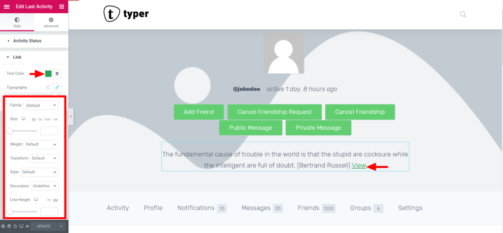
This is the section that helps in altering the display of the link within the activity status. In this case the text “View” is used as the link. To customize its style appearance we use the following settings:
- Text Color
- Typography
- Text Shadow
- Text Color:- In this part it allows users to set a different color for the link text. We recommend choosing a color (meant for links) that rhymes with your WordPress theme to maintain a consistent color pattern.
- Typography:- Similar to activity status, this setting enables users to set various text settings such as the font family, the font size in (px, em, %), and the font weight. Additionally when it comes to the text transformation, style, and decoration you can leave them as default. Change the letter spacing and line height according to your preference.

3. Text Shadow:- Users can change the Text Shadow around the Link text which makes it have a nice design. You can change the shadow using the following settings:
Color
Blur
Horizontal Position
Vertical Position


