Filters [Common]
Background Color
This option will allow you to set the background color of the filters section to your preferred choice.
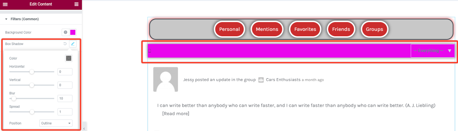
Box Shadow
With this styling you can add some shadow effect to the Filter box section. You can adjust the blur size, spread it horizontally or vertically and also set the position to be either outline or inset.
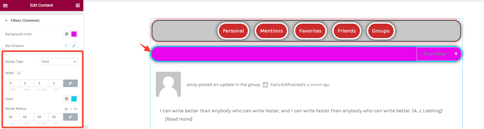
Border Styling
As for this part you have an option to add a border from different types like solid, dotted, dashed, double among others. You can also define the width size of your border for the filters section. Choose a preferred color for the border and add a radius size in case you want the borders to have rounded corners.
Lastly you can add some padding to increase spacing between the filter items and the filter box.
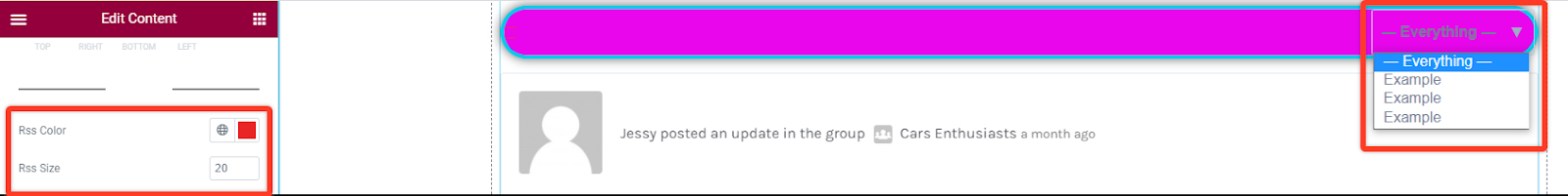
RSS Color and Size
This option allows you to pick the color for the RSS text and then adjust its size as well.
Filters Text
Section titled “Filters Text”Text Typography
In this style option you can alter the font settings of the text in the content area. You can change the font family, size, weight, style, line height among others.

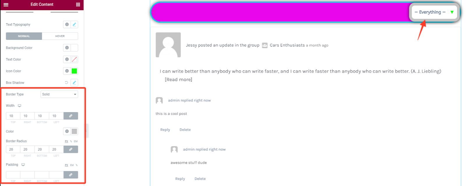
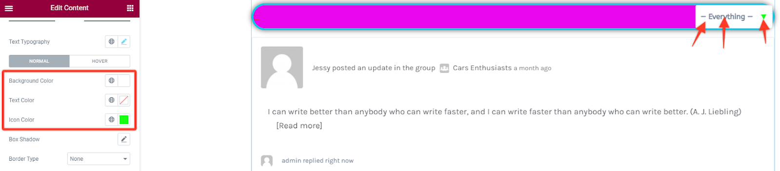
Text Color, Background Color & Icon Color
Under this option you have the option to choose your preferred text, background and icon color for the Filter item in all states that are the normal, active and hover states.
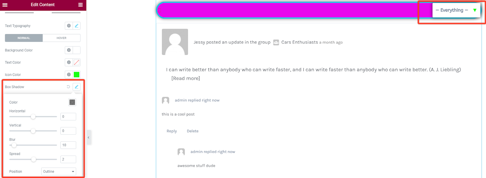
Box Shadow
As for this styling you can add some shadow effect to the navigation item. You can adjust the blur size and spread it horizontally or vertically.
Border Styling
With this option you can add some border styling like adding different border types like solid, dotted, dashed, double among others. Then define the width size of your border in the navigation item section. Choose a preferred color for the border and add a radius size in case you want the borders to have rounded corners. You can also adjust the padding to space out items within the filter element.