Profile Details
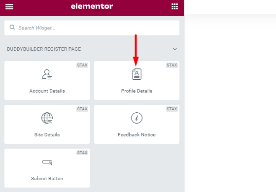
The widget helps in gathering additional user profile data. This data for example includes Name, Last Name and Nickname.
Styling the Profile Details
Section titled “Styling the Profile Details”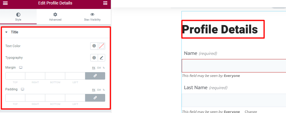
Text Color: Allows you to specify the color to the title of the Profile Details Widget.
Typography: Enables you to specify the font properties to the title. Some of the properties include, font family, font size, font weight, style, decoration, line height, letter spacing and Transform property.
Margin: Allows you specify a top, bottom, left and right spacing around the widget title
Padding: Allows you to add a top, bottom, left and right padding around the title
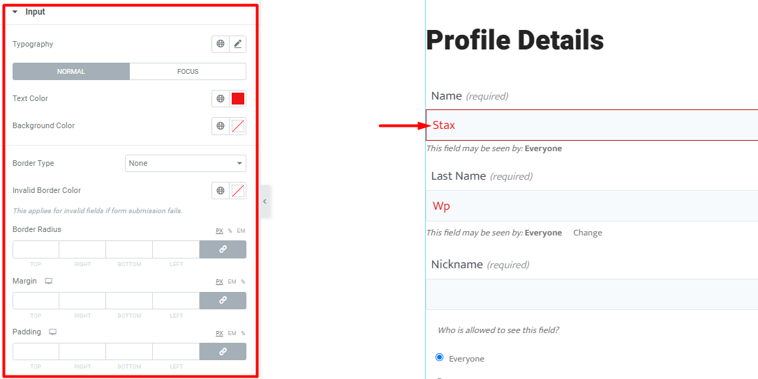
Typography: Allows you to specify the font aspects to the field inputs on the form. These include; font family, font size, font weight, style, decoration, line height, letter spacing and Transform.
Normal State
Within this state you can specify the following aspects to the input fields: Text Color, Background color, Border Type, Invalid input Border color, border radius, margin and padding.
Focus State
Within this state you can specify the following aspects to the input fields: Text Color, Background color, Border Type, Border Color, Invalid input Border color, border radius, margin and padding.
Input Labels
Section titled “Input Labels”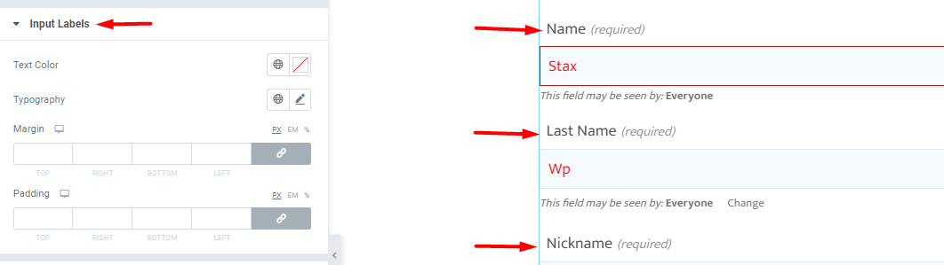
Text Color: Defines the colors of the labels within the profile details form.
Typography: Allows you to specify the font aspects to the labels within the form. These include; font family, font size, font weight, style, decoration, line height, letter spacing and Transform.
Margin: Allows you specify a top, bottom, left and right spacing around the labels.
Padding: Allows you to add a top, bottom, left and right padding around the labels.
Input Visibility
Section titled “Input Visibility”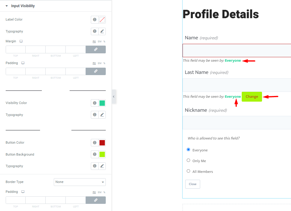
This section allows you to specify the CSS properties of the Visibility text and Visibility Button.
Label Color: Defines the color of the Visibility labels
Typography: Allows you to specify the font aspects to the visibility labels within the form. These include; font family, font size, font weight, style, decoration, line height, letter spacing and Transform.
Margin: Allows you specify a top, bottom, left and right spacing around the input visibility content.
Padding: Allows you to add a top, bottom, left and right padding around the input visibility content.
Visibility Text
Visibility Color: Alters the user visibility status text color.
Typography: Allows you to specify the font aspects to the visibility status text within the form. These include; font family, font size, font weight, style, decoration, line height, letter spacing and Transform.
Visibility Button
Button Color: Allows you to specify the color of the Button text
Button Background: Enables you to alter the Button Background color
Typography: Allows you to specify the font aspects to the visibility button text. These include; font family, font size, font weight, style, decoration, line height, letter spacing and Transform.
Border Type: Enables you to specify the border type to the visibility button
Width: Enables you specify the border width to the visibility button
Color: Enables you specify the border color to the visibility button
Padding: Enables you specify the padding to the visibility button
Visibility Form
Section titled “Visibility Form”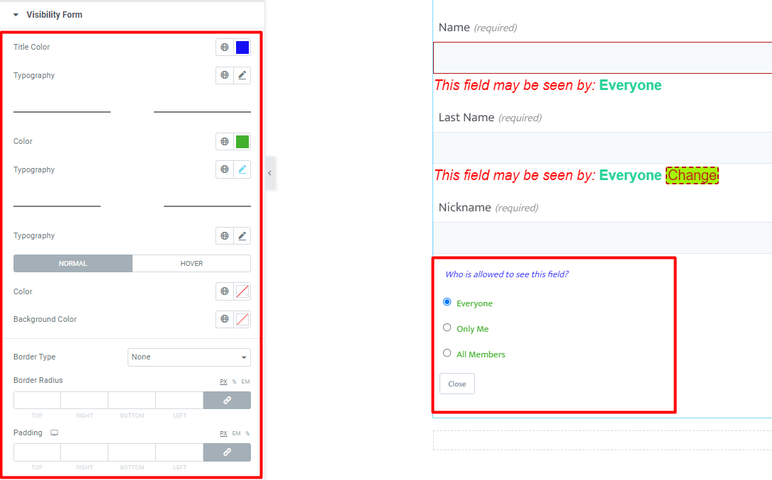
Title Color: Allows you to specify the color of the Visibility form title
Typography: Allows you to specify the font aspects to the visibility form title. These include; font family, font size, font weight, style, decoration, line height, letter spacing and Transform.
Options
Color: Defines the color of the options within the visibility form
Typography: Allows you to specify the font aspects to the options within the visibility form. These include; font family, font size, font weight, style, decoration, line height, letter spacing and Transform.
Close Button
Typography: Allows you to specify the font aspects to the close button within the visibility form. These include; font family, font size, font weight, style, decoration, line height, letter spacing and Transform.
Normal State
The normal state is the default state of the close button.
Within this state you can specify the following button aspects: Text color, Background color, Border Type, Border radius and padding.
Hover State
The hover state comes into play once there is a mouse over action on the close button.
Within this state you can specify the following input aspects: Text color, Background color, Border Color, Border Type, Border Radius and padding.