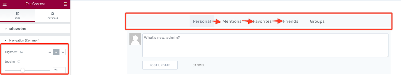
Navigation [Common]
Alignment
With this option you can align the navigation section towards the left, right or center of the content widget.
Spacing
For this case it increases the spacing between the navigation items or rather the subsections.
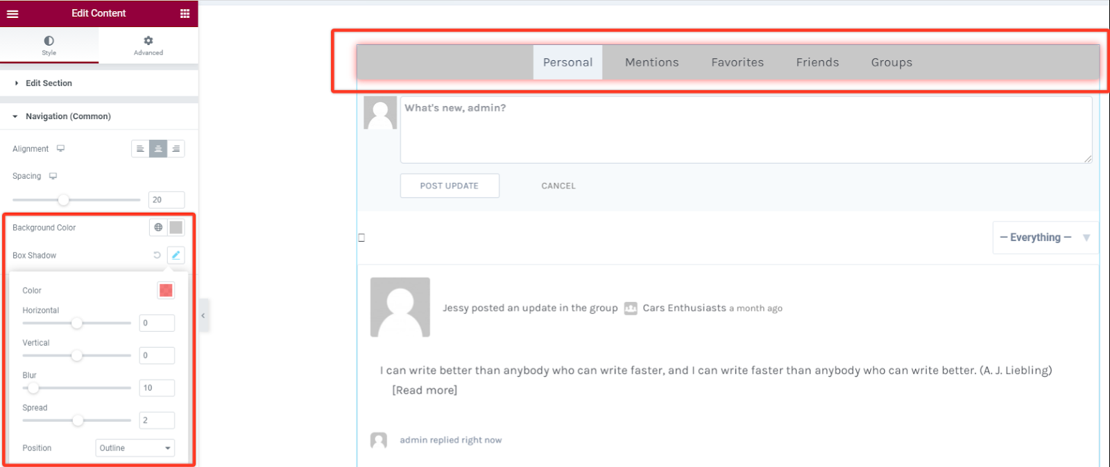
BackGround Color
For this option you can set the background color of the navigation section to your preferred choice.
Box Shadow
As for this styling you can add some shadow effect to the navigation box section. You can adjust the blur size and spread it horizontally or vertically.
Border Styling
As for this part you have an option to add a border from different types like solid, dotted, dashed, double among others. You can also define the width size of your border for the navigation section. Choose a preferred color for the border and add a radius size in case you want the borders to have rounded corners.

Padding and Margin
These options allow you to add spacing between the navigation box and the navigation items themselves. You can either add them in pixels across all sides of the navigation section.

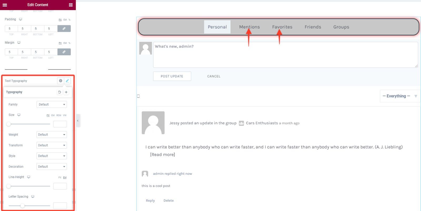
Navigation Menu Item
Section titled “Navigation Menu Item”Text Typography
In this style option you can alter the font settings of the text in the content area. Change the font family, size, weight, style, line height among others.
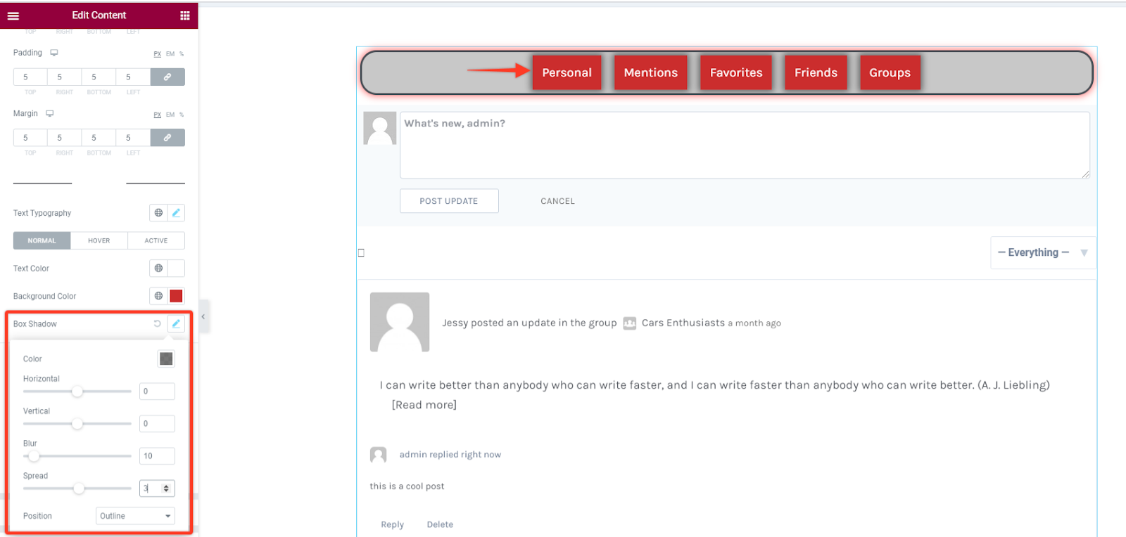
Text Color & Background Color
Under this option you have the option to choose your preferred text and background color for the navigation item in all states that are the normal, active and hover states.

Box Shadow
As for this styling you can add some shadow effect to the navigation item. You can adjust the blur size and spread it horizontally or vertically.
Border Styling
With this option you can add some border styling like adding different border types like solid, dotted, dashed, double among others. Then define the width size of your border in the navigation item section. Choose a preferred color for the border and add a radius size in case you want the borders to have rounded corners.
