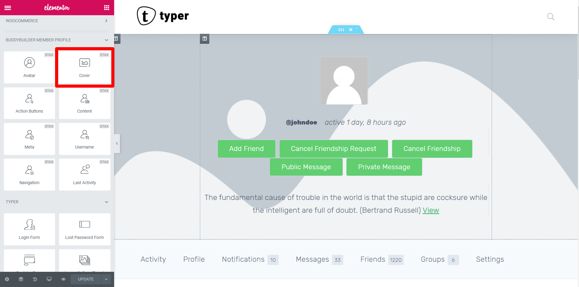
The cover widget is basically a front or background image that helps describe more about the user’s profile. A custom cover image basically reflects your profile in an ideal way.
Note: This widget shows and can be added only on the Member Profile template.
Like all the other widgets of Elementor, the Cover Image widget can simply be dragged and dropped in the position you want it to appear.

Let us take a look at each settings tab of the Cover widget.
Content Area
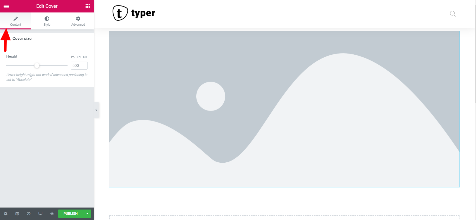
The content area just features the size of the cover image in terms of “Height”. The maximum height you can set is 1000px.

Styling Area
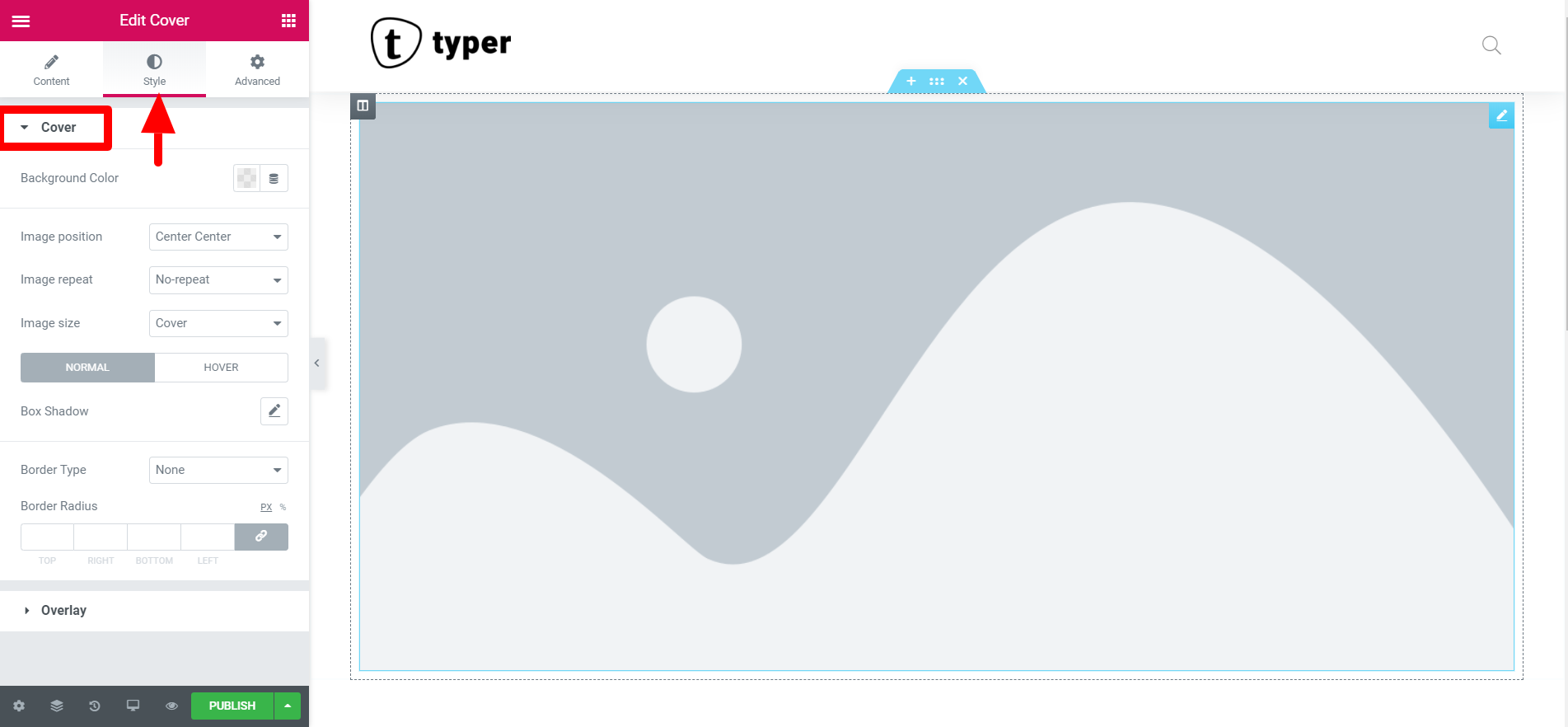
Under the Style tab, you will see two options one which is “Cover” and the other is “Overlay”
From the Cover settings we have:
- Background Color
- Image Position
- Image Repeat
- Image Size
- Box Shadow
- Border Type (Color, Width)
- Border Radius
- Background Color:- This section allows you to set your preferred background color for the cover image. You can also adjust its opacity according to your preference.
- Image Position:- This simply enables you to set a defined cover image position from several choices. Among them includes: Default, Top Left, Top Center, Top Right,Center Left, Center Center, Center Right, Bottom Left, Bottom Center, Bottom Right.
- Image Repeat:- This setting dictates how the image repeats itself in the confined location that it has been set. From its options the image can either be set to: No repeat, Repeat, Repeat X, Repeat Y. For the Repeat X and Y, it simply means that the cover image will repeat itself either horizontally or vertically.
- Image size:- This represents the size of the image within the container space. This is set depending on four choices which are: Default size, Auto, Cover, and Contain.
- Box Shadow:- Allows you to add a shadow behind the cover image. Users can select from the following options: Color, Horizontal, Vertical, Blur, Spread and Position (Outline or inline).
- Border Type:- Enables users to select between the following border types, as well as the color and the width of the border on each side of the cover image: None, Solid, Double, Dotted, Dashed, and Groove border types.
- Border Radius:- Just like in the avatar image widget, one can set the radius of the cover image borders which adds rounded corners to its container.

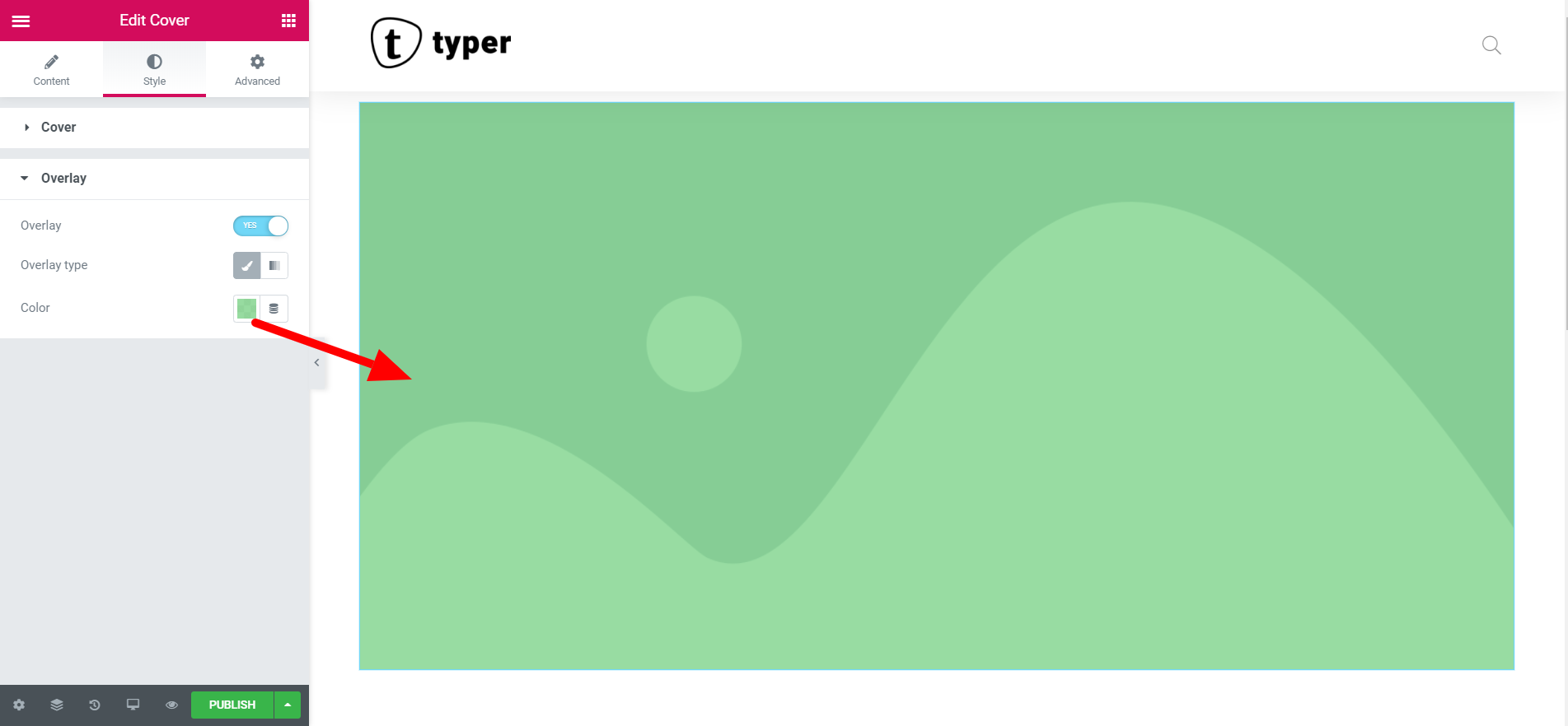
The Overlay styling simply adds an overlaid color on top of the cover image or allows you to specify a gradient for the cover. You can adjust the opacity of your preferred color so that it may not hide the cover image fully. This could be used by people suffering by visual distortions reading the content on the normal background. The image below shows an example of a color overlay on the cover image:


