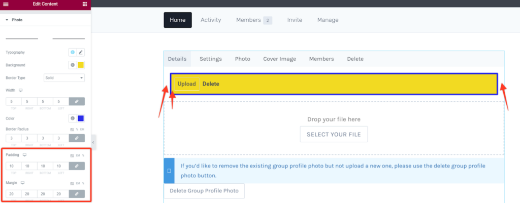
Note: Please note that these styling options can be used in both the photo upload subsection or the cover image upload subsection.
Tabs (Upload & Delete Buttons Container)
Typography
Under this style option you can change the general/both font settings of the two action buttons in the container . In this case you can change the font family, size, weight, style, line height among others. Alternatively you can choose a global font setting.
Text Color and BG Color
This option enables you to choose your preferred general text and background color for the two buttons container.
Border Styling
This option allows you to add borders within the buttons’ container section. You can add different border types like solid, dotted, dashed, double among others. Then define the width size of your border in the section and choose a preferred color for the border. To add rounded corners you can adjust the border radius as per your liking.
Padding and Margin
These options will allow you to add spacing between the buttons and the container or between the container and the whole page container respectively.

Individual Buttons
Text Color and BG Color
This option enables you to choose your preferred general text and background color for the two action buttons.
Border Styling
This option allows you to add borders within the two individual buttons. You can add different border types like solid, dotted, dashed, double among others. Then define the width size of your border in the buttons and choose a preferred color for the border. To add rounded corners you can adjust the border radius as per your liking.
Padding and Margin
These options will allow you to add spacing between the buttons content or between the two buttons and the container respectively.
Drop File/Photo Section
Background Color
For this option you can set the background color of the drop file sections to your preferred choice.
Border & Padding Styling
This option allows you to add borders within the drop file section. You can add different border types like solid, dotted, dashed, double among others. Then define the width size of your border in the drop file section and choose a preferred color for the border. To add rounded corners you can adjust the border radius as per your liking.

Padding and Margin
These options will allow you to add spacing between the content in the file section or between the drop file section and the whole page container respectively.
Drop File Text
Typography
With this style option you can alter the font settings of the “drop file text”. Change the font family, size, weight, style, line height among others. Alternatively you may also select a global font.
Text Color
This option enables you to choose your preferred text color for this text.
You may optionally add some margin to increase spacing between elements.
Select File Button
Typography
Under this style option you can change the font settings of the select file button. Change the font family, size, weight, style, line height among others. Alternatively you may also select a global font.
Text Color and BG Color
This option enables you to choose your preferred general text and background color for the action button.
Border Styling
This option allows you to add borders within the button. You can add different border types like solid, dotted, dashed, double among others. Then define the width size of your border in the button and choose a preferred color for the border. To add rounded corners you can adjust the border radius as per your liking.
Box Shadow
Similar to other box shadow styling options you can add some shadow effect to the select button. Within its options you can adjust the blur size and spread it horizontally or vertically then position it between the outline and inset modes.
Recommendation Text Section
Typography
This option allows you to alter the font settings of the text in the recommendation sections. Change the font family, size, weight, style, line height among others. Alternatively you may also select a global font.
Text Color and BG Color
This option enables you to choose your preferred text color and background color for the recommendation text section.
Border Styling
This option allows you to add borders within the recommendation box. You can add different border types like solid, dotted, dashed, double among others. Then define the width size of your border in the box container and choose a preferred color for the border. To add rounded corners you can adjust the border radius as per your liking.
You may optionally add some padding to increase spacing in the 2nd section and some margin in the 1st section.
Delete Photo Button
Typography
Under this style option you can change the font settings of the delete button. Change the font family, size, weight, style, line height among others. Alternatively you may also select a global font.
Text Color and BG Color
This option enables you to choose your preferred text and background color for the delete button.
Border Styling
This option allows you to add borders within the button. You can add different border types like solid, dotted, dashed, double among others. Then define the width size of your border in the button and choose a preferred color for the border. To add rounded corners you can adjust the border radius as per your liking.
Padding and Margin
These options will allow you to add spacing between the content in the button section or between the button and the whole page container respectively.


