
BuddyBuilder activity item widgets
The activity item widgets design a single activity entry: the author’s avatar, the header line, the content, the action buttons and the comments. You arrange them once in a Site-Wide Activity Loop Item template, and BuddyBuilder repeats that layout for every entry in the stream.
Create the activity item template
Section titled “Create the activity item template”- Go to BuddyBuilder > Dashboard.
- Under Site-Wide Activity Loop Item, click Create new.
- Add the widgets from the BuddyBuilder Site-Wide Activity Item category and style them.
- Click Publish. The template is set as the active one for that type.
The template is used on every page where activity is listed, not only on the main activity page. The free Content widget of the Site-Wide Activity template shows which loop item template is attached and links to it.
All options are on the Style tab. Standard Elementor controls (Typography, Border, Box Shadow, Padding, Margin) work as in any other widget.
Avatar
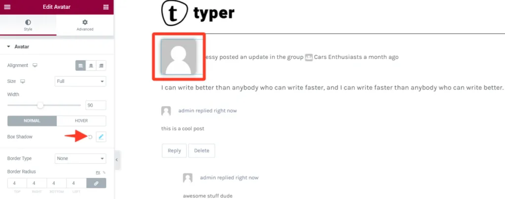
Section titled “Avatar”The Avatar widget shows the profile photo of the member who posted the activity.
| Option | What it does |
|---|---|
| Alignment | Places the avatar left, center or right. |
| Size | Image size to load: Thumb or Full. |
| Width | Display width of the avatar. |
| Normal / Hover | Box shadow for each state. |
| Border, Border Radius, Padding, Margin | Border, rounding and spacing of the avatar. |
Activity Header
Section titled “Activity Header”The Activity Header widget shows the action line of the entry, for example who posted an update, where and when.
| Option | What it does |
|---|---|
| Alignment | Aligns the header text left, center or right. |
| Typography, Text Color | Font and color of the plain text. |
| Link Typography, Link Color | Font and color of the links (member and group names, date), with a hover color. |
| Margin | Space around the header. |
| Meta Avatars > Border Radius | Rounding of the small avatars shown inside the header line. |
Activity Content
Section titled “Activity Content”The Activity Content widget shows the body of the entry: the text and media the member posted.
| Option | What it does |
|---|---|
| Typography, Text Color | Font and color of the content text. |
| Link Color | Color of links in the content, for the normal and hover states. |
| Margin | Space around the content. |
Action Buttons
Section titled “Action Buttons”The Action Buttons widget shows the buttons under an entry. On BuddyPress these are the comment, favorite and delete buttons; on BuddyBoss Platform they include the like button. Which buttons a member sees depends on BuddyPress and on that member’s permissions.
| Option | What it does |
|---|---|
| Container | Background Color, border, Border Radius, box shadow, Padding and Margin of the row that holds the buttons. |
| Text Typography, Text Color | Font and color of the button labels. |
| Icon Color, Icon Size | Color and size of the button icons. |
| Padding | Space inside each button. |
| Active (Like Btn) | BuddyBoss Platform only. Text and icon color of the like button once a member has liked the entry. |
Comments
Section titled “Comments”The Comments widget shows the replies to an entry and the reply form. It has two style sections, Comments and Comment Form.
Comments section
Section titled “Comments section”| Group | Options |
|---|---|
| Comment list | Comments Typography, Comments Text Color, Background, border, Border Radius, Padding, Margin. |
| Reply Avatar | Border Radius, Margin, Avatar width. |
| Reply Meta | The line with the author and date: Typography, Link Typography, Text Color, Link Color (normal and hover). |
| Reply Content | Padding and Margin of the reply text. |
| Reply List Item | Margin of nested replies. |
| Reply Action Buttons | Margin of the row with the reply and delete buttons. |
| Buttons | The reply and delete buttons: Typography, Background, Color, Box Shadow, border, Border Radius, Padding, Margin, for the normal and hover states. |
| Show All Comments | The link that expands a long thread, with the same options as Buttons. |
Comment form section
Section titled “Comment form section”| Group | Options |
|---|---|
| Form box | Background, Padding, Content Space (the gap between the avatar and the text field). |
| Input Text | Form Border and Form Border Radius of the text field. |
| Avatar | Avatar Box Shadow, Avatar Border, Avatar Border Radius. |
| Post Button | Typography, Background, Color, Box Shadow, border, Border Radius, Padding, Margin, for the normal and hover states. |
| Cancel Button | Same options as Post Button. |
Common questions
Section titled “Common questions”The widgets are not in the Elementor panel. They only appear while you edit a template of the type Site-Wide Activity Loop Item, with BuddyBuilder Pro active.
My activity entries still use the default layout. Check that a template is selected under Site-Wide Activity Loop Item in BuddyBuilder > Dashboard, and that the page showing the stream uses a BuddyBuilder template with the Content widget.