
BuddyBuilder Pro member profile content styling
BuddyBuilder Pro adds style sections to the Content widget of the Member Profile template, so you can design each profile screen (Activity, Profile, Notifications, Messages, Friends, Groups, Settings) without CSS. This page covers how the sections work, the shared sections and the Activity, Profile, Friends and Groups screens. Messages, Notifications and Settings are on Member profile messages, notifications and settings styling.
All sections are on the Style tab of the widget. Section names that end in (Common) style parts that several screens share; set them once and they apply to every screen that has that part. Typography, Border, Box Shadow, Padding and Margin are the standard Elementor controls and are only named below. Buttons, links, inputs and menu items have Normal and Hover (or Focus, Active) tabs for their colors.
Edit Section
Section titled “Edit Section”Edit Section chooses which profile screen you are styling. It changes the preview in the editor and the list of sections in the panel; it does not change what visitors see.
- Edit your Member Profile template with Elementor and select the Content widget.
- Open the Style tab and the Edit Section section.
- In Select section, choose Activity, Profile, Notifications, Messages, Friends, Groups or Settings.
- In Preview subsection, choose the sub-page to preview, for example Personal or Mentions for Activity, View or Edit for Profile, Inbox or Compose for Messages.
- Style the sections that appear below, then repeat for the next screen.
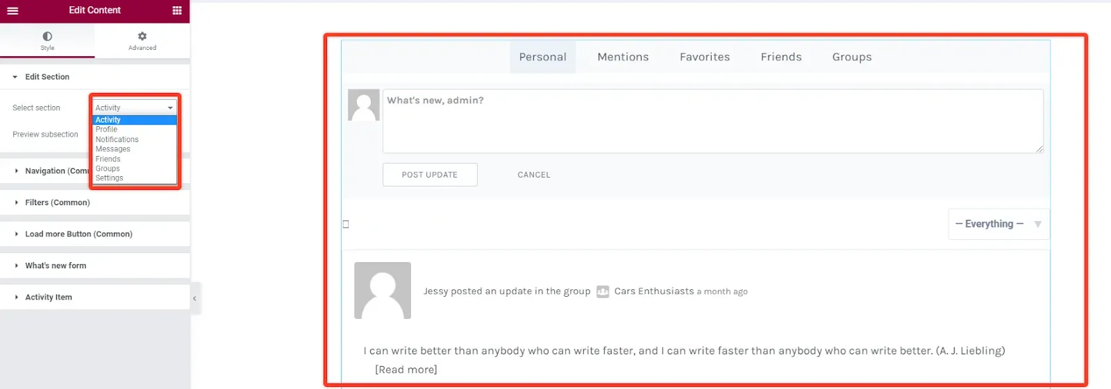
Which shared section shows on which screen:
| Section | Screens |
|---|---|
| Navigation (Common) | All |
| Filters (Common) | Activity, Notifications, Messages, Friends, Groups |
| Content Wrapper (Common) | Profile, Notifications, Settings |
| Load more Button (Common) | Activity |
| Buttons (Common) | Profile, Messages, Settings |
| Typography (Common) | Profile, Settings |
Navigation
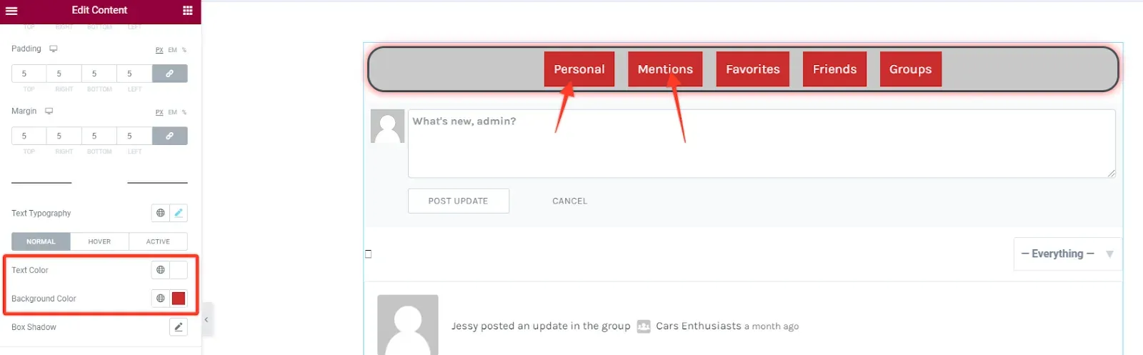
Section titled “Navigation”Navigation (Common) styles the sub-menu at the top of each screen (for example Personal, Mentions, Favorites, Friends, Groups on the Activity screen). The main profile menu is a separate widget: see Navigation.
| Part | Options |
|---|---|
| Menu bar | Alignment, Spacing between items, Background Color, Box Shadow, Border, Border Radius, Padding, Margin. |
| Menu Item | Typography, then Text Color, Background Color, Border Color and Box Shadow for Normal, Hover and Active, Border, Border Radius, Items Padding. |
Filters
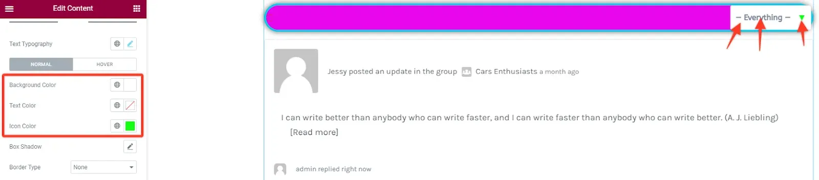
Section titled “Filters”Filters (Common) styles the bar under the sub-menu that holds the sorting dropdown, the search field and similar controls. Turn Show off to hide the bar on all screens.
| Part | Shown on | Options |
|---|---|---|
| Filter bar | All screens with filters | Background Color, Box Shadow, Border, Border Radius, Padding, Margin. |
| List Toggle | Friends, Groups | Background Color, icon Color for Normal, Hover and Active, Border, Border Radius, Padding. |
| RSS Icon | Activity | Rss Color, Rss Size. |
| Sorting dropdown control | Activity, Notifications, Messages, Friends | Typography, Background Color, Text Color, Icon Color, Box Shadow, Border, Border Radius, Padding. |
| Sorting prev/next buttons | Same as the dropdown | Padding. |
| Search, Search Button | Messages | Typography, Background Color, Text Color, Placeholder Color (field) or Icon Color (button), Box Shadow, Border, Border Radius, Padding. |
| Label | Messages | Typography, Checkbox Text Color. |
Content Wrapper
Section titled “Content Wrapper”Content Wrapper (Common) styles the box around the screen content on Profile, Notifications and Settings: Background, Box Shadow, Border, Border Radius, Padding and Margin.
Load more button
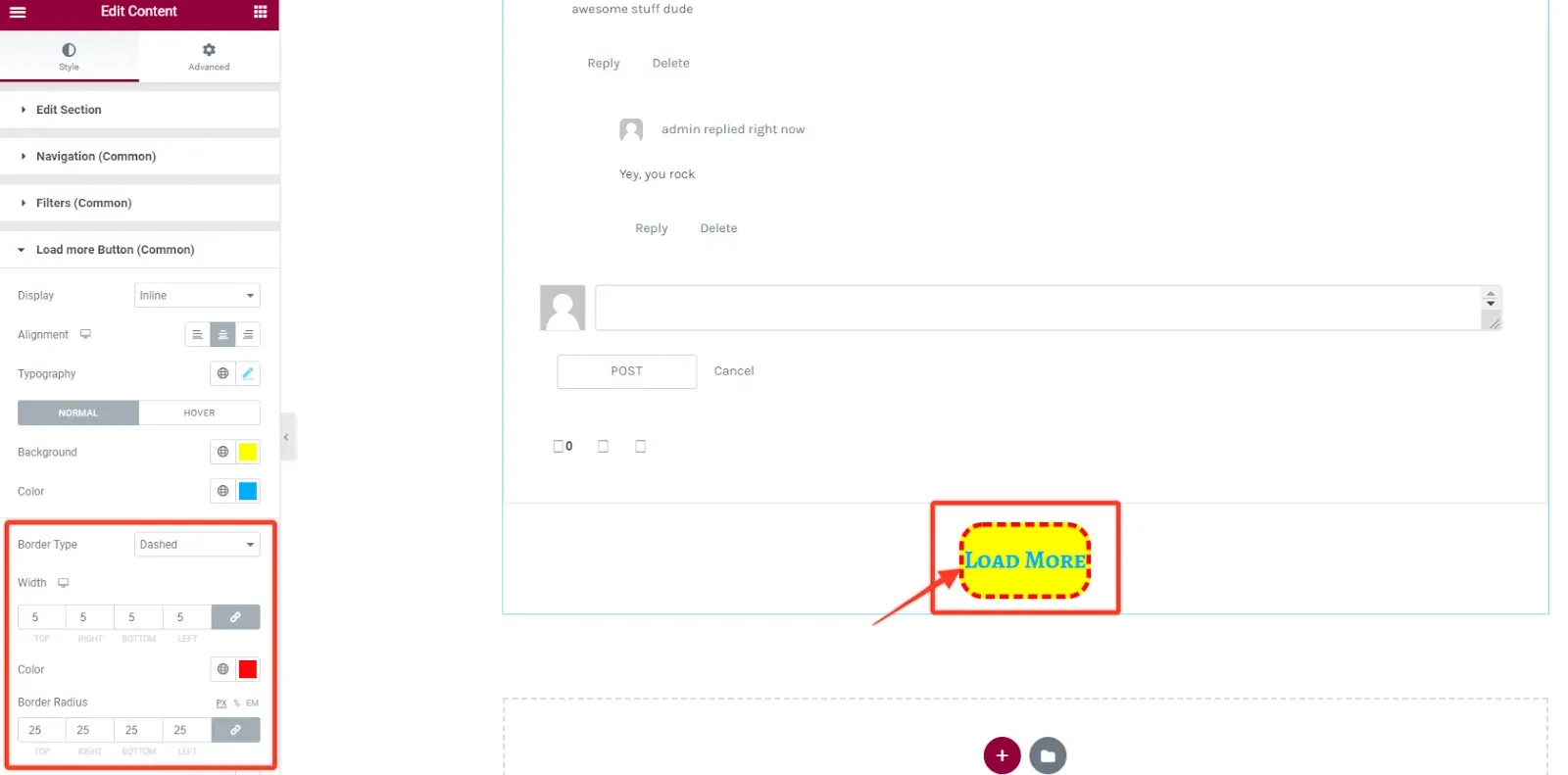
Section titled “Load more button”Load more Button (Common) styles the button that loads older items at the end of the activity stream.
| Option | What it does |
|---|---|
| Display | Inline (as wide as its text) or Block (full width). |
| Alignment | Left, center or right. |
| Typography, Background, Color | Text and colors, for Normal and Hover (plus Border Color on hover). |
| Box Shadow, Border, Border Radius, Padding, Margin | Shape and spacing. |
| Loading icon > Spacing | Space between the label and the loading icon. |
Buttons
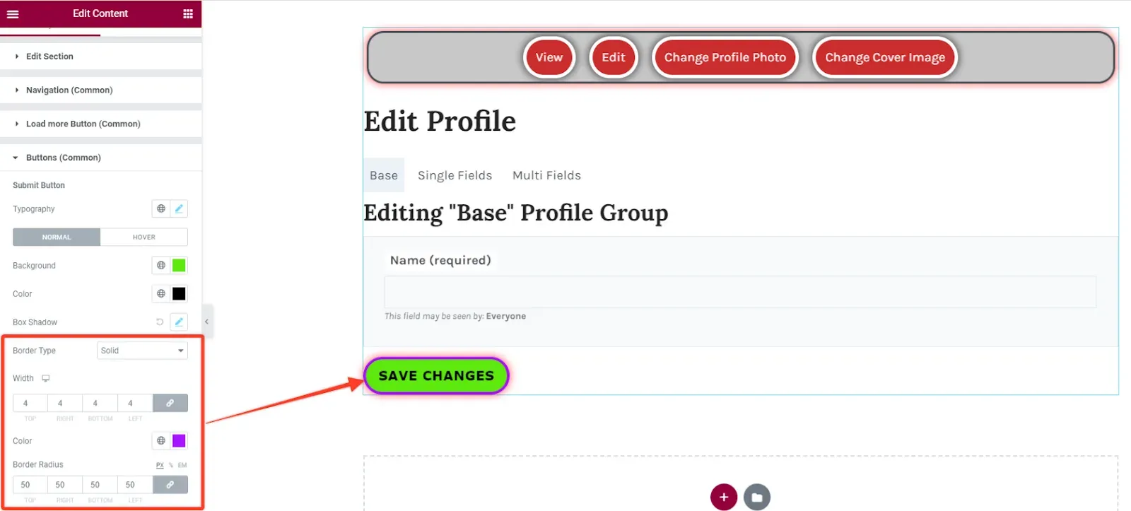
Section titled “Buttons”Buttons (Common) styles the submit buttons of the Profile, Messages and Settings screens (for example Save Changes). Under the Submit Button heading you set Typography, Background, Color, Border Color (hover), Box Shadow, Border, Border Radius, Padding and Margin.
Buttons with their own heading in a screen section, such as Generate Password Button or Post Button, are styled there.
Typography
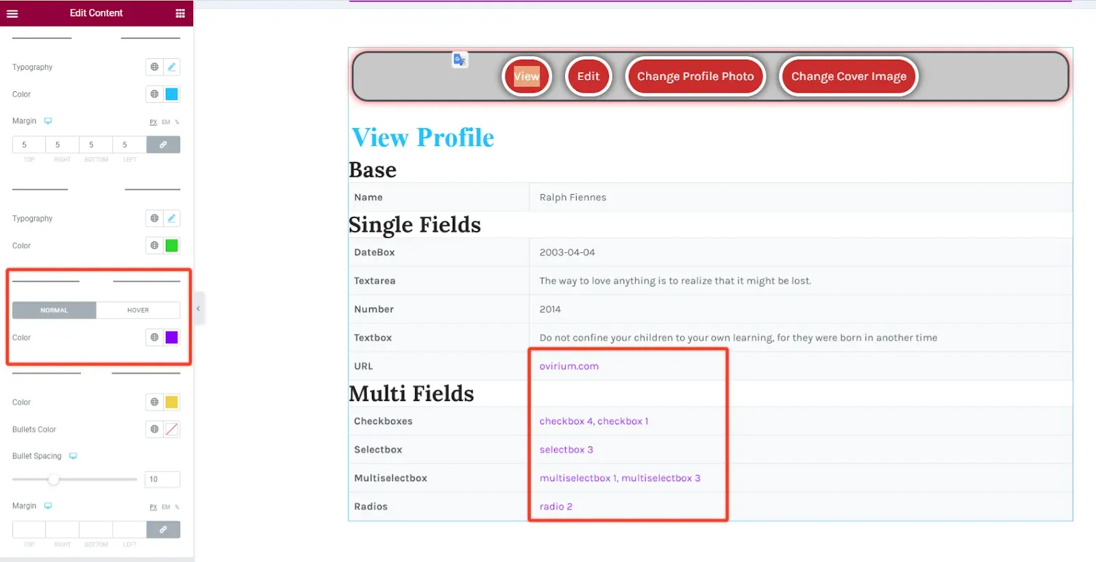
Section titled “Typography”Typography (Common) sets the text styles of the Profile and Settings screens.
| Part | Options |
|---|---|
| Headings | Typography, Color, Border, Padding, Margin of the screen titles (for example “View Profile”). |
| Paragraphs | Typography, Color. |
| Links | Color for Normal and Hover. |
| Lists | Color, Bullets Color, Bullet Spacing, Margin. |
Activity
Section titled “Activity”With Select section set to Activity, three sections style the stream:
| Section | Options |
|---|---|
| What’s new form | The post form, shown when Preview subsection is Personal. Show title, box background, shadow, border and padding; Avatar (Show avatar, shadow, radius); Textarea (Left space, colors for Normal and Focus, border, padding); Post Update Button and Cancel Button (Typography, colors, shadow, border, padding). |
| Activity Items | Border and Border Radius of the list that holds all items. |
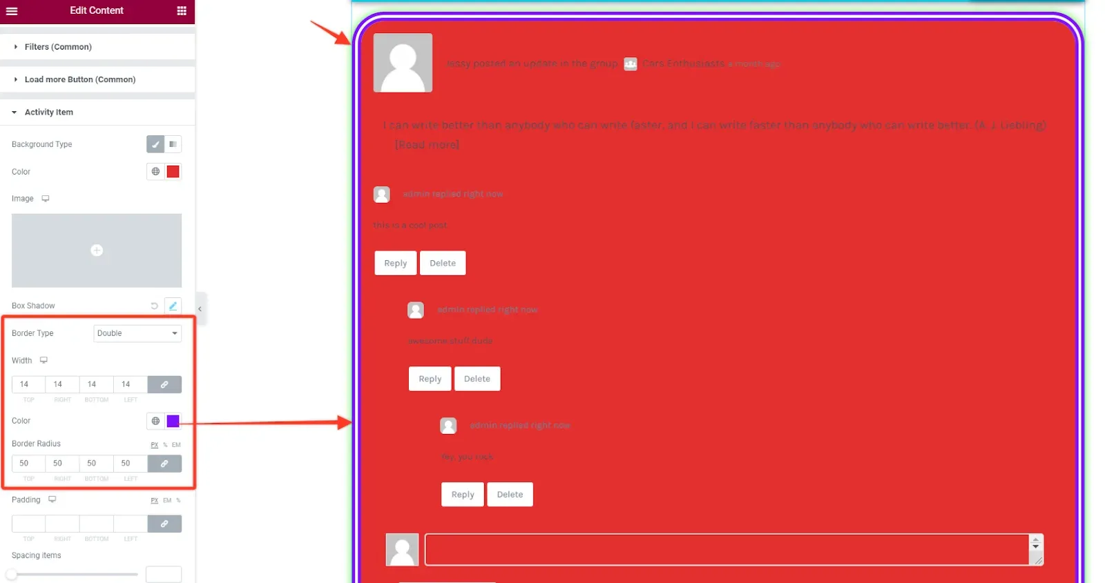
| Activity Item | Background (color, image or gradient), Box Shadow, Border, Border Radius and Padding of each item, and Spacing items for the vertical space between one item and the next. |
Profile
Section titled “Profile”With Select section set to Profile, the section depends on Preview subsection:
| Section | Parts you can style |
|---|---|
| View | Inner section, Titles, Table and Table Body (text, labels, links, odd and even row backgrounds). |
| Edit | Navigation and Navigation Item (the field group tabs), Title, Inner Section, Options Label, Options Inputs, Options Description, Options Visibility, Options Buttons Visibility, Submit Button. A second Preview subsection switches between Base, Single Fields and Multi Fields. |
| Change Profile Photo | Tabs, Tab Item, Drag&Drop Area, Drag&Drop Label, Drag&Drop Button, Notification, Delete Notice, Delete Button. |
| Change Cover Image | The same drag and drop, notification and delete parts, without tabs. |
Friends
Section titled “Friends”With Select section set to Friends, the sections depend on Preview subsection.
Friendships (the list of friends):
| Section | Options |
|---|---|
| Layout | Columns (One to Four, per device), then Spacing for one column or Vertical Spacing and Horizontal Spacing for a grid. |
| Style | Background, Box Shadow, Border, Border Radius, Margin and Padding of each friend card. |
Requests (pending friendship requests):
| Section | Options |
|---|---|
| Requests items | Avatar (shadow, radius, margin), Name (Typography, colors), Last Activity (Typography, Color), Accept Button, Reject Button and Common Buttons (Typography, colors, border, padding). |
| Layout | Horizontal Spacing. |
| Style | Background, Box Shadow, Border, Border Radius, Margin and Padding of each request. |
Groups
Section titled “Groups”With Select section set to Groups, the sections depend on Preview subsection.
Memberships (the groups the member belongs to):
| Section | Options |
|---|---|
| Layout | Columns (One to Four, per device) and the spacing between cards, as for Friends. |
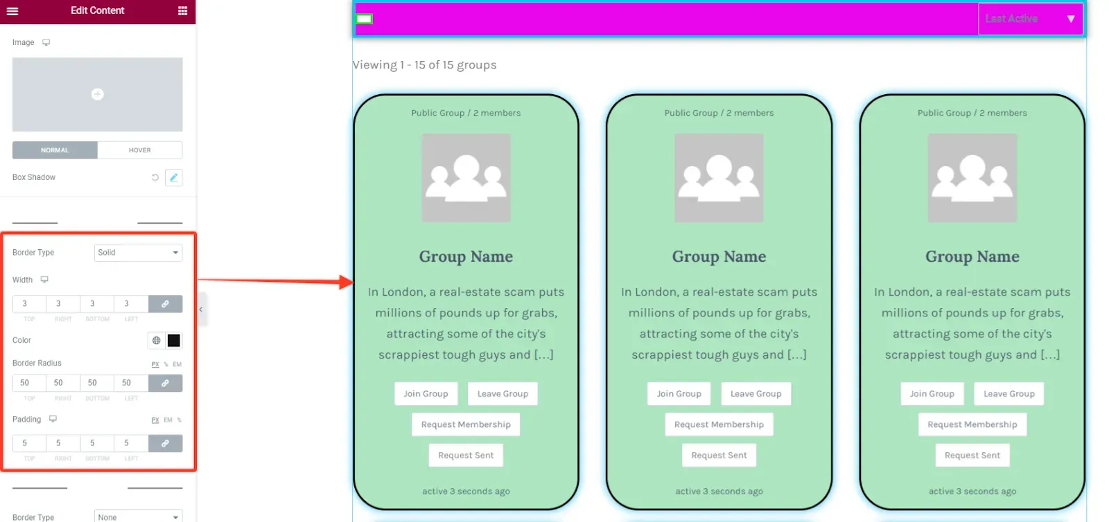
| Style | Background and Box Shadow (Normal, Hover) of each card, then Border, Border Radius and Padding under Multiple Columns and again under One Column. |
| Icons | Switches for Public group icon, Private group icon and Hidden group icon, then Color, Background Color, Border, Vertical position and Horizontal position of the status icon shown on the group avatar. |
Invitations (pending group invitations) has one section, Invitations, with Group Avatar, Group Title, Group Meta, Group Description, Accept Button and Reject Button.
BuddyBoss Platform
Section titled “BuddyBoss Platform”With BuddyBoss Platform instead of BuddyPress, Select section lists Timeline (instead of Activity), Connections (instead of Friends) and Account (instead of Settings), and adds Photos, Forums and Email Invites. The shared sections keep their names, but some show on fewer screens, and the screen sections follow the BuddyBoss markup, so their names and parts can differ from the tables above.