BuddyBuilder Pro members directory item widgets
The members directory item widgets are six BuddyBuilder Pro widgets for the Members Directory Loop Item template: Avatar, Cover Image, Name, Last Online, Last Activity and Actions. That template is the design of one member card; the Members Listing widget repeats it for every member, in the directory and in the other places where members are listed.
The widgets appear in the Elementor panel only while you edit a Members Directory Loop Item template. Each one reads its data from the member being listed, so in the editor you see placeholder data. Typography, Border, Box Shadow, Text Shadow, Padding and Margin are the standard Elementor controls and are only named in the tables below.
Avatar
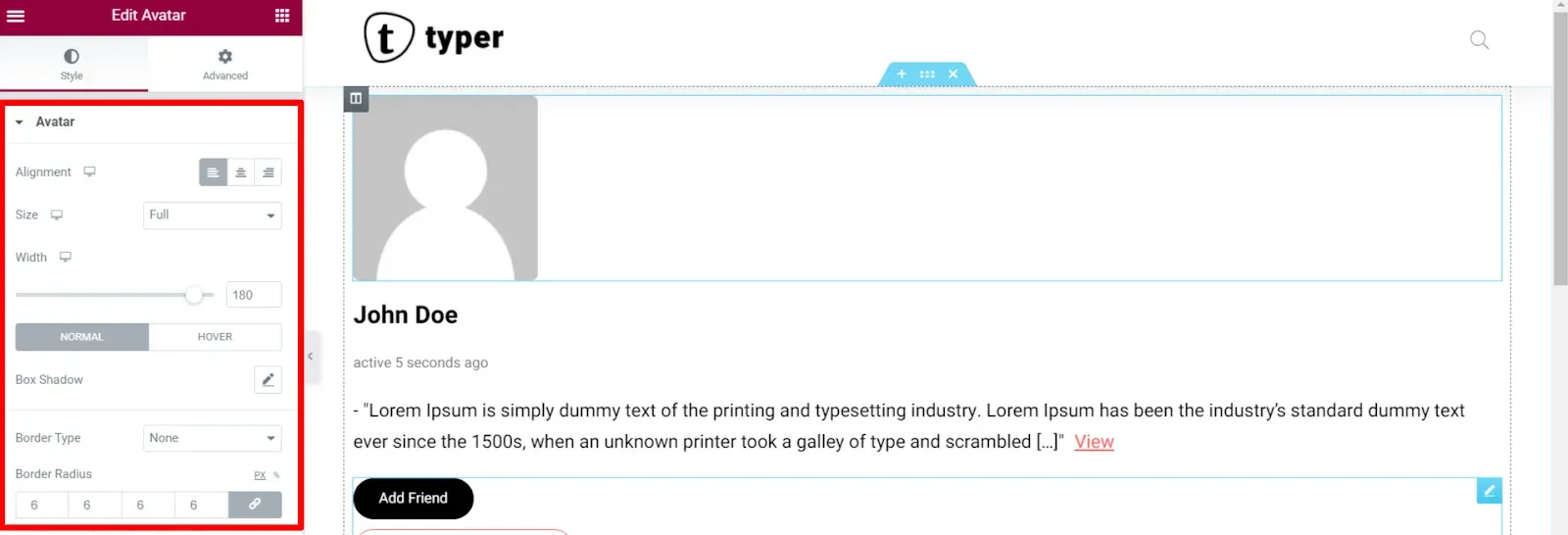
Section titled “Avatar”The Avatar widget shows the profile photo of the member, linked to the profile.
| Option | What it does |
|---|---|
| Alignment | Places the avatar left, center or right in the card. |
| Size | Image size that BuddyPress loads: Thumb or Full. Pick Full for a large avatar. |
| Width | Display width of the avatar. |
| Box Shadow (Normal, Hover), Border, Border Radius | Frame of the photo. |
Cover Image
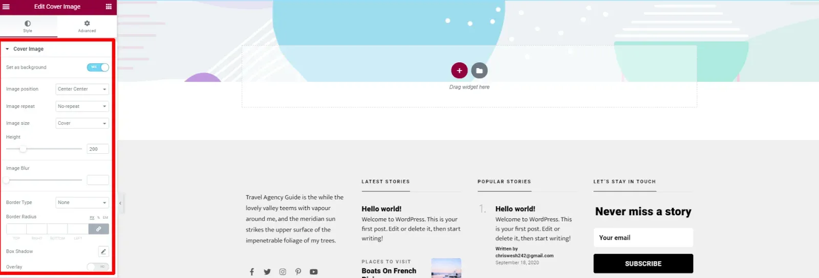
Section titled “Cover Image”The Cover Image widget shows the cover image of the member. For members without a cover image it outputs nothing.
| Option | What it does |
|---|---|
| Set as background | On: the image is a background that you size with the options below. Off: the image is a regular picture and you set Alignment, Width and Max Width instead. |
| Image position, Image repeat, Image size | How the background image fills the area. |
| Height | Height of the cover area (background mode only). |
| Image Blur | Blurs the image, useful when text sits on top of it. |
| Border, Border Radius, Box Shadow | Frame of the cover. |
| Overlay | Switch that adds a color or gradient layer over the image (background mode only). |
The Name widget shows the name of the member, linked to the profile.
| Option | What it does |
|---|---|
| What to generate | Name (the display name, the default) or @Username (the mention name). |
| HTML Tag | Heading tag used for the text. |
| Alignment, Typography, Text Color (Normal, Hover) | Style of the text. |
Last Online
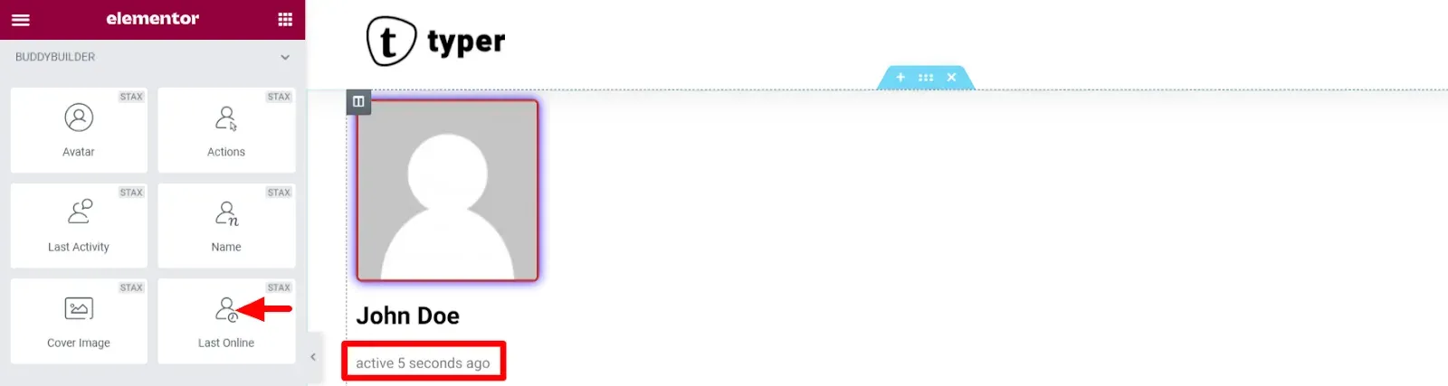
Section titled “Last Online”The Last Online widget shows when the member was last active (for example “active 5 seconds ago”).
Style options: Alignment, Text Color, Typography and Text Shadow.
Last Activity
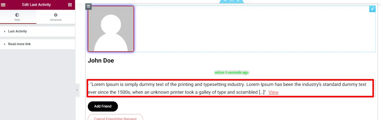
Section titled “Last Activity”The Last Activity widget shows the latest activity update of the member, shortened, with a link to read it in full. Members who have not posted an update get no output.
| Section | Options |
|---|---|
| Last Activity | Text Color, Typography, Text Shadow, Alignment, Border, Border Radius, Margin and Padding of the update text. |
| Read more link | Typography, Text Color and Background Color for Normal and Hover, Border Color on hover, Text Shadow, Border, Border Radius, Padding, Display (Inline or Block), Spacing and Margin. |
Actions
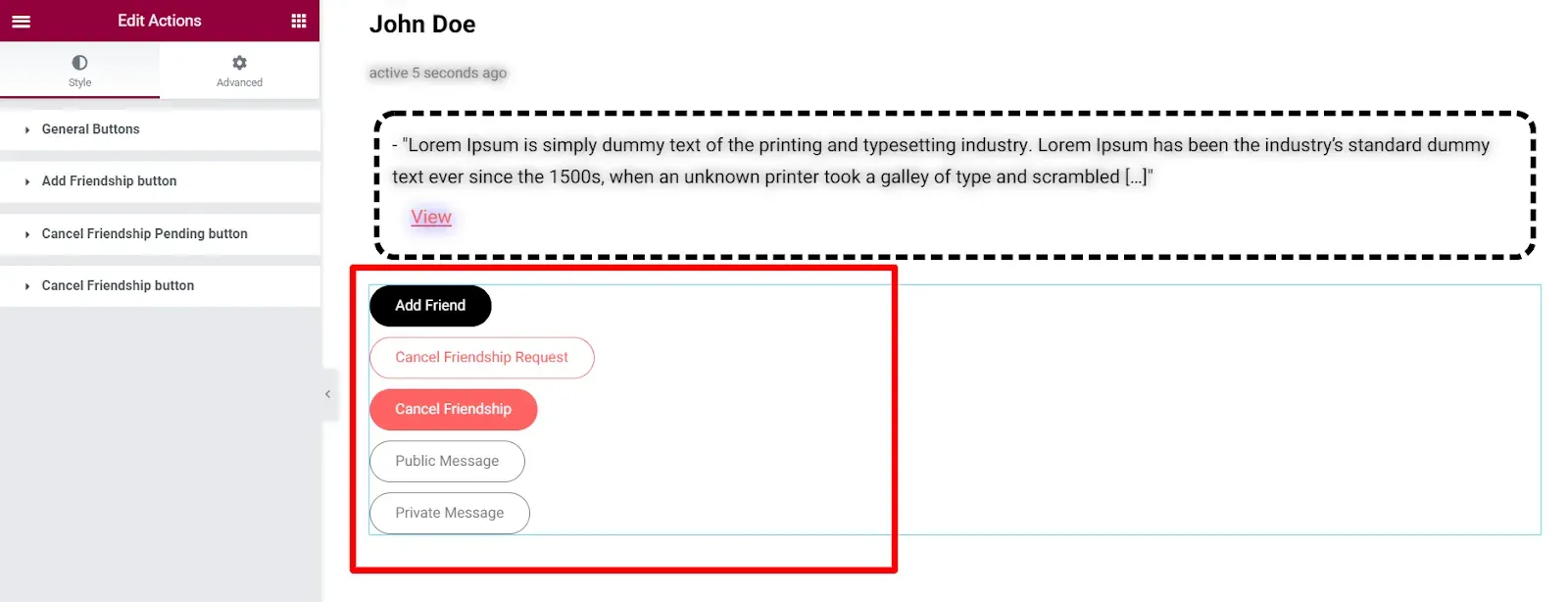
Section titled “Actions”The Actions widget shows the buttons a visitor can use on a member, such as Add Friend, Cancel Friendship Request and Cancel Friendship. BuddyPress decides which buttons appear, based on the active components and on the relation between the visitor and the member.
| Section | Options |
|---|---|
| General Buttons | Alignment, Display (Inline or Block), Vertical Spacing, Horizontal Spacing, Width, Typography, Text Color and Background Color for Normal and Hover, Border Color on hover, Box Shadow, Border, Border Radius, Padding. Applies to every button. |
| Add Friendship button | Text Color, Background Color, Border Color and Box Shadow, for Normal and Hover. |
| Cancel Friendship Pending button | Same options, for the button shown while a request is pending. |
| Cancel Friendship button | Same options, for the button shown to friends. |
The three button sections override General Buttons for that button only.