
BuddyBuilder members directory widgets
The members directory widgets are the three Elementor widgets that BuddyBuilder adds for the Members Directory template: Members Navigation (the tabs with counters), Members Filters (search, sorting and the grid or list switch) and Members Listing (the member loop with pagination). Place all three, usually in that order, to rebuild the BuddyPress or BuddyBoss Platform members page.
The three widgets are free. They appear in the Elementor panel, in the BuddyBuilder Members Directory category, only while you edit a Members Directory template. To get a template to edit, see Installing BuddyBuilder and Importing BuddyBuilder templates; the BuddyBuilder overview explains how templates work.
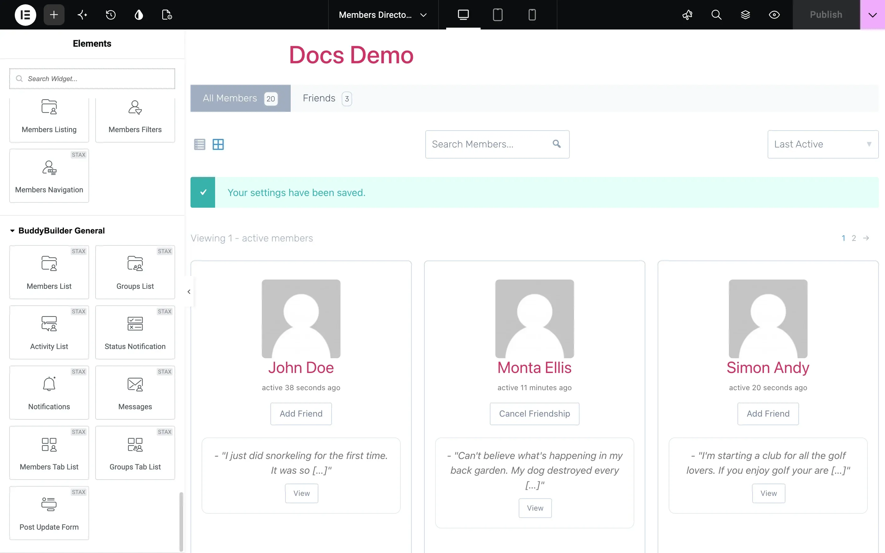
Typography, Border, Box Shadow, Padding and Margin are the standard Elementor controls and are only named in the tables below. Colors usually have Normal and Hover tabs.
Members Navigation
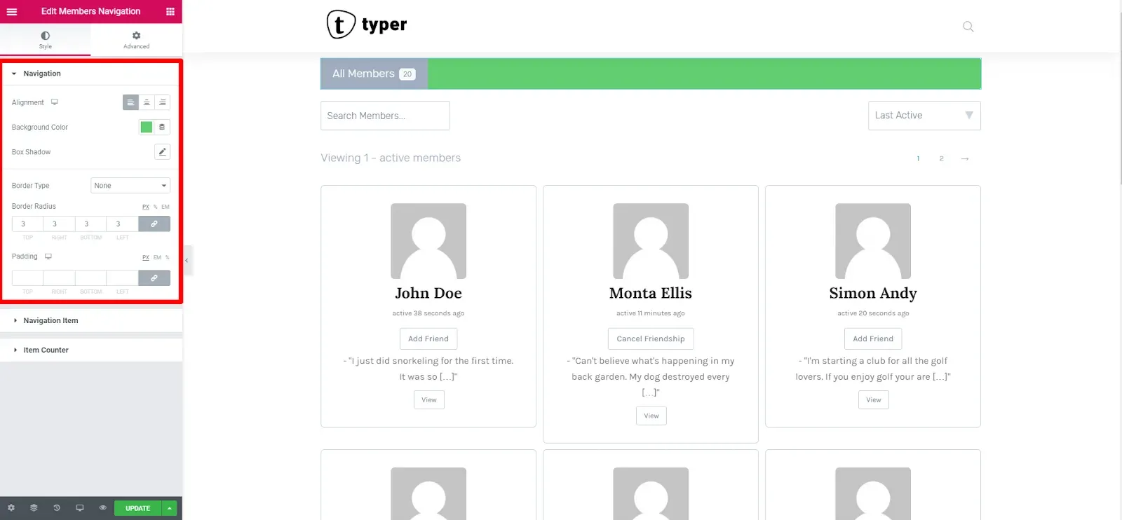
Section titled “Members Navigation”The Members Navigation widget shows the directory tabs, such as “All Members”, each with a counter of the members it holds. Put it at the top of the template.
| Section | Options |
|---|---|
| Navigation | Background Color, Box Shadow, Border, Border Radius and Padding of the tab bar. |
| Navigation Item | Alignment, Content Align, Display (Inline or Block), Spacing, Width (block display), Typography, then Text Color, Background Color, Border Color and Box Shadow for Normal, Hover and Active, Border, Border Radius, Items Padding and Items Margin. |
| Item Counter | Spacing between the label and the counter, Typography, Text Color, Background Color and Border Color for Normal, Hover and Active, Border, Border Radius and Padding. |
Members Filters
Section titled “Members Filters”The Members Filters widget shows the bar that visitors use to find members: a search field, a sorting dropdown (for example Last Active, Newest Registered, Alphabetical) and a switch between grid and list view.
The Content section decides what the bar contains:
| Option | What it does |
|---|---|
| Show & Order | Which controls are shown and in what order, from left to right. There are 15 combinations of List Toggle, Search and Sort, for example List Toggle > Search > Sort (the default), Search > Sort, Search alone or Sort alone. |
| Background Color, Box Shadow, Border, Border Radius, Padding | Style of the bar. |

The other sections style each control:
| Section | Options |
|---|---|
| List Toggle | Background Color, icon Color for Normal, Hover and Active, Border, Border Radius, Padding. |
| Search Box | Typography, Background Color, Text Color, Placeholder Color and Border Color (hover), Box Shadow, Border, Border Radius, Padding. |
| Search Button | Left Space between the field and the button, Background Color, Icon Color and Border Color (hover), Box Shadow, Border, Border Radius, Padding. |
| Sorting | Typography, Background Color, Text Color, Icon Color and Border Color (hover), Box Shadow, Border, Border Radius, Padding. |
Members Listing
Section titled “Members Listing”The Members Listing widget shows the members themselves, with pagination above and below. It loads the list through BuddyPress, so search, sorting and paging work without a page reload.
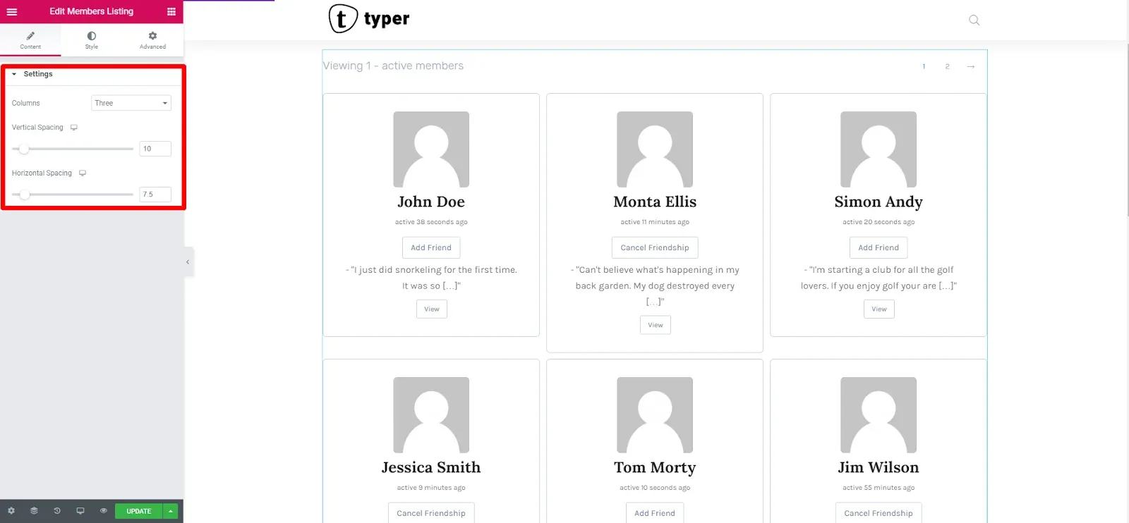
Content options, in the Settings section:
| Option | What it does |
|---|---|
| Columns | One to Four members per row, set separately for desktop, tablet and mobile. |
| Spacing, or Vertical Spacing and Horizontal Spacing | Space between members: one value for a single column, two values for a grid. |
Style options:
| Section | Options |
|---|---|
| Listing | Background (color, image or gradient), Box Shadow, Border, Border Radius, Margin and Padding of each member card. |
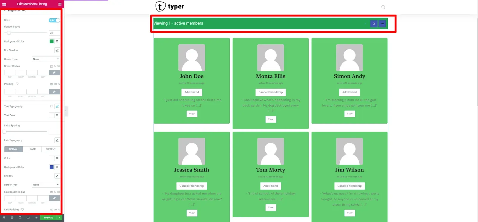
| Pagination Top | Show switch, Bottom Space, Background Color, Box Shadow, Border, Border Radius and Padding of the pagination bar; Typography and Text Color of the “Viewing 1 - 20 of 27 active members” text; Links Spacing, Typography, and Color, Background Color, Border Color for the Normal, Hover and Current page links, with Link Border Radius and Link Padding. |
| Pagination Bottom | The same options for the pagination under the list. |
Design the member card (Pro)
Section titled “Design the member card (Pro)”In the free plugin the content of each member card (avatar, name, last active time, latest update, buttons) has a fixed layout. With BuddyBuilder Pro the widget gets a Member Loop Item Template section, which tells you whether a Members Directory Loop Item template is attached; that template lets you build the card yourself from separate widgets. See Members directory item widgets.