
BuddyBuilder groups directory widgets
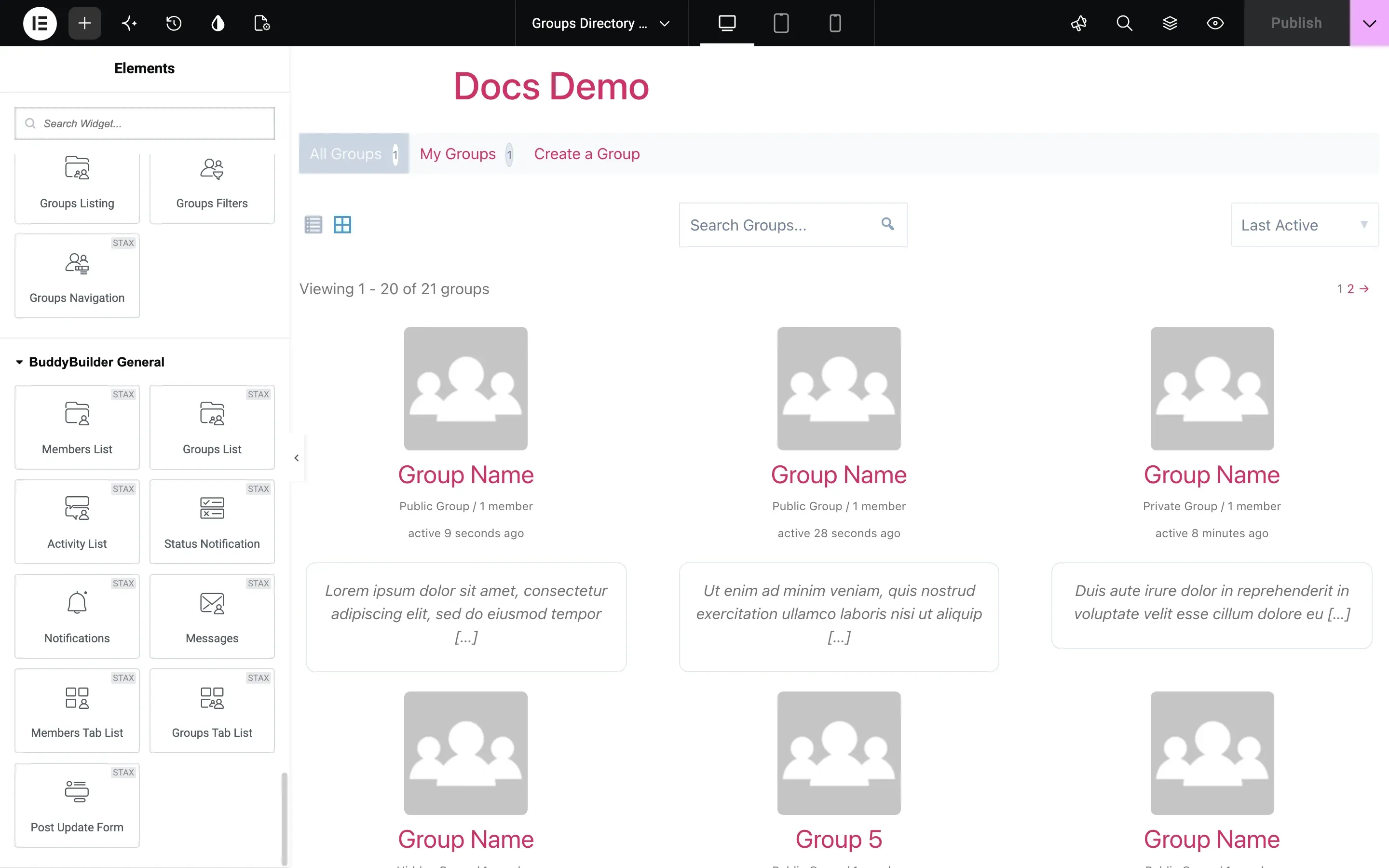
The groups directory widgets build the page that lists all groups of your community, in the BuddyBuilder Groups Directory template. There are three, all part of the free plugin: Groups Navigation (the All Groups / My Groups tabs), Groups Filters (search and sort) and Groups Listing (the list of groups with pagination).
They show in the Elementor panel under BuddyBuilder Groups Directory, and only while you edit a template of the Groups Directory type. To create or import that template, see Importing BuddyBuilder templates; for the plugin basics, see the BuddyBuilder overview.
In the tables below, Typography, Box Shadow, Border, Border Radius, Padding and Margin are the standard Elementor controls. “Normal / Hover” means the option has a tab for each state. Every widget also has the usual Elementor Advanced tab.
Groups Navigation
Section titled “Groups Navigation”Shows the directory tabs with their counters: All Groups, My Groups (for logged-in members) and the Create a Group link (when members are allowed to create groups). It has no content options.
Style tab:
| Section | Options |
|---|---|
| Navigation | The whole bar: Background Color, Box Shadow, Border, Border Radius, Padding |
| Navigation Item | Display (Inline or Block), Alignment (Inline) or Content Align and Width (Block), Spacing, Typography; Text Color, Background Color, Border Color and Box Shadow for Normal / Hover / Active; Border, Border Radius, Items Padding, Items Margin |
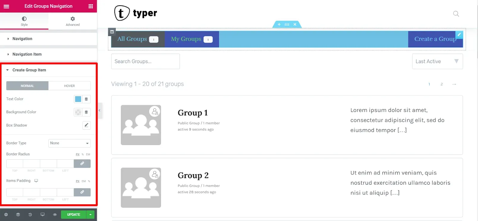
| Create Group Item | Overrides the item style for the Create a Group link: Text Color, Background Color and Box Shadow for Normal / Hover (Hover adds Border Color); Border, Border Radius, Padding, Margin. Link to menu (Inline display only) keeps the link next to the other tabs; switch it off to push the link to the opposite end of the bar |
| Item Counter | The number badge on each tab: Spacing, Typography; Text Color, Background Color and Border Color for Normal / Hover / Active; Border, Border Radius, Padding |
Groups Filters
Section titled “Groups Filters”Shows the tools above the list: the grid or list toggle, the search field and the sort dropdown (last active, most members, newly created, alphabetical). It has no content options: what is shown, and in which order, is set in the Style tab.
Style section Content:
| Option | What it does |
|---|---|
| Show & Order | Which tools show and their order, from left to right. Fifteen combinations of List Toggle, Search and Sort, for example List Toggle > Search > Sort (default), Search > Sort, Search or Sort |
| Background Color, Box Shadow, Border, Border Radius, Padding | Style of the filters bar |
The other sections show only when the tool is part of the selected Show & Order value:
| Section | Options |
|---|---|
| List Toggle | Background Color; icon Color for Normal / Hover / Active; Border, Border Radius, Padding |
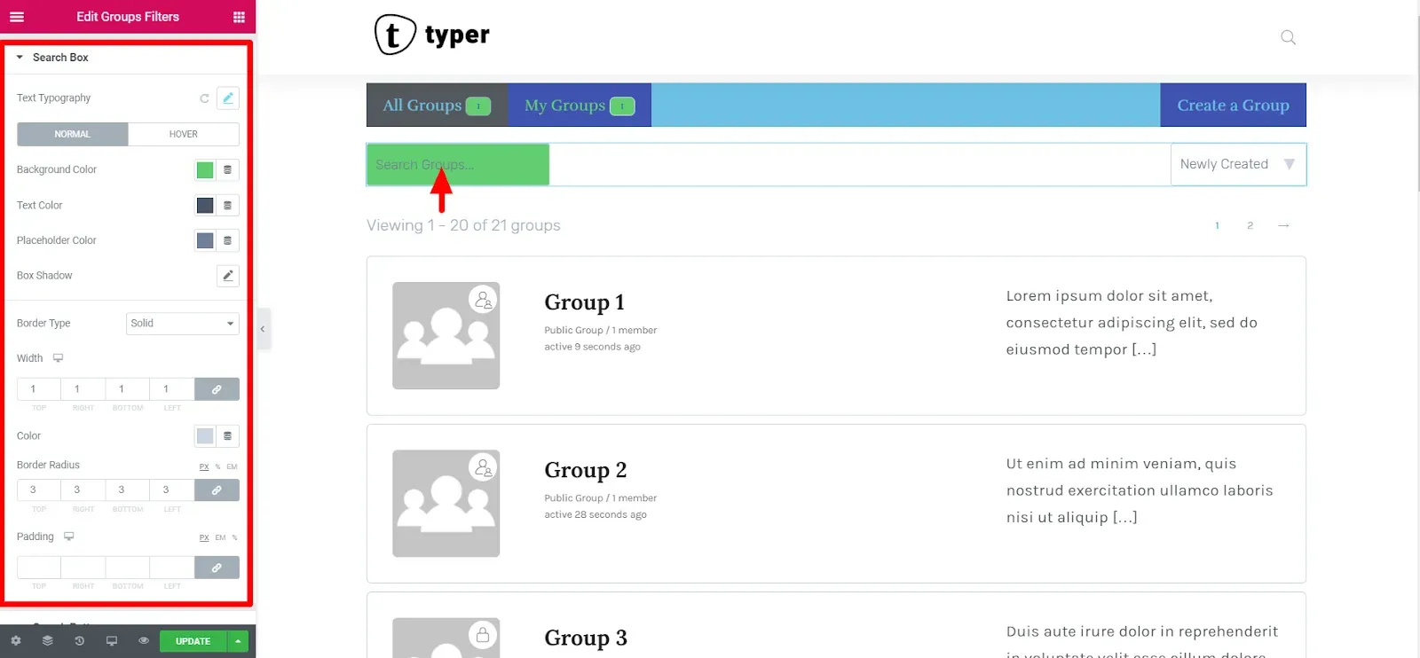
| Search Box | Text Typography; Background Color, Text Color, Placeholder Color and Box Shadow for Normal / Hover (Hover adds Border Color); Border, Border Radius, Padding |
| Search Button | Left Space (gap from the search field); Background Color, Icon Color and Box Shadow for Normal / Hover (Hover adds Border Color); Border, Border Radius, Padding |
| Sorting | Text Typography; Background Color, Text Color, Icon Color and Box Shadow for Normal / Hover (Hover adds Border Color); Border, Border Radius, Padding |
Groups Listing
Section titled “Groups Listing”Shows the groups of the directory, with pagination above and below the list.
Content tab:
| Section | Options |
|---|---|
| Settings | Columns (One to Four). With one column: Spacing between rows. With more: Vertical Spacing and Horizontal Spacing between cards |
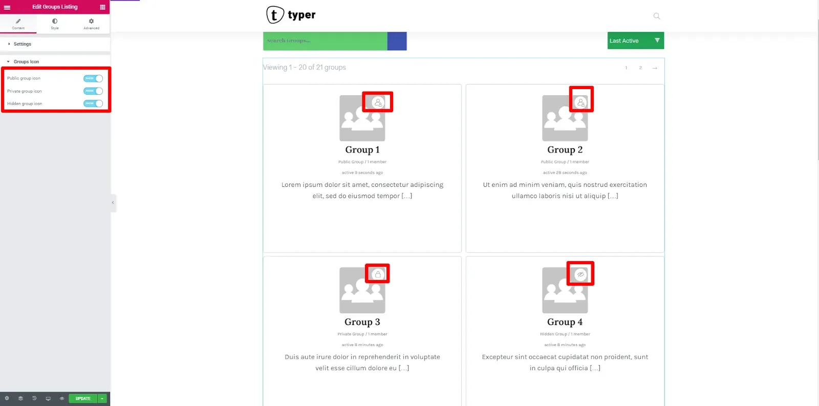
| Groups Icon | Public group icon, Private group icon, Hidden group icon: show a small status icon on the avatar of groups of that kind |
Style tab:
| Section | Options |
|---|---|
| Listing Groups | Each group card: Background (classic or gradient), Box Shadow for Normal / Hover, Border, Border Radius, Padding |
| Groups Icon | The status icon: Color, Background Color, Border, Vertical position, Horizontal position |
| Pagination Top | Show (switch off to hide it). Bar: Bottom Space, Background Color, Box Shadow, Border, Border Radius, Padding. “Viewing x of y” text: Text Typography, Text Color. Page links: Links Spacing, Link Typography; Color, Background Color, Border Color and Shadow for Normal / Hover / Current; Link Border, Link Border Radius, Link Padding |
| Pagination Bottom | The same options, for the pagination under the list |
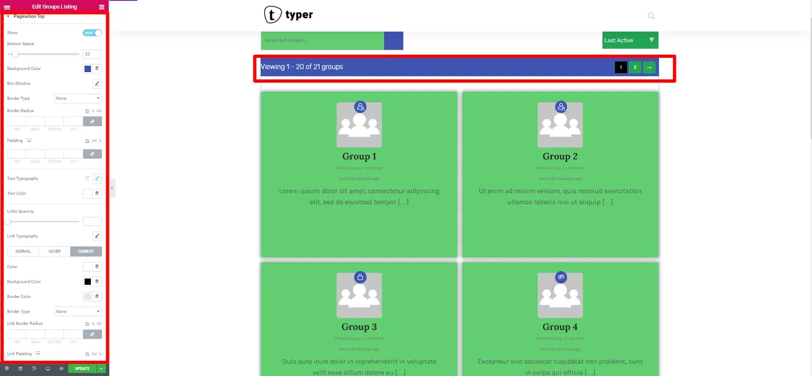
To change how many groups load per page, see How to control the number of groups in the group directory.
Design the group card (Pro)
Section titled “Design the group card (Pro)”In the free plugin each group card keeps the default BuddyPress layout. With BuddyBuilder Pro the widget gets a Group Loop Item Template section in the Content tab, with a button that takes you to the Groups Directory Loop Item template, where you design the card yourself. See Groups directory item widgets.