
BuddyBuilder group profile widgets
The group profile widgets build the single group page (header, navigation and content) in the BuddyBuilder Group Profile template. All ten are part of the free plugin: Name, Avatar, Cover, Status, Last Activity, Description, Buttons, Leadership, Navigation and Content.
They show in the Elementor panel under BuddyBuilder Group Profile, and only while you edit a template of the Group Profile type. On other pages and template types they are hidden. To create or import that template, see Importing BuddyBuilder templates; for the plugin basics, see the BuddyBuilder overview.
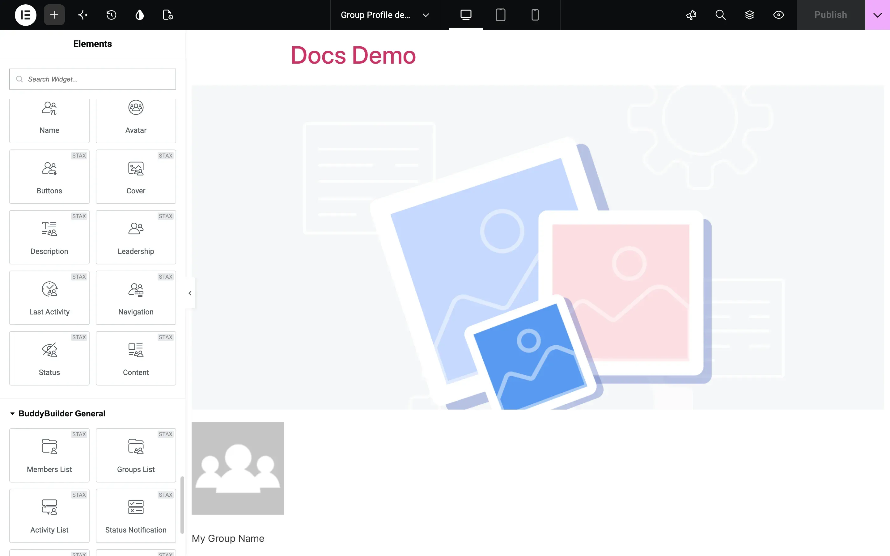
In the editor each widget shows placeholder data (a sample group). On the live site it shows the data of the group being viewed.
In the tables below, Typography, Text Shadow, Box Shadow, Border, Border Radius, Padding and Margin are the standard Elementor controls. “Normal / Hover” means the option has a tab for each state. Every widget also has the usual Elementor Advanced tab.
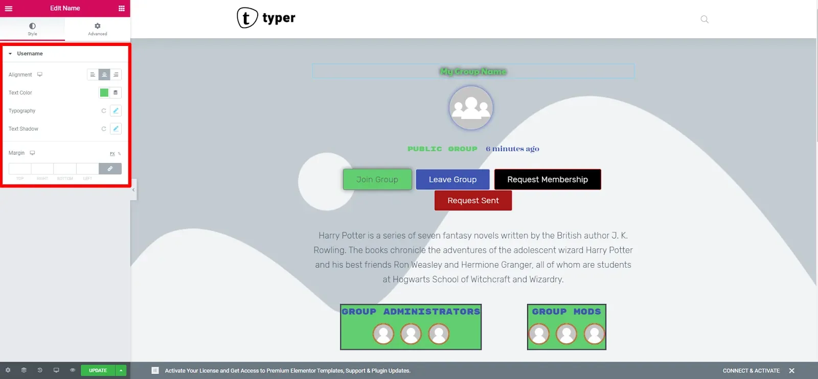
Shows the group name. It has no content options.
The style section is labeled Username in the panel:
| Option | What it does |
|---|---|
| Alignment | Left, center or right |
| Text Color | Color of the name |
| Typography, Text Shadow, Margin | Standard controls |
Avatar
Section titled “Avatar”Shows the group photo that the group admins uploaded. It has no content options.
Style section Avatar:
| Option | What it does |
|---|---|
| Alignment | Left, center or right |
| Size | Image version to load: Thumb or Full (default) |
| Width | Display width, up to 200 px |
| Box Shadow | Normal / Hover |
| Border, Border Radius | Standard controls; use a 50% radius for a round avatar |
Shows the group cover image as a background area. It has no content options: the height is set in the Style tab.
Style section Cover:
| Option | What it does |
|---|---|
| Background Color | Color shown behind or instead of the image |
| Image position, Image repeat, Image size | Background placement. Defaults: Center Center, No-repeat, Cover |
| Position | Default, Absolute or Fixed. With Absolute or Fixed you also get Horizontal Orientation, Vertical Orientation and their Offset sliders |
| Height | Cover height, up to 1000 px. Works only when Position is not Absolute |
| Box Shadow | Normal / Hover |
| Border, Border Radius | Standard controls |
| Advanced Settings | BuddyPress only. Replaces the shadow, border and overlay options with two sliders: Border Radius and Skew |
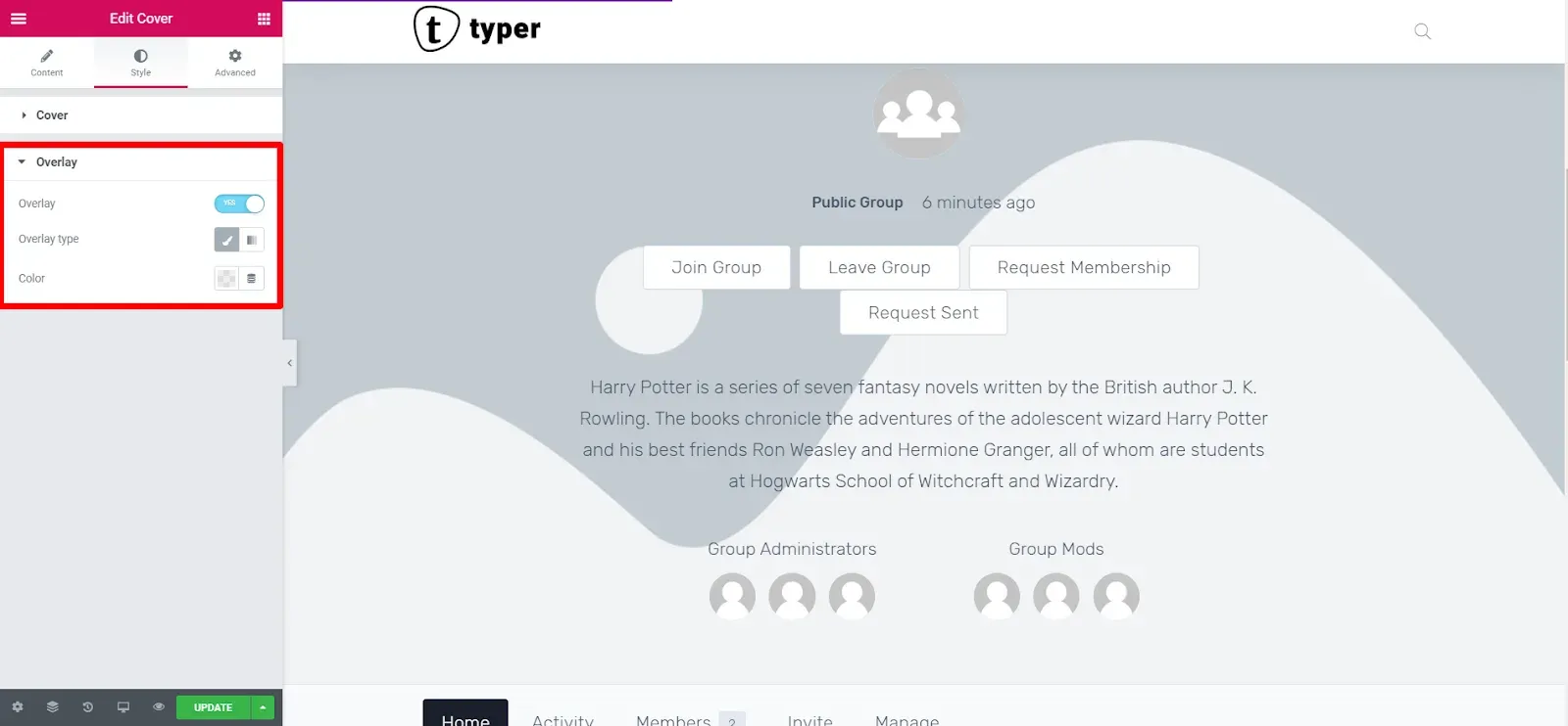
Style section Overlay (BuddyPress only, hidden while Advanced Settings is on):
| Option | What it does |
|---|---|
| Overlay | Switches a color layer on top of the cover image |
| Overlay type | Classic (one color) or gradient |
Status
Section titled “Status”Shows the group status text (public, private or hidden group). With BuddyBoss Platform it shows the group type instead. It has no content options.
Style section Status: Alignment, Text Color, Typography, Text Shadow and Margin.
Last Activity
Section titled “Last Activity”Shows when the group was last active, for example “active 6 minutes ago”. It has no content options.
Style section Last Activity: Alignment, Text Color and Typography.
Description
Section titled “Description”Shows the group description written by the group admins. It has no content options.
Style section Description: Alignment, Text Color and Typography.
Buttons
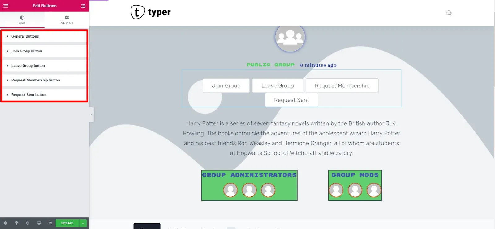
Section titled “Buttons”Shows the group action buttons for the current visitor: join the group, leave it, request membership, or the “request sent” state. It has no content options. In the editor all four buttons show at once so you can style them; on the live site a visitor sees only the buttons that apply.
Style section General Buttons (applies to all buttons):
| Option | What it does |
|---|---|
| Display | Inline (side by side) or Block (stacked) |
| Alignment | Left, center or right |
| Horizontal Spacing, Vertical Spacing | Gaps between inline buttons, up to 50 px |
| Spacing, Width | Shown for Block display: gap between buttons and button width |
| Typography | Standard control |
| Text Color, Background Color, Box Shadow | Normal / Hover. Hover also has Border Color |
| Border, Border Radius, Padding | Standard controls |
The sections Join Group button, Leave Group button, Request Membership button and Request Sent button override the general style for one button each. They all have the same options: Text Color, Background Color, Border Color and Box Shadow, Normal / Hover.
Leadership
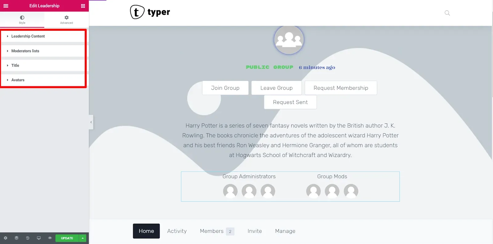
Section titled “Leadership”Shows the avatars of the group administrators and group moderators, each list under its own title. It has no content options.
With BuddyPress the Style tab has four sections:
| Section | Options |
|---|---|
| Leadership Content | Align Titles, Display mods (Inline or Block), Inline Spacing, Block Spacing |
| Moderators lists | Moderators BG Color, Padding, Border, Border Radius |
| Title | Typography, Text Color, Spacing (gap between title and avatars) |
| Avatars | Border, Border Radius, Size (up to 50 px), Spacing |
With BuddyBoss Platform the sections are Container (Display mods, Align Titles, Background Color, Border, Border Radius, Padding), Title and Avatars (without Size).
Navigation
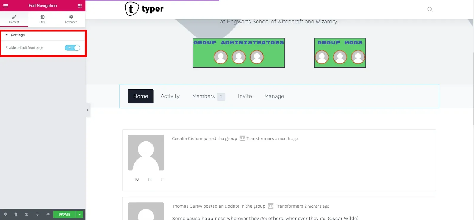
Section titled “Navigation”Shows the group menu: the tabs that switch the content area, such as Home, Activity, Members, Invite and Manage. Which tabs appear depends on the active BuddyPress components and on the visitor’s role in the group.
Content tab, section Settings:
| Option | What it does |
|---|---|
| Enable default front page | Adds the Home tab (the group’s front page) to the menu. Saving the template also saves this choice to the BuddyPress group front page setting |
Style tab:
| Section | Options |
|---|---|
| Navigation | Menu bar: Background Color, Box Shadow, Border, Content Padding |
| Navigation Item | Alignment, Display (Inline or Block), Spacing, Width (Block only), Typography; Text Color, Background Color, Border Color and Box Shadow for Normal / Hover / Active; Border, Border Radius, Items Padding, Items Margin |
| Counter | The number badge on a tab (for example the member count): Spacing, Typography; Text Color, Background Color and Border Color for Normal / Hover / Active; Border, Border Radius, Padding |
Content
Section titled “Content”Shows the screen of the selected navigation tab: the group activity feed, the members list, the invite screens and the manage screens. Place it once, below the Navigation widget.
In the free plugin the Content widget has no content or style options: it renders the screens as they are. Its panel shows a Go PRO notice instead.