
BuddyBuilder member profile widgets
The member profile widgets are the Elementor widgets that BuddyBuilder adds for the Member Profile template: Avatar, Cover, Name/Username, Action Buttons, Meta, Last Activity, Navigation and Content. Together they rebuild the header, the menu and the body of every BuddyPress (or BuddyBoss Platform) member page.
All eight widgets are free. They appear in the Elementor panel, in the BuddyBuilder Member Profile category, only while you edit a Member Profile template. They are not listed when you edit a regular page or another BuddyBuilder template. To get a template to edit, see Installing BuddyBuilder and Importing BuddyBuilder templates; the BuddyBuilder overview explains how templates work.
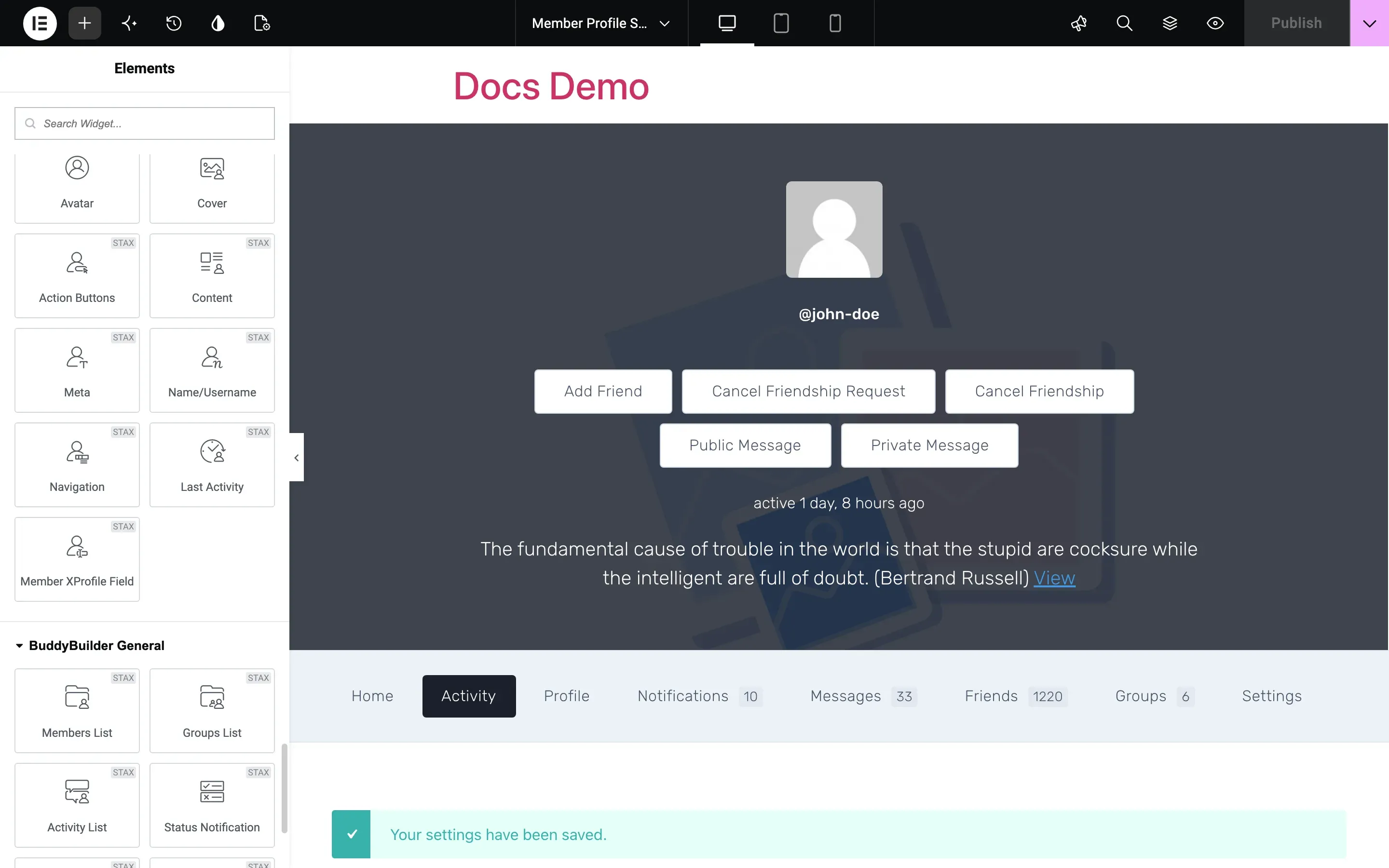
Each widget reads its data from the member whose profile is being viewed, so there is nothing to type in: you place the widget and style it. In the editor you see placeholder data. Typography, Border, Box Shadow, Text Shadow, Padding and Margin are the standard Elementor controls and are only named in the tables below.
Avatar
Section titled “Avatar”The Avatar widget shows the profile photo of the member, linked to the profile.
| Option | What it does |
|---|---|
| Alignment | Places the avatar left, center or right. |
| Size | Image size that BuddyPress loads: Thumb or Full. Pick Full for a large avatar so it stays sharp. |
| Width | Display width of the avatar. |
| Normal / Hover | Box Shadow for each state, plus Border Color on hover. |
| Border, Border Radius | Border around the photo. Set a 50% radius for a round avatar. |
The Cover widget shows the cover image of the member.
Style options, in the Cover section:
| Option | What it does |
|---|---|
| Background Color | Color of the cover area, behind the image. |
| Image position, Image repeat, Image size | How the image fills the area (for example Center Center, No-repeat, Cover). |
| Position | Default, Absolute or Fixed. With Absolute or Fixed you also set Horizontal Orientation, Vertical Orientation and an Offset for each, which lets the cover sit behind other widgets. |
| Height | Height of the cover, up to 1000px. It only applies when Position is not set to Absolute. |
| Box Shadow, Border, Border Radius | Frame of the cover, with Normal and Hover shadows. |
| Advanced Settings | BuddyPress only. Replaces the frame options with a Border Radius slider and a Skew slider applied to the cover image. |
The Overlay section (BuddyPress only, hidden while Advanced Settings is on) has an Overlay switch and a background control. Use it to put a color or gradient over the image so that text placed on top stays readable.
Username
Section titled “Username”The Name/Username widget shows the name of the member.
| Option | What it does |
|---|---|
| What to generate | @Username (the mention name, the default) or Name (the display name). |
| HTML Tag | Heading tag used for the text. |
| Alignment, Text Color, Typography, Text Shadow, Margin | Style of the text. |
The @Username option depends on the BuddyPress Activity component with mentions enabled. If nothing is displayed on the live profile, switch What to generate to Name.
Action Buttons
Section titled “Action Buttons”The Action Buttons widget shows the buttons a visitor can use on a member profile: Add Friend, Cancel Friendship Request, Cancel Friendship, Public Message and Private Message. BuddyPress decides which buttons appear, based on the active components and on the relation between the visitor and the member.
| Section | Options |
|---|---|
| General Buttons | Display (Inline or Block), Alignment, Horizontal Spacing and Vertical Spacing (inline), Spacing and Width (block), Typography, Text Color and Background Color for Normal and Hover, Box Shadow, Border, Border Radius, Padding. Applies to every button. |
| Add Friendship button | Text Color, Background Color, Border Color and Box Shadow, for Normal and Hover. |
| Cancel Friendship Request button | Same options, for the button shown while a request is pending. |
| Cancel Friendship button | Same options, for the button shown to friends. |
The three button sections override General Buttons for that button only, so you can, for example, color Cancel Friendship differently from Add Friend.
The Meta widget shows when the member was last active (for example “active 2 hours ago”).
Style options: Alignment, Text Color, Typography and Text Shadow.
Last Activity
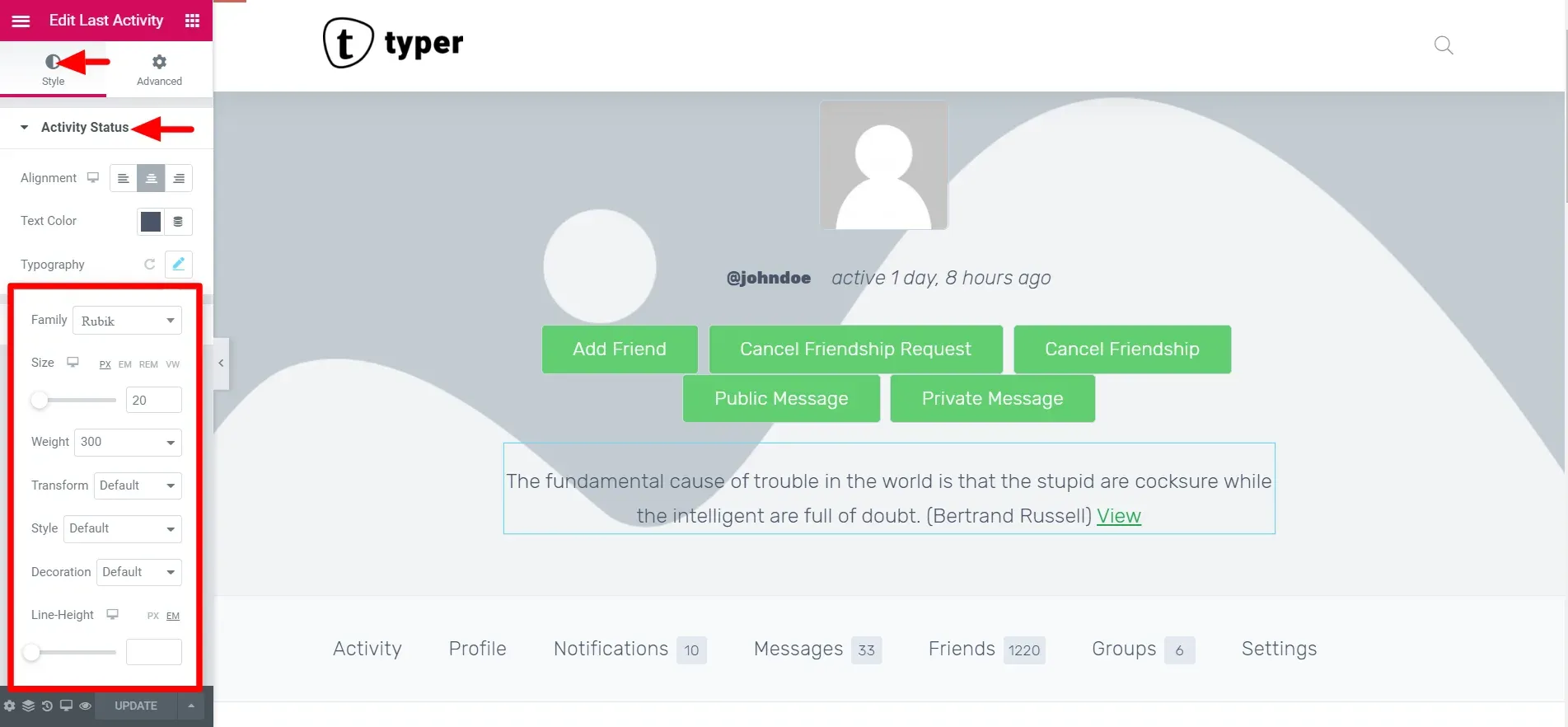
Section titled “Last Activity”The Last Activity widget shows the latest activity update posted by the member, followed by a View link to that update. It needs the BuddyPress Activity component.
| Section | Options |
|---|---|
| Activity Status | Alignment, Text Color and Typography of the update text. |
| Link | Text Color, Typography and Text Shadow of the link. |
Navigation
Section titled “Navigation”The Navigation widget shows the profile menu: Activity, Profile, Notifications, Messages, Friends, Groups, Settings and any item added by other plugins. The items and their counters come from BuddyPress.
Content option (BuddyPress only), in the Settings section:
- Enable default front page: turns the BuddyPress member front page (the Home tab) on or off. The switch is kept in sync with the same BuddyPress appearance setting in the Customizer.
Style options:
| Section | Options |
|---|---|
| Navigation | Background Color, Box Shadow, Border and Content Padding of the whole menu bar. |
| Navigation Item | Alignment, Display (Inline for a horizontal menu, Block for a vertical one), Content Align, Spacing, Width (block display), Typography, then Text Color, Background Color, Border Color and Box Shadow for the Normal, Hover and Active states, Border, Border Radius, Items Padding and Items Margin. |
| Counter | Spacing between the label and the count, Typography, Text Color, Background Color and Border Color for Normal, Hover and Active, Border, Border Radius and Padding. |
For a vertical menu in a sidebar column, set Display to Block and give the items a Width of 100%.
Content
Section titled “Content”The Content widget outputs the body of the profile: the screen that matches the selected menu item (activity stream, profile fields, notifications, messages, friends, groups, settings) together with its sub-menu. Add it once to every Member Profile template.
In the free plugin the widget has no options and uses the styling of your theme. BuddyBuilder Pro adds style sections for every screen: see Member profile content styling.