
Group invite and manage styling in BuddyBuilder Pro
The Invite and Manage screens of a group are styled from the Content widget of the Group Profile template: select the widget, open Style > Edit Section, set Select section to Invite or Manage, then pick the screen in Preview subsection. The panel then shows the sections described on this page.
The Invite screens are My friends, All members, Pending friends and Send invites. The Manage screens are Details, Settings, Photo, Cover image, Members and Delete. With BuddyBoss Platform the screens and section names differ (for example Pending invites, Requests and Cover photo); this page describes the sections you get with BuddyPress.
In the tables below, Typography, Box Shadow, Border, Border Radius, Padding and Margin are the standard Elementor controls. “Normal / Hover” means the option has a tab for each state.
The Cards section styles the member cards on the My friends, All members and Pending friends screens, where a group member picks who to invite.
| Group | Options |
|---|---|
| Card | Background Color, Box Shadow, Border, Border Radius, Padding |
| Member Avatar | Box Shadow, Border, Border Radius |
| Member Name | Typography, Text Color |
| Icon | Icon Color of the invite icon |
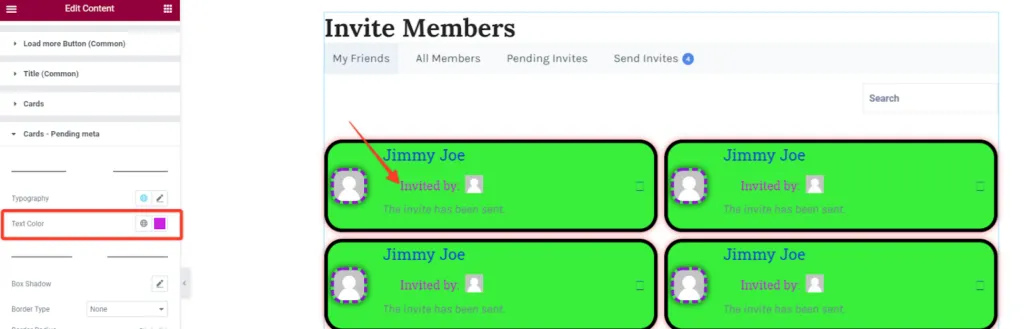
Cards pending meta
Section titled “Cards pending meta”The Cards - Pending meta section shows on the Pending friends screen only. It styles the extra lines a pending invitation adds to each card.
| Group | Options |
|---|---|
| Invited By | Typography and Text Color of the “Invited by” text |
| Avatar | Box Shadow, Border and Border Radius of the inviter’s small avatar |
| Status | Typography, Text Color and Margin of the status line (for example “The invite has been sent”) |
Send invites
Section titled “Send invites”The Send Invites section shows on the Send invites screen, where the selected members are listed above an optional message and the send button.
| Group | Options |
|---|---|
| Avatars | Selected members’ avatars: Box Shadow, Border, Border Radius |
| Label | The text above the message field: Typography, Text Color |
| Textarea | The message field: Box Shadow; Background, Color and Placeholder Color for Normal / Focus (Focus adds Border Color); Border, Border Radius, Padding |
| Send Button | Typography; Background, Color and Box Shadow for Normal / Hover (Hover adds Border Color); Border, Border Radius, Padding |
| Cancel Button | Same options as the Send button |
Details
Section titled “Details”The Details section styles the form on Manage > Details, where a group admin edits the group name and description.
| Group | Options |
|---|---|
| Input Label | Field labels: Typography, Color, Margin |
| Input Text | The name and description fields: Typography; Background Color, Color and Box Shadow for Normal / Focus (Focus adds Border Color); Border, Border Radius, Padding |
The save button is styled in Buttons (Common).
Settings
Section titled “Settings”The Settings section styles Manage > Settings, where the privacy and invitation options are grouped in boxes.
| Group | Options |
|---|---|
| Box | Each options box: Background, Border, Border Radius, Padding, Margin |
| Legend | The box title (for example “Privacy Options”): Typography, Color, Background |
| Labels | The radio and checkbox labels: Typography, Color |
| Lists | The bullet lists under each option: Typography, Color |
| Description | The explanatory text: Typography, Color |
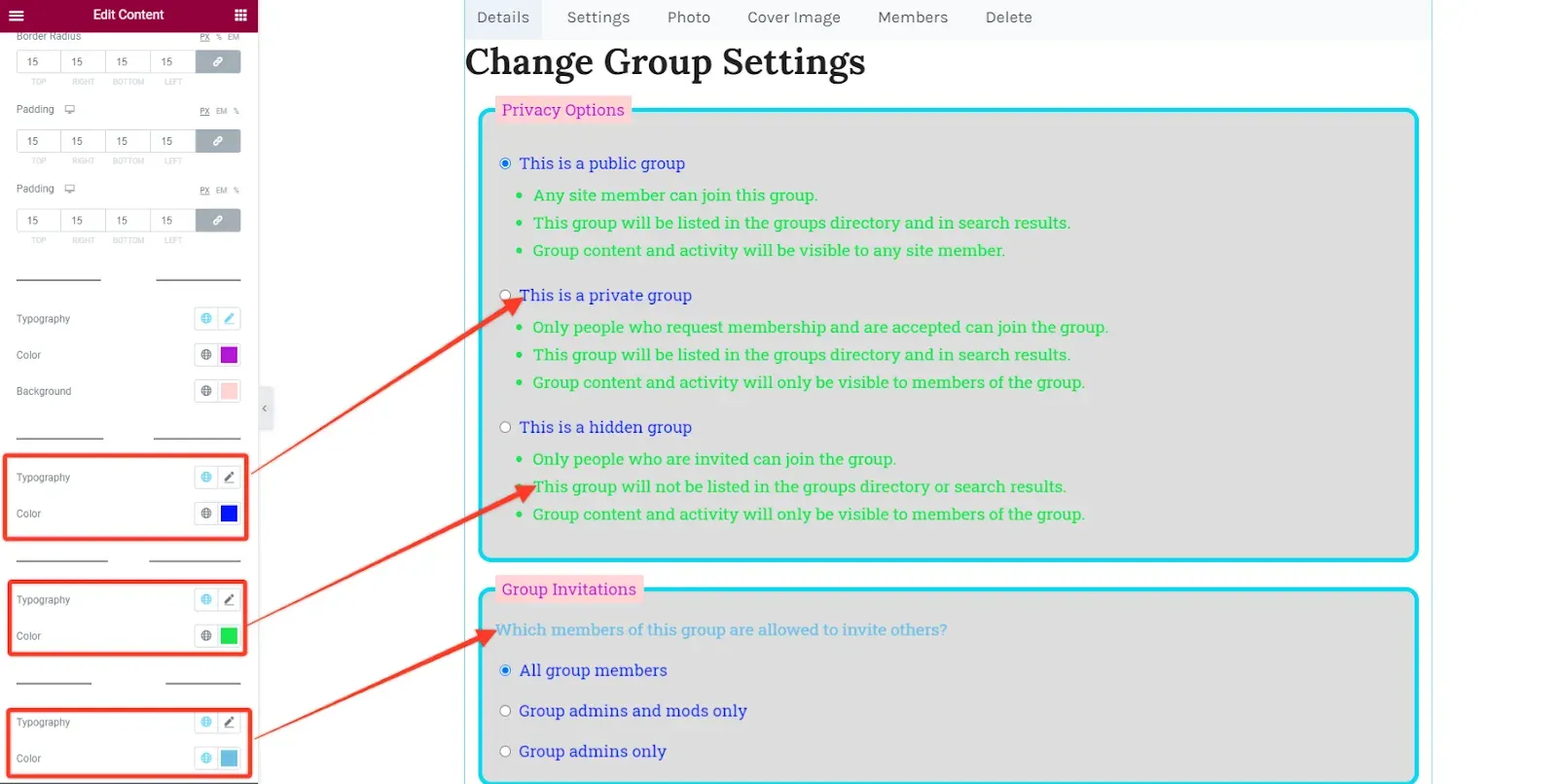
Photo and cover image
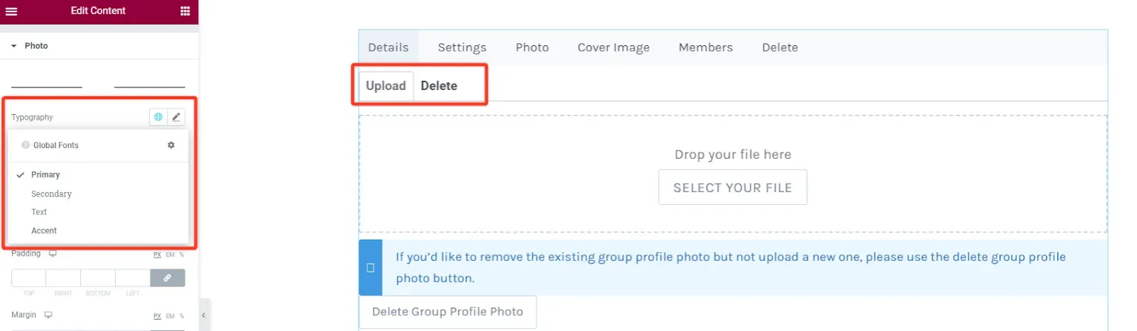
Section titled “Photo and cover image”The Photo section (on Manage > Photo) and the Cover Image section (on Manage > Cover image) style the upload screens. Both have the same groups, except that only Photo has the Upload and Delete tabs.
| Group | Options |
|---|---|
| Tabs | Photo only. The bar that holds the Upload and Delete tabs: Typography, Background, Border, Border Radius, Padding, Margin |
| Tab Item | Photo only. Each tab: Color, Background and Border Color for Normal / Hover / Active (Active adds Border Bottom Color); Border, Border Radius, Padding, Margin |
| Drag&Drop Area | The upload box: Background, Border, Border Radius, Padding, Margin |
| Drag&Drop Label | The “Drop your file here” text: Typography, Color, Margin |
| Drag&Drop Button | The select file button: Typography; Background and Color for Normal / Hover (Hover adds Border Color); Box Shadow, Border, Border Radius, Padding |
| Notification | The notice box: Typography, Color, Background, Border, Border Radius, Padding |
| Delete Notice | The text above the delete button: Typography, Color, Margin |
| Delete Button | Typography; Background and Color for Normal / Hover (Hover adds Border Color); Border, Border Radius, Padding, Margin |
Manage members
Section titled “Manage members”The Members section shows on Manage > Members, where group admins see the members in a table grouped by role and can edit, ban or remove them.
| Group | Options |
|---|---|
| Table | Background, Border, Margin |
| Table Header | Alignment, Typography, Color, Background, Border, Padding |
| Table Body | Typography, Color; row Background and Background (odd) for Normal / Hover; Border, Padding |
| Avatar | Avatar Size (20 to 50 px), Box Shadow, Border, Border Radius, Margin |
| Name | Typography; Color for Normal / Hover |
| Edit Link, Ban Link, Delete Link | Each action link: Typography; Color for Normal / Hover |
| Link Separator | Color of the separator between the action links |
| Role Type | The role heading of each table: Alignment, Typography, Color |
Delete
Section titled “Delete”The Delete section styles the Manage > Delete screen. It has one group, Labels, with Typography and Color for the warning text.