
BuddyBuilder site-wide activity widgets
The site-wide activity widgets build the main BuddyPress activity page: the post form, the search and filter bar, the activity stream and the activity tabs. They are free and appear in the BuddyBuilder Site-Wide Activity widget category when you edit a Site-Wide Activity template.
To create that template, go to BuddyBuilder > Dashboard and click Create new under Site-Wide Activity. See Create and assign templates.
All four widgets have no content options: they output the BuddyPress markup, and every option is on the Style tab. Sections differ slightly between BuddyPress and BuddyBoss Platform. Standard Elementor controls (Typography, Border, Box Shadow, Padding, Margin) work as in any other widget and are not explained one by one.
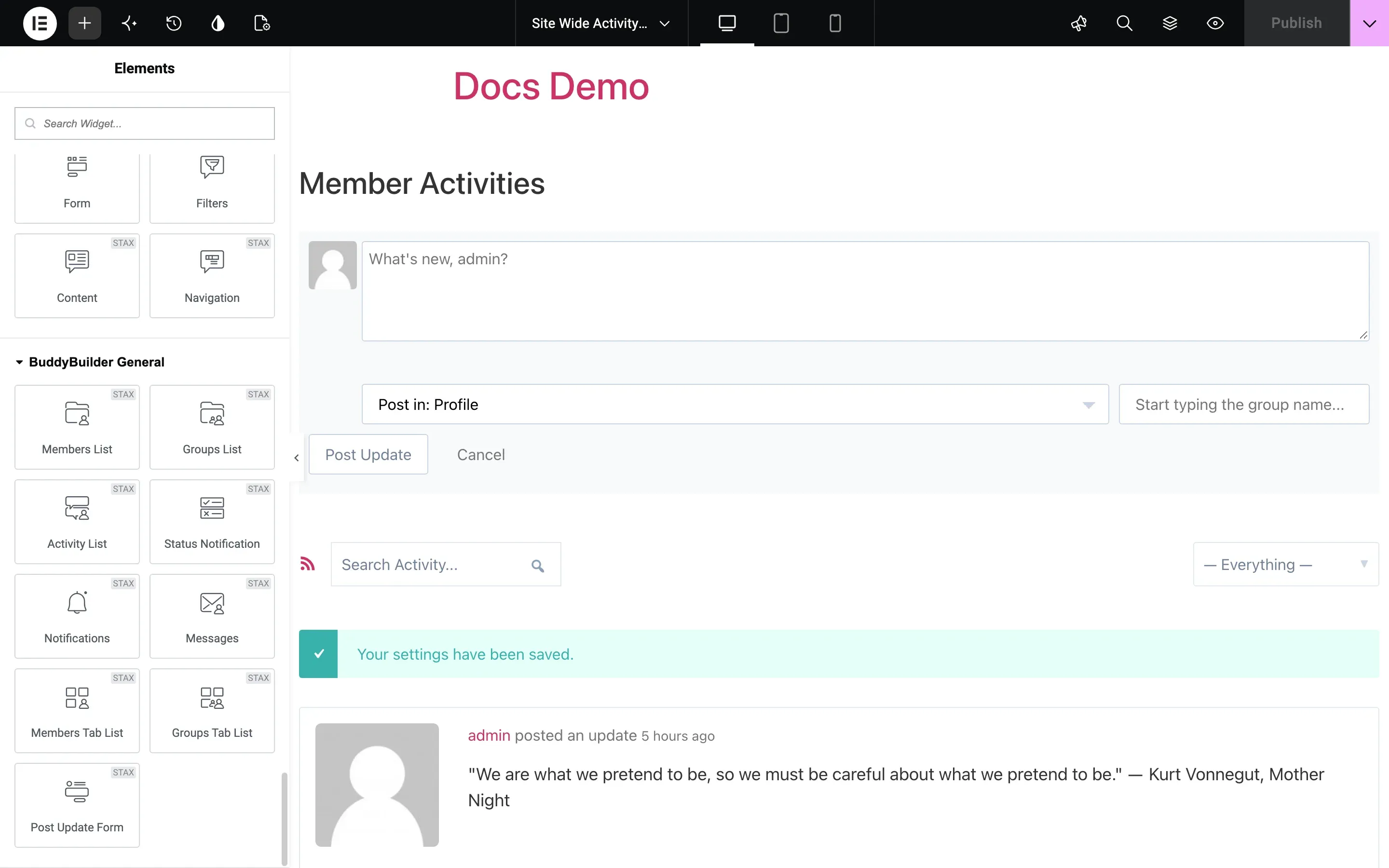
The Form widget shows the “What’s new” box where members write and post an activity update.
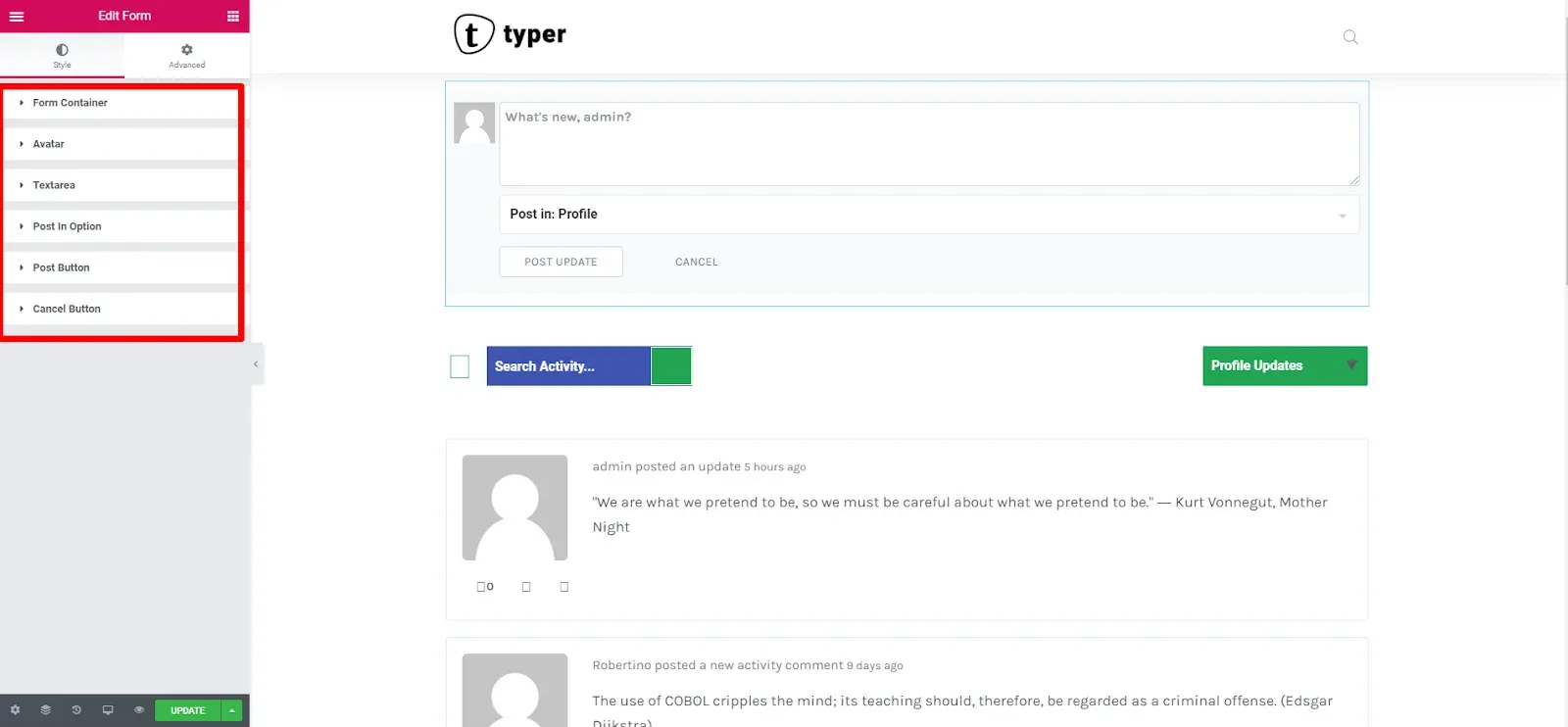
| Style section | What you can style |
|---|---|
| Form Container | Background, border, border radius, box shadow, padding and margin of the whole form. On BuddyBoss Platform also Form Header, Form Footer and Form Dividers. |
| Avatar | Border radius and box shadow of the member avatar. |
| User Name | BuddyBoss Platform only. Name color in the normal and focus states. |
| Textarea | Background, text color, Placeholder Color, border, radius and padding, for the normal and focus states. |
| Post In Option | The “Post in” selector: Text Typography, Background Color, Text Color, Placeholder Input Color, Select Arrow Color, border and padding. |
| Post Button | Typography, background, text color, border, radius and padding, for the normal and hover states. |
| Cancel Button | Same options as Post Button. |
Filters
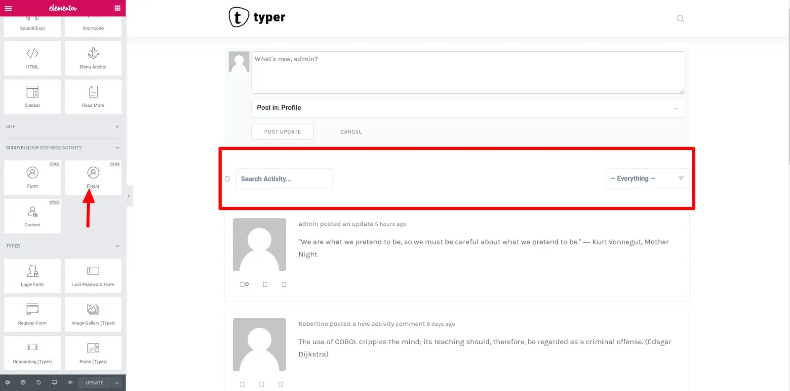
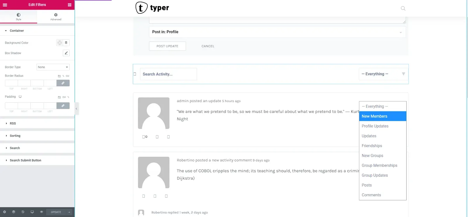
Section titled “Filters”The Filters widget shows the activity search field and the filter dropdown. Visitors use the dropdown to limit the stream to one activity type, for example new members, profile updates, updates, friendships, new groups, group memberships, group updates, posts or comments. The list comes from BuddyPress and depends on the active components.
| Style section | What you can style |
|---|---|
| Container | Background Color, border, border radius, box shadow and padding of the bar. |
| RSS | BuddyPress only. Rss Color and Rss Size of the feed icon. |
| Sorting | BuddyPress only. The filter dropdown: Text Typography, Background Color, Text Color, Icon Color, border and padding, for the normal and hover states. |
| Search | The search field: Clear Icon color, Text Typography, Background Color, Text Color, Placeholder Color, border, padding and margin, for the normal and hover states. |
| Search Button | Background Color, Icon Color, border, radius and padding, for the normal and hover states. |
Content
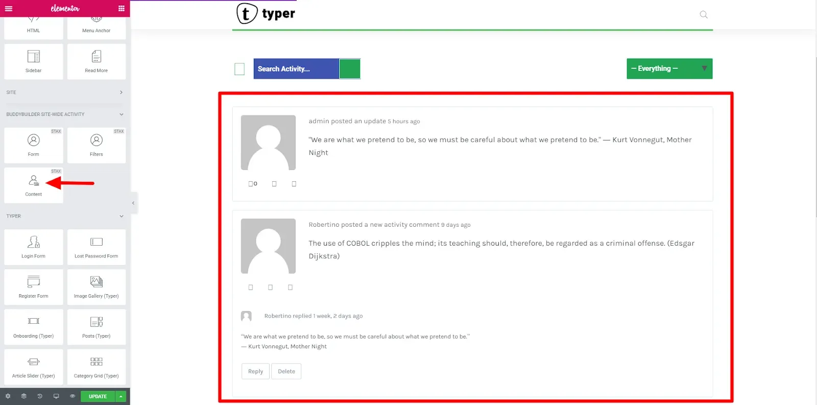
Section titled “Content”The Content widget shows the activity stream: each entry with the author’s avatar, the action text, the content, the action buttons, the comments and the Load More button.
| Style section | What you can style |
|---|---|
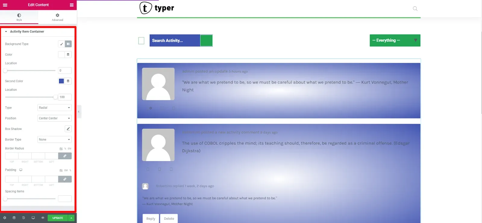
| Activity Items | The list as a whole: border and border radius. On BuddyBoss Platform the section is named Activity Container and also has background, padding and margin. |
| Activity Item | Each entry: background, border, border radius, padding and Spacing items (the gap between entries). Named Activity Item Container on BuddyBoss Platform. |
| Load More Button | Display (Inline or Block), Alignment, typography, background, text color, border, radius and padding, for the normal and hover states. |
Navigation
Section titled “Navigation”The Navigation widget shows the activity tabs of the page (for example all members, friends, groups, favorites and mentions for a logged-in member). The tabs come from BuddyPress and depend on the active components.
| Style section | What you can style |
|---|---|
| Navigation | Background Color, border, border radius, box shadow and padding of the tab bar. |
| Navigation Item | Alignment, Display (Inline or Block), spacing and width, Text Typography, text, background and border colors for the normal, hover and active states, Items Padding and Items Margin. |
| Item Counter | BuddyPress only. The count badge next to a tab: spacing, typography, colors for the normal, hover and active states, border radius and padding. |
Common questions
Section titled “Common questions”The widgets are not in the Elementor panel. They only appear while you edit a template of the type Site-Wide Activity. On a regular page, use the Activity List widget from the BuddyBuilder General category instead.
The activity page still shows the default design. Check that your template is selected under Site-Wide Activity in BuddyBuilder > Dashboard, then click Save.