
BuddyBuilder groups directory item widgets
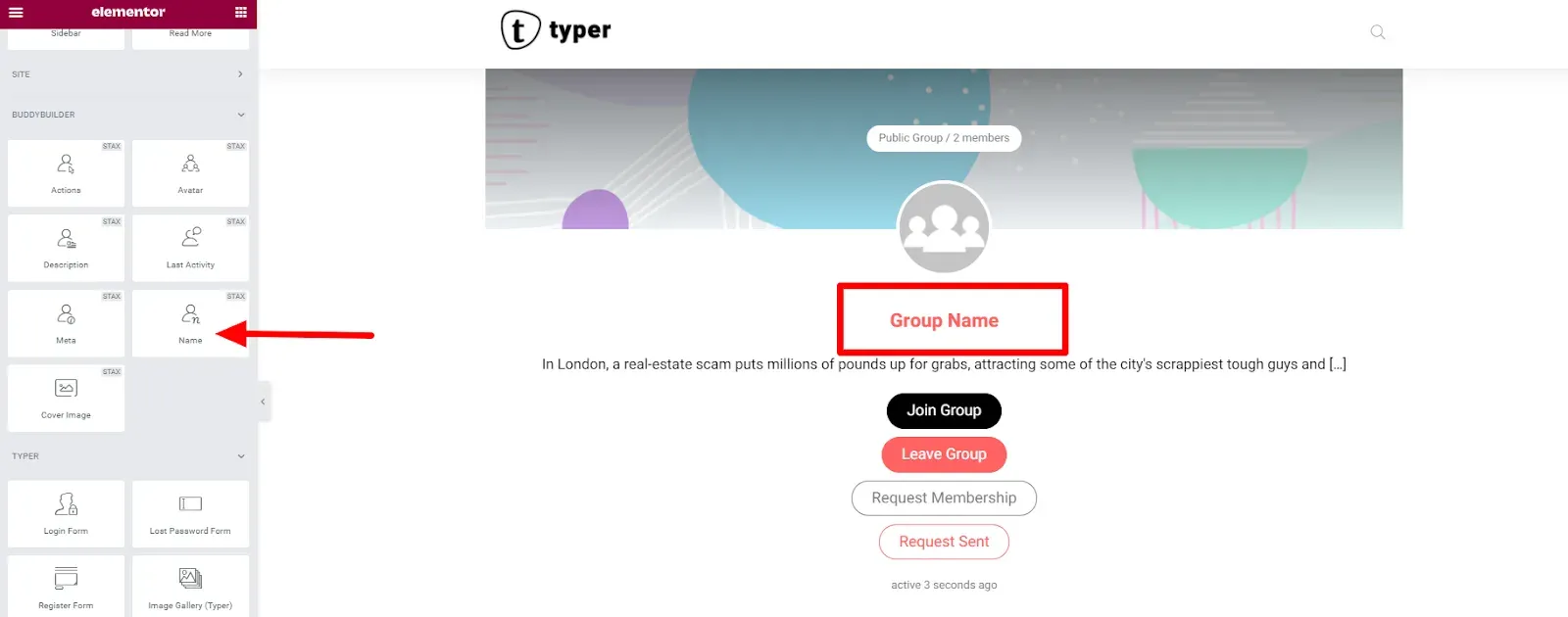
The groups directory item widgets design one group card, which BuddyBuilder then repeats for every group in a list. They belong to the Groups Directory Loop Item template and there are eight: Actions, Avatar, Cover Image, Description, Last Activity, Members, Meta and Name.
The widgets show in the Elementor panel under BuddyBuilder Groups Directory Item, and only while you edit a template of that type. The card you design is used wherever groups are listed: the groups directory and the Groups tab of a member profile.
Create the item template
Section titled “Create the item template”- Edit your Groups Directory template with Elementor and select the Groups Listing widget.
- In the Content tab, open Group Loop Item Template. With no template attached, click Go to settings to open the BuddyBuilder settings, where you create and assign the Groups Directory Loop Item template. With a template attached, click Edit template.
- Build the card with the widgets below, plus any regular Elementor widgets and containers, then save.
In the editor the widgets show a sample group. In the tables below, Typography, Text Shadow, Box Shadow, Border, Border Radius, Padding and Margin are the standard Elementor controls.
Actions
Section titled “Actions”Shows the group button for the current visitor: join the group, leave it, request membership, or the “request sent” state. It has no content options. In the editor all four buttons show at once so you can style them.
Style section Buttons (applies to all buttons):
| Option | What it does |
|---|---|
| Alignment | Left, center or right |
| Display | Inline (side by side) or Block (stacked) |
| Vertical Spacing, Horizontal Spacing | Gaps between buttons; horizontal applies to Inline display |
| Width | Button width, for Block display |
| Typography | Standard control |
| Text Color, Background Color, Box Shadow | Normal / Hover. Hover also has Border Color |
| Border, Border Radius, Padding | Standard controls |
The sections Join Group button, Leave Group button, Request Membership button and Request Sent button override the general style for one button each, with Text Color, Background Color, Border Color and Box Shadow for Normal / Hover.
Avatar
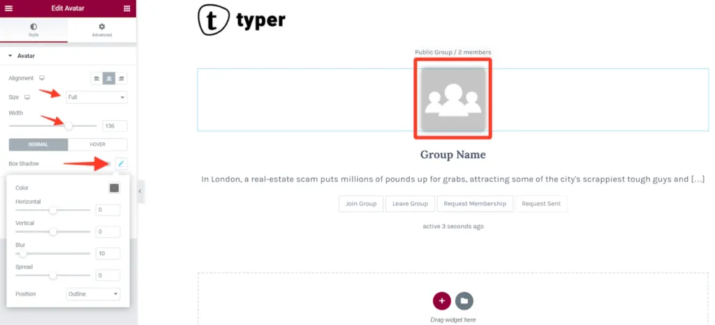
Section titled “Avatar”Shows the group photo. It has no content options.
Style section Avatar:
| Option | What it does |
|---|---|
| Alignment | Left, center or right |
| Size | Image version to load: Thumb or Full (default) |
| Width | Display width, up to 200 px |
| Box Shadow | Normal / Hover |
| Border, Border Radius | Standard controls |
Cover Image
Section titled “Cover Image”Shows the group cover image, either as a regular image or as the background of the widget area. It has no content options.
Style section Cover Image:
| Option | What it does |
|---|---|
| Set as background | Off: the cover is an image you can align and size. On: the cover fills the widget area as a background |
| Alignment, Width, Max Width | Shown when Set as background is off |
| Image position, Image repeat, Image size | Shown when Set as background is on. Background placement |
| Height | Shown when Set as background is on. Height of the area, up to 900 px |
| Image Blur | Blurs the image, up to 50 px |
| Border, Border Radius, Box Shadow | Standard controls |
| Overlay, Overlay type | Shown when Set as background is on. Adds a classic or gradient color layer over the image |
Description
Section titled “Description”Shows an excerpt of the group description. It has no content options.
Style section Description: Alignment, Text Color, Typography, Text Shadow, Border, Border Radius, Margin and Padding.
Last Activity
Section titled “Last Activity”Shows when the group was last active, for example “active 3 seconds ago”. It has no content options.
Style section Last Activity: Alignment, Text Color, Typography and Text Shadow.
Members
Section titled “Members”Shows the avatars of a few group members, followed by a count of the remaining ones (for example “+12 members”).
Content section Members:
| Option | What it does |
|---|---|
| Max Members | How many avatars to show. Default 3 |
| Show Label | Shows the “+N members” text after the avatars |
Style tab:
| Section | Options |
|---|---|
| Content | Content Position: left, center or right |
| Avatar | Border, Border Radius |
| Label | Text Color, Typography |
Shows the group details line: the group status (public, private or hidden) and the number of members. It has no content options.
Style section Meta: Alignment, Text Color, Typography, Text Shadow and Padding.
Shows the group name. It has no content options.
Style section Name: Alignment, Text Color, Typography and Text Shadow.