
BuddyBuilder Pro messages, notifications and settings styling
The Messages, Notifications and Settings screens of a member profile are styled from the Content widget of the Member Profile template: choose the screen in Edit Section and its style sections appear below. This page lists those sections for BuddyPress. The shared sections (navigation, filters, buttons, typography) and the other screens are on Member profile content styling.
To reach a section, select the Content widget, open the Style tab, set Edit Section > Select section to the screen and Preview subsection to the sub-page named below. Typography, Border, Box Shadow, Padding and Margin are the standard Elementor controls and are only named in the tables.
Messages list
Section titled “Messages list”Messages List styles the list of conversations. It shows when Select section is Messages and Preview subsection is Inbox, Starred or Sent.
| Part | Options |
|---|---|
| List container | Margin around the list. |
| List items | Border Type, Width and Border Color of the rows, Background Color Odd, Background Color Even, Padding. |
| Avatar | Box Shadow, Border, Avatar Border Radius. |
| Author, Subject, Content, Counter, Date | Typography and Color of each text in a row. |
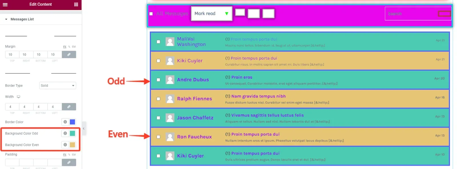
The bar above the list (bulk actions and search) is styled in Filters (Common): see Filters.
Active conversation
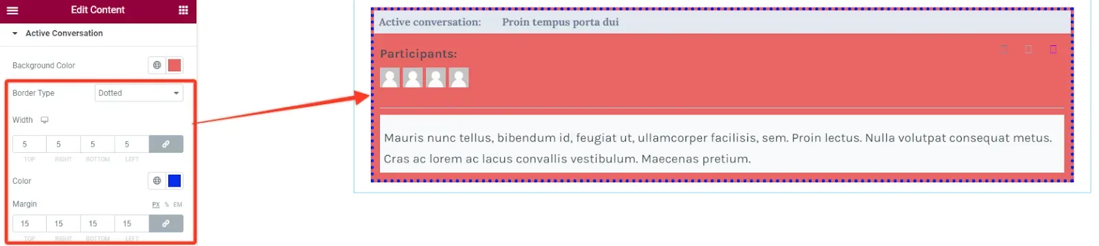
Section titled “Active conversation”Active Conversation styles the preview of the conversation selected in the list, on the same Inbox, Starred and Sent sub-pages.
| Part | Options |
|---|---|
| Container | Background Color, Border, Margin. |
| Header | Typography, Color, Background Color, Border, Border Radius, Padding of the title row. |
| Preview Content | Margin. |
| Participants | Typography, Color, Background Color, Border, Border Radius, Padding. |
| Participants Avatar | Box Shadow, Border, Avatar Border Radius. |
| Message | Typography, Background Color, Color, Border, Border Radius, Padding of the message text. |
| Message Actions | Icon Color for Normal and Hover. |
Reply and compose
Section titled “Reply and compose”Three more sections cover the other Messages sub-pages:
| Section | Preview subsection | Parts you can style |
|---|---|---|
| Reply Conversation | Reply | Header, Participants, Participants Avatar, Message, Message Author, Message Meta, Message Content, Message List, Message List Item, Message Actions. |
| Reply Form | Reply | Form Margin, Avatar, Label, Post Button. |
| Compose Form | Compose | Form Margin, Labels, Inputs (Normal and Focus), Post Button, Reset Button. |
Notifications table
Section titled “Notifications table”With Select section set to Notifications, the Table section styles the list of notifications. Preview subsection switches between Unread and Read.
| Part | Options |
|---|---|
| Table | Background, Border, Margin. |
| Table Header | Alignment, Typography, Color, Background, Border, Padding of the heading row. |
| Table Actions(header) | Alignment of the Actions heading. |
| Table Body | Typography, then for Normal and Hover: Color, Link Color, Action Button Color and Background, each with an (odd) variant for alternating rows; Border and Padding of the cells. |
| Table Actions(boddy) | Alignment of the Actions column in each row. |
| Filter Actions | The Bulk Actions dropdown: Typography, Background, Text Color, Icon Color, Box Shadow, Border, Border Radius, Padding. |
| Apply Button | Typography, Background, Color, Border Color (hover), Box Shadow, Border, Border Radius, Padding, Margin. |
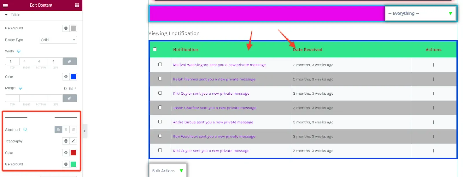
Two more sections, Pagination Top and Pagination Bottom, style the “Viewing 1 notification” text and the page links above and below the table. Each has a Show switch, Bottom Space, the box options (Background Color, Box Shadow, Border, Border Radius, Padding), Typography and Text Color, Links Spacing, and link colors for Normal, Hover and Current with Link Border Radius and Link Padding.
Settings forms
Section titled “Settings forms”With Select section set to Settings, the Settings section styles the form fields of all Settings sub-pages (General, Email, Profile Visibility, Group Invites, Export Data, Delete Account).
| Part | Options |
|---|---|
| Labels | Typography, Color. |
| Text Inputs | Typography, Background Color and Color for Normal and Focus, Border Color on focus, Border, Border Radius, Padding. |
| Lost Password Link | Typography, Color for Normal and Hover. |
| Generate Password Button | See below. |
Screen titles, paragraphs and links come from Typography, the Save Changes button from Buttons and the sub-menu from Navigation.
Generate Password button
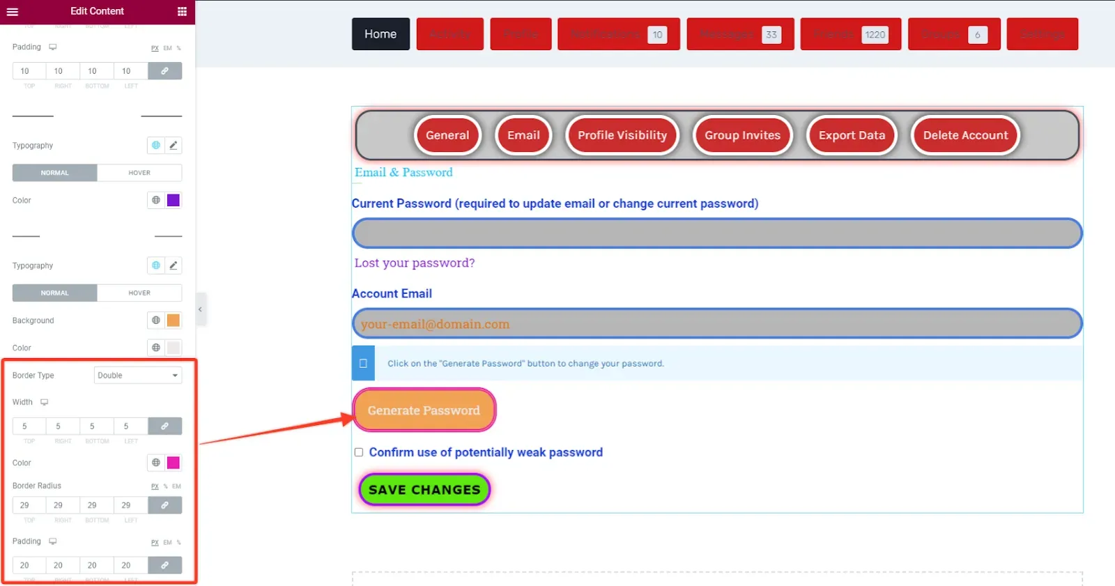
Section titled “Generate Password button”The Generate Password button of the General sub-page has its own heading at the end of the Settings section, so it can look different from the Save Changes button: Typography, Background and Color for Normal and Hover, Border Color on hover, Border, Border Radius and Padding.
Settings tables
Section titled “Settings tables”The Table section shows when Preview subsection is Email or Profile Visibility, the two Settings sub-pages laid out as tables.
| Part | Options |
|---|---|
| Table | Background, Border, Margin. |
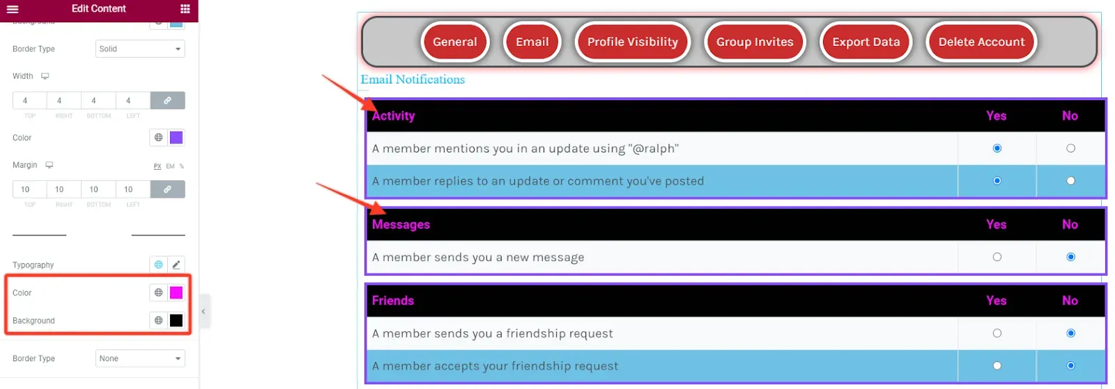
| Table Header | Typography, Color, Background, Border, Padding of the title rows (for example Activity, Messages, Friends on the Email sub-page). |
| Table Body | Typography, then for Normal and Hover: Color, Link Color and Background, each with an (odd) variant; Border and Padding of the cells. |
| Select | The visibility dropdowns: Typography, Background Color, Text Color, Border Color (hover), Box Shadow, Border, Border Radius, Padding. |
BuddyBoss Platform
Section titled “BuddyBoss Platform”With BuddyBoss Platform the same screens have different sections, because the markup differs: Messages uses Messages Container, Messages List, Messages List Item, Single Message, Single Message Header, Single Message Content and Compose Message, and the Settings screen is named Account, with a Settings section and a Table section for the email and privacy preferences.